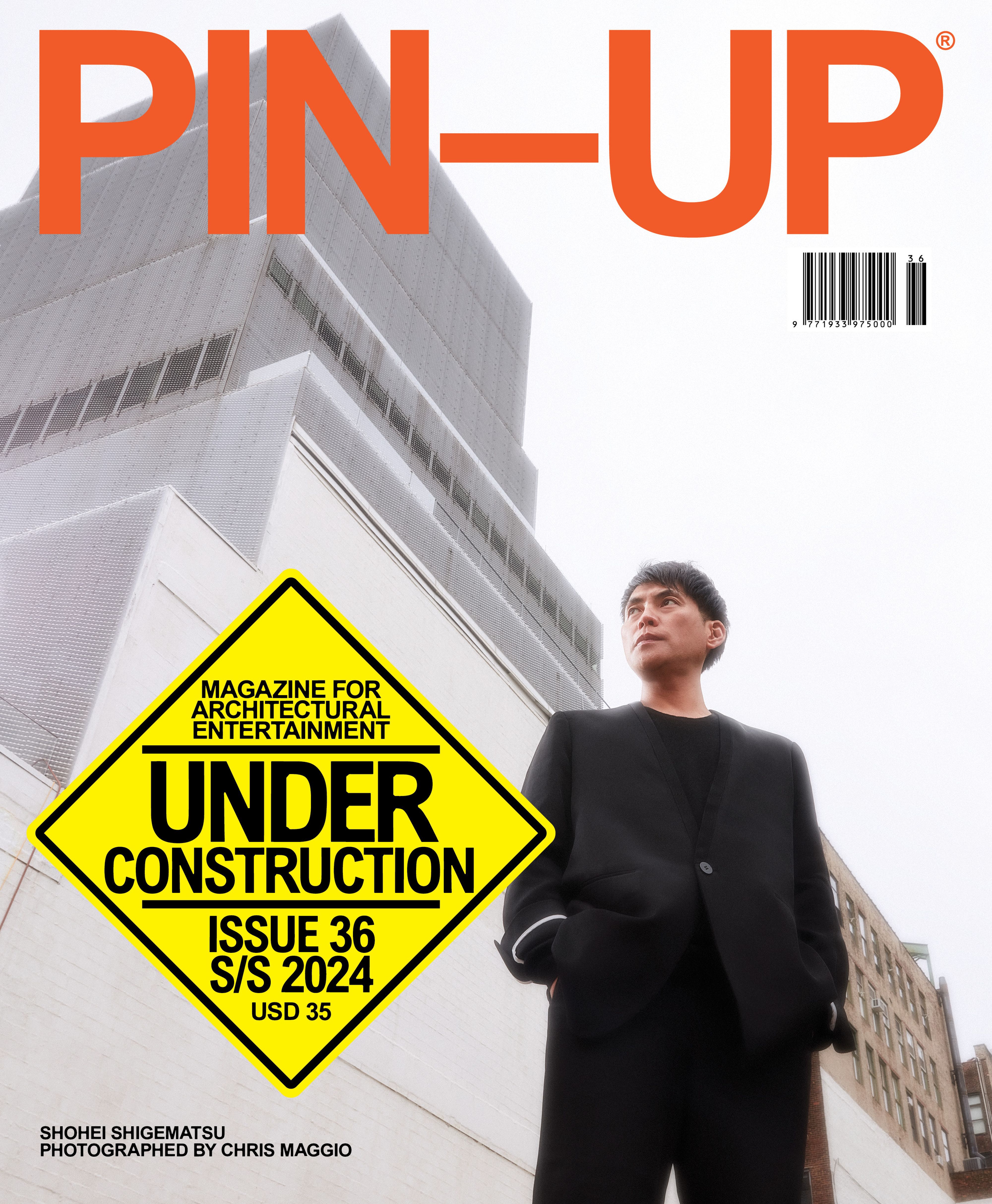
SHOHEI SHIGEMATSU

BREAKING GROUND WITH THE BUSY OMA PARTNER

by Felix Burrichter

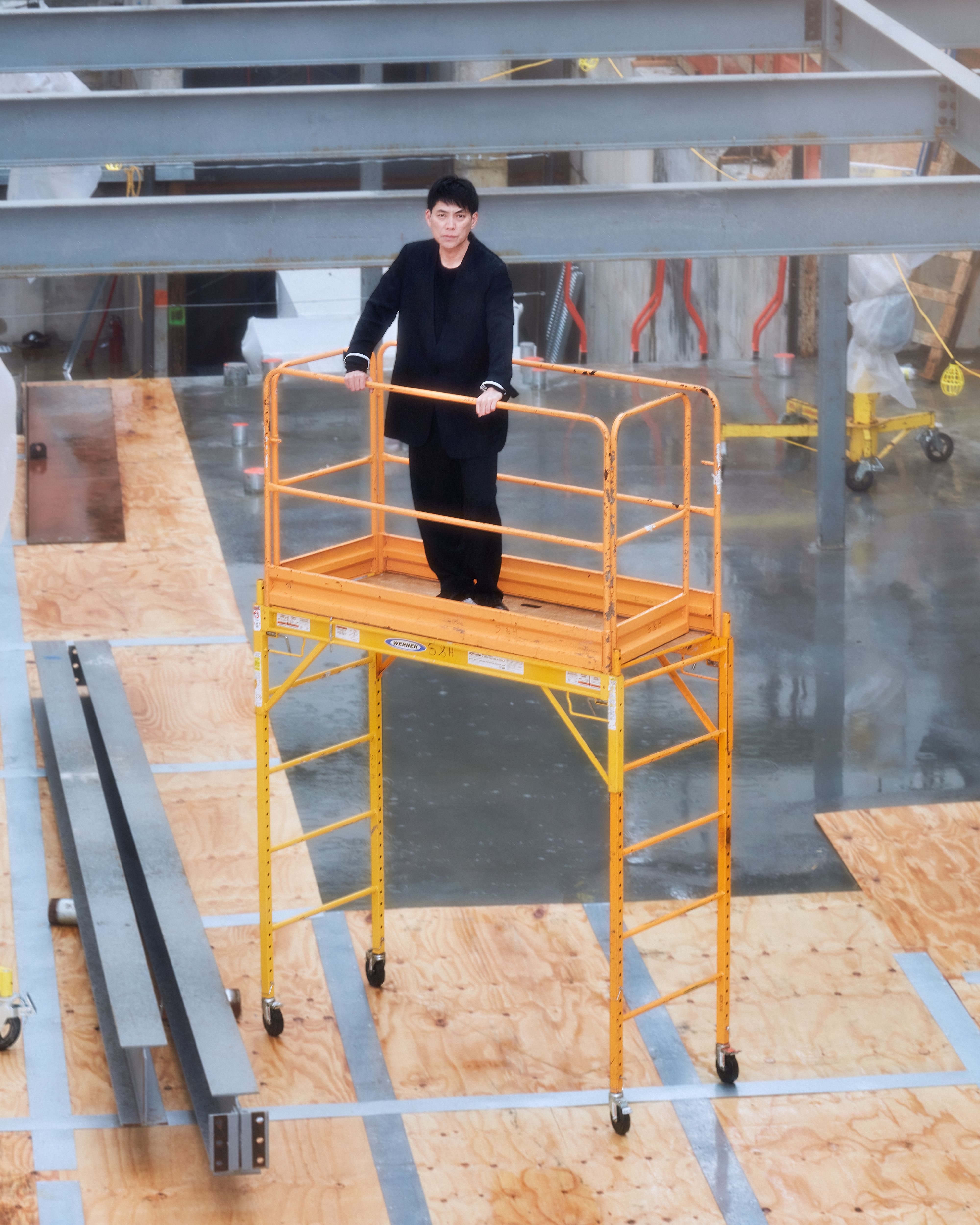
Shohei Shigematsu photographed by Chris Maggio for PIN–UP.

Get the new Shohei Shigematsu edition of PIN–UP 36 HERE

Shohei Shigematsu loves to build. Born in Japan, the 51-year-old architect is one of eight partners at OMA, or Office for Metropolitan Architecture, the firm co-founded by Rem Koolhaas with offices in Rotterdam, New York, and Hong Kong. Since its inception in 1978, OMA has had a firm grip on architectural discourse, especially since the 1990s, when the seminal book S,M,L,XL (1995) became essential reading for any self-respecting architect. Shigematsu joined OMA in 1998 when the firm started to be recognized not only as a think tank but also as a firm that could actually construct. The U.S., especially in the enthusiasm of the late Clinton tech-bubble years, seemed like the land of unlimited possibilities, and OMA was the hottest girl at the party. But, after the turn of the millennium, the American political and economic landscape changed radically: several of OMA’s U.S. projects fell through — Universal Studios, the Whitney, LACMA — and Shigematsu, who’d been “stationed” in New York, found himself with a skeleton crew and no work. For a man who feels that “to push architecture forward, you have to build,” the experience was traumatic. Today, Shigematsu no longer needs to worry about not building: since 2006, Shigematsu has completed 19 projects in North America alone (most recently a new gallery for the Buffalo AKG Art Museum) and is overseeing several projects in Japan, which now make up 40 percent of his work, not to mention exhibition design for brands like Dior and Louis Vuitton, as well as artist collaborations.

Among the 18 projects he currently has under construction, the extension to the New Museum, scheduled to open in 2025, is arguably his most high-profile project in the U.S. to date and OMA’s first public building in New York City. (He was photographed for PIN–UP on site.) The 60,000 square-foot museum addition will double the exhibition space, add public programming, and improve circulation, all while performing an architectural balancing act of engaging with the original building’s iconic architecture, courtesy of SANAA, and completed as recently as 2007. (SANAA also participated in the competition for the extension but lost to OMA.) Shigematsu met with PIN–UP founder Felix Burrichter to chat about construction, food, and learning from failure.

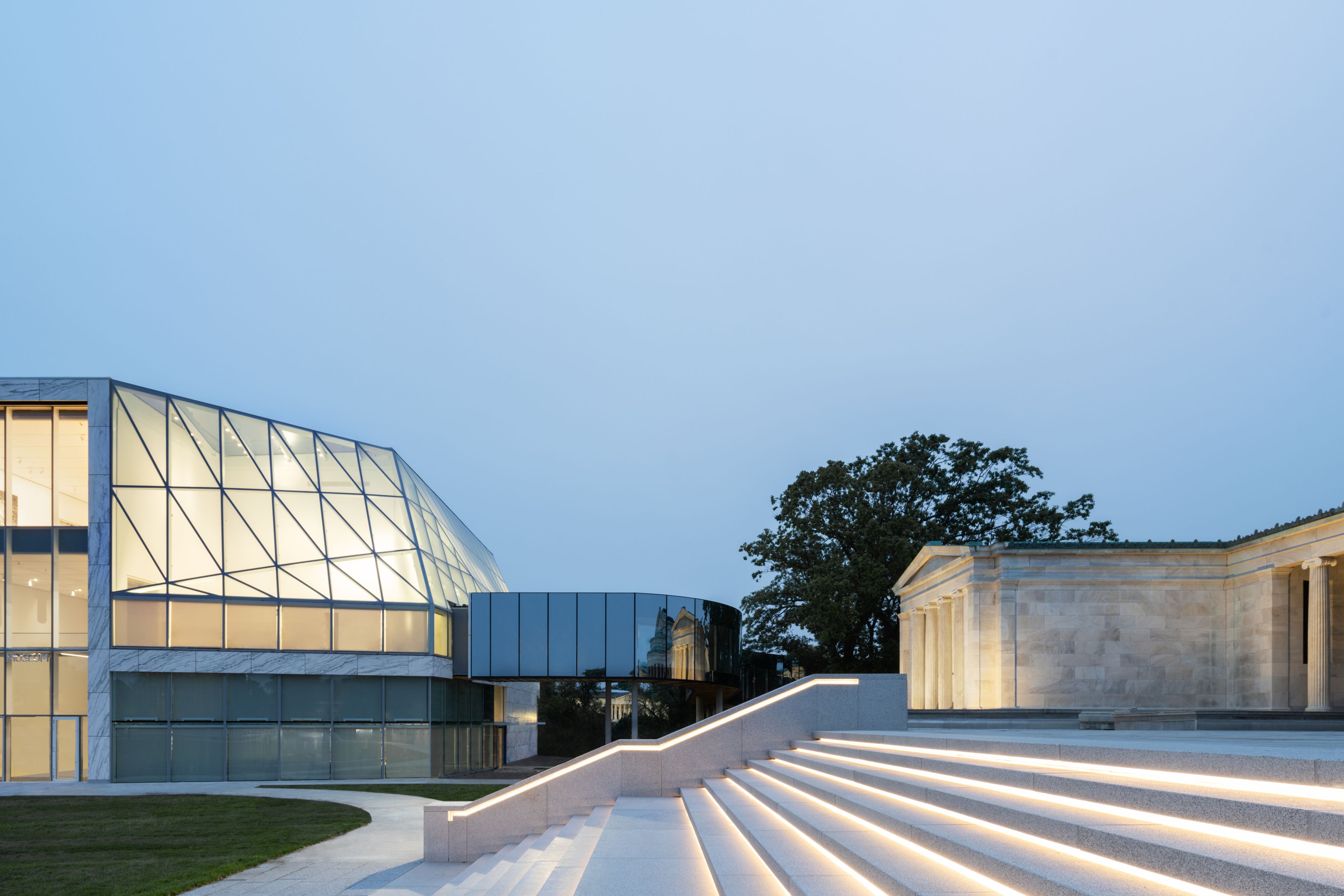
The OMA/Shigematsu-designed expansion of the Albright-Knox Art Gallery in Buffalo, New York (completed in 2023), was the office’s first public art museum project in the U.S. With 53,700 square feet of additional exhibition space plus a new education wing, the building features a fritted transparent façade that offers 360-degree views of its surroundings. A bridge attaches the new Gundlach Building to the original museum, which Shigematsu says symbolizes architecture’s role in fostering connection. Photography © Marco Cappelletti.

Felix Burrichter: We’ve known each other a long time, but I still don’t really know how you ended up here in New York.

Shohei Shigematsu: I started at OMA in Rotterdam in May of 1998, at the height of OMA’s American projects — Universal Studio headquarters, which I was working on, the Whitney Museum extension, and we won LACMA, which I was the project architect for, and then Prada. It was a really vibrant moment. I was here in New York during 9/11 for the Whitney project — we were also collaborating with Davis Brody Bond, KPF, and Toyo Ito on a mixed-use office project for the U.N., but we lost. After 9/11, OMA’s focus shifted — we won the competition for CCTV in Beijing, which I was co-leading, so my direction moved to China, and then elsewhere in Asia and also to the Middle East for four or five years. Lots of radical buildings were being designed there at the time. But eventually I got tired of all that because it was always about building huge projects without much context, generally in a new central business district, a sort of urban tabula rasa. At the time, Josh Ramus was running the New York office and he asked me if I was interested in working on Milstein Hall, the Cornell University extension [2006–11]. Soon after, Josh left OMA, and the New York office moved to REX [in 2006, Joshua Ramus bought out OMA’s New York projects and set up his firm, REX]. OMA New York was vacant, and I was the only one working on a U.S. project at the time. I had been leading the designs, but I also wanted to grow by actually leading the project itself so that I could really understand the construction and later phases.

You grew up in Fukuoka, right?

Yes, but I lived in the U.S. for one year when I was nine because my father was a research fellow at MIT. I think that somehow influenced my becoming an architect. I remember being so surprised by how beautiful Boston was, with the glass skyscraper by I. M. Pei and European-style housing and Boston Common, a beautiful park, and great architecture at MIT and Harvard. I have a vivid childhood memory of seeing Eero Saarinen’s MIT chapel for the first time.

Many of your contemporaries “graduated” from OMA to start their own firms — Ole Scheeren, Dan Wood and Amale Andraos, Joshua Ramus, Bjarke Ingels, Fernando Romero, Julien De Smedt, Jeanne Gang, among others. It’s unusual to see someone shaping their own path within a structure so uniquely tied to one founding partner like Rem.

A lot of successful people worked at OMA at the time, and the fact that they chose me, a 32-year-old Japanese person, to take over the U.S. office was crazy. But I was loyal to OMA, and I wasn’t going to take people away from the office. I eventually realized I had to step up to get more projects. At one point, I just said, “Fuck it, I’m going to treat this office as if it’s my own.” And inevitably I had to try to get my name out there to be more productive in running the office and getting new projects. In the beginning, there was a lot of criticism within the firm. “Why are you saying OMA/Shohei Shigematsu?” I explained it this way: you have to overcome one of the biggest names of your generation; if you just say OMA, most people immediately associate a project with Rem. People thought I was being an egomaniac, but now it’s become common practice at OMA — the firm’s partners no longer work under Rem’s shadow, but on their own projects. I like the structure where there’s diversity under a single umbrella.

Shohei Shigematsu photographed by Chris Maggio for PIN–UP.

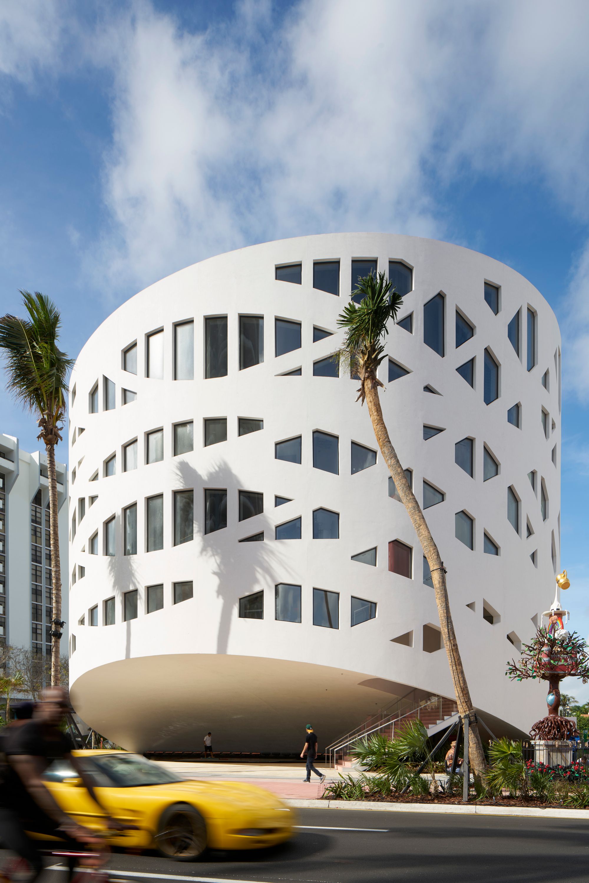
OMA/Shohei Shigematsu Miami’s Faena Forum is an arts center with flexible design: a black box theater and dome space can be used together or separately, depending on the programming. Shigematsu connected the Faena Forum building with a series of public spaces — a plaza, courtyard, and a marina dock. Photography © Bruce Damonte.

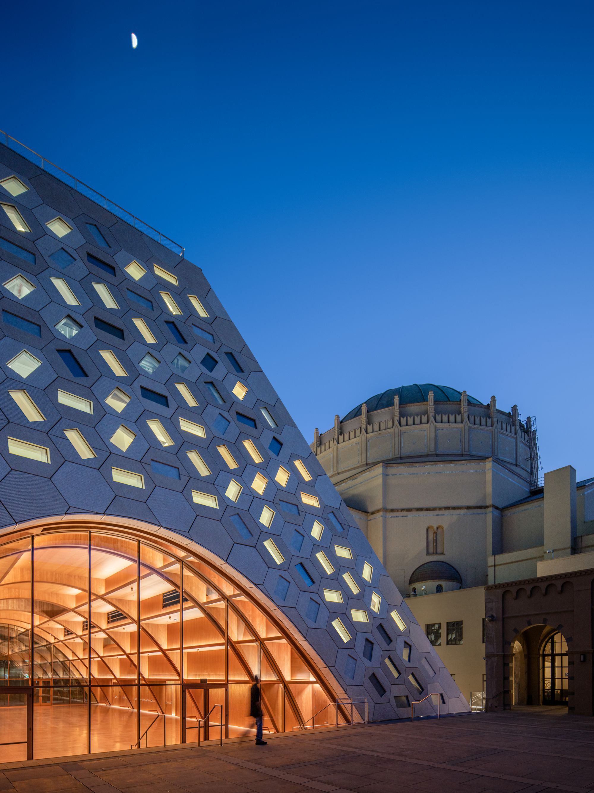
The Audrey Irmas Pavilion (2021) in Los Angeles is OMA’s first religious institution. Designed as an extension to the Wilshire Boulevard Temple, Shigematsu embedded unexpected shapes into the classic form, from a circular sunken garden to trapezoidal voids in the façade, all striking against the background of the complex’s Byzantine Revival Sanctuary from 1929. Photography © Jason O’Rear.

You said that when you started at OMA in the late 90s, U.S. projects were sprouting like mushrooms, but that later, things came to a standstill. What project eventually turned things around for the office?

For the first five years it was very difficult for me to get projects, to the point where we almost had to close the office. The pivotal project that got us going was the Pierre Lassonde Pavilion in Quebec City [2010–16], the first for which we won a competition without Rem’s involvement, and where the client accepted us like that. The Met exhibition in 2016 [Manus x Machina: Fashion in an Age of Technology] was also key to our progress — through that we developed our relationship with Dior and now Louis Vuitton.

You once referred to OMA as an academic environment. What did you mean?

When our work in America was growing and I was exposed to this influx of high-prestige projects, OMA also set up AMO [the firm’s research arm]. So a lot of researchers were involved in the projects. With that kind of environment, it was almost like a school — you could call it academic, but also a school of thought. OMA was globally influential even though we were all only 30 to 40 years old. Some people grew out of that and became world famous. Working in that environment was a big learning moment for me.

Competitions, whether you win them or not, are also a form of research.

That’s true, and this is a good segue into construction. Rem’s focus wasn’t always on building — rather coming up with interesting ideas. Rem is a great liberator — he encourages young designers to conceive something radical, something you’ve never seen before. And he has the stamina and openness to accept that as a scheme to be presented to the client. My priority has always been to show something that’s buildable. I want to build a building. In order to push architecture forward, you have to build, and then you have to see how people actually use that building in order to verify your assumptions and move productively on to the next one. Without that verification in the real world you can’t achieve the ultimate goal. During my first four years at OMA New York, nothing was built, and I think that trauma is at the root of what makes me focus on building so much. We have great minds, processes, and concepts, but if you don’t finish it, it can become irrelevant. I was really thinking about how to capture the essence of those experimental thoughts, but also being able to build it.

What role does the construction industry play in your large-scale projects? And what about alternative building methods?

Milstein Hall was actually a very interesting project because we chose the upper part to be a steel construction and the lower part to be concrete. It also involved renovation and adaptive reuse of existing parts. I learned a lot about building from that project. In Japan, it’s always scrap and build. Japanese society likes new buildings, and I think much of it comes from the fact that it has to contend with frequent natural disasters and the memory of the war — the Japanese are used to seeing buildings destroyed and rebuilt. But, for environmental reasons, the U.S. has really started to question the act of building. In the future, I imagine there will be U.S. laws demanding proof that new buildings will not be harmful to the environment. I think we should be anticipating that. The alternative model is 3D printing, or something that allows less waste and better control between the design and construction phases. For example, the process between design and construction is much more seamless in Japan, despite the U.S. leading the technological part of architecture software. You’ve thought about the design so much, you’ve made a sophisticated 3D model, but once you go on site it’s a whole different world. In Japan and Europe, there’s some continuity between the design and the construction. Not so much in the U.S. — I’m not sure why.

Shohei Shigematsu photographed by Chris Maggio for PIN–UP.

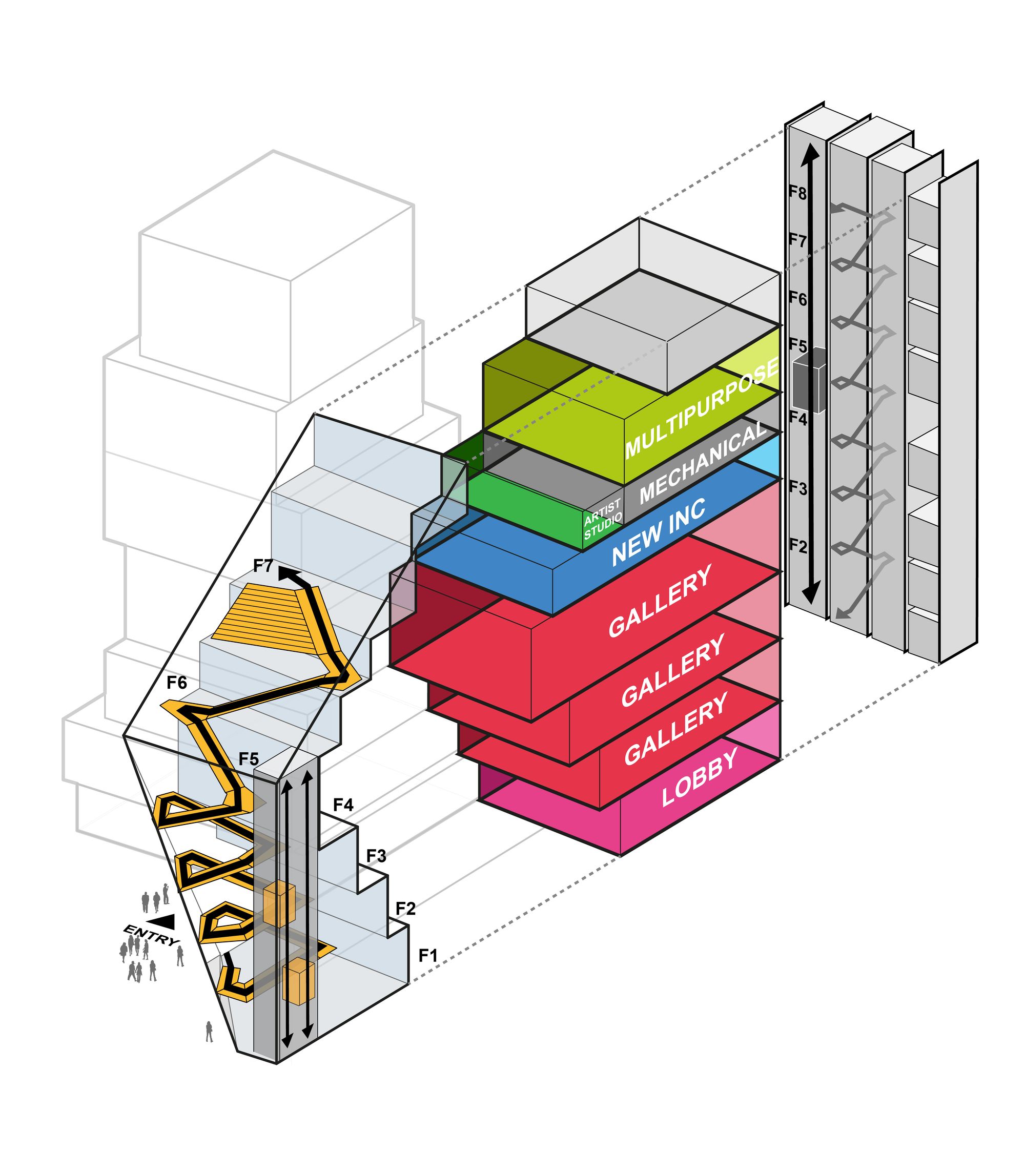
For OMA/Shohei Shigematsu’s expansion of the New Museum (expected 2025), Shigematsu wants the new building to act as an extension of the street, drawing in energy from the Bowery up through its seven floors. Image courtesy OMA.

Shohei Shigematsu photographed by Chris Maggio for PIN–UP.

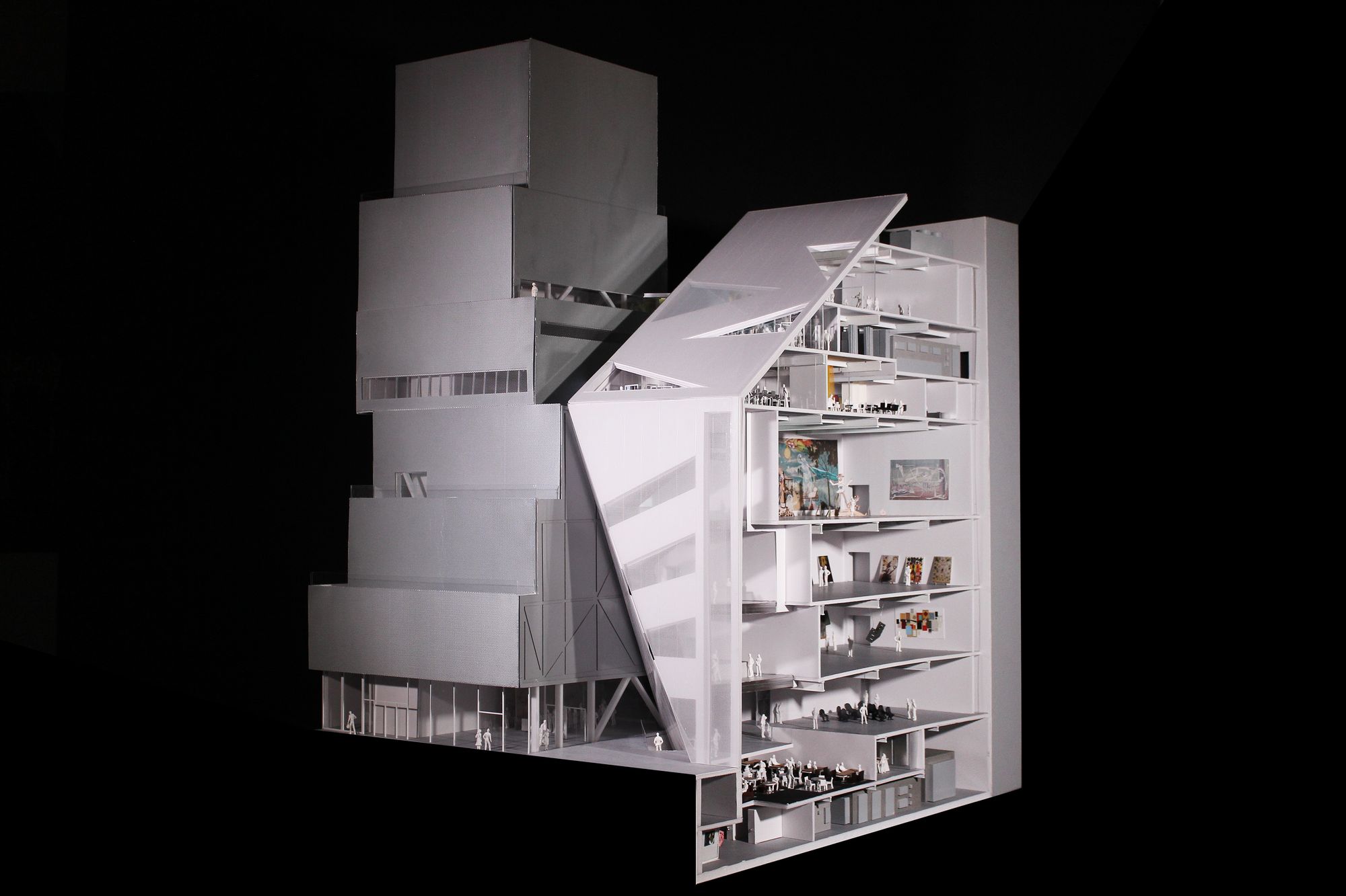
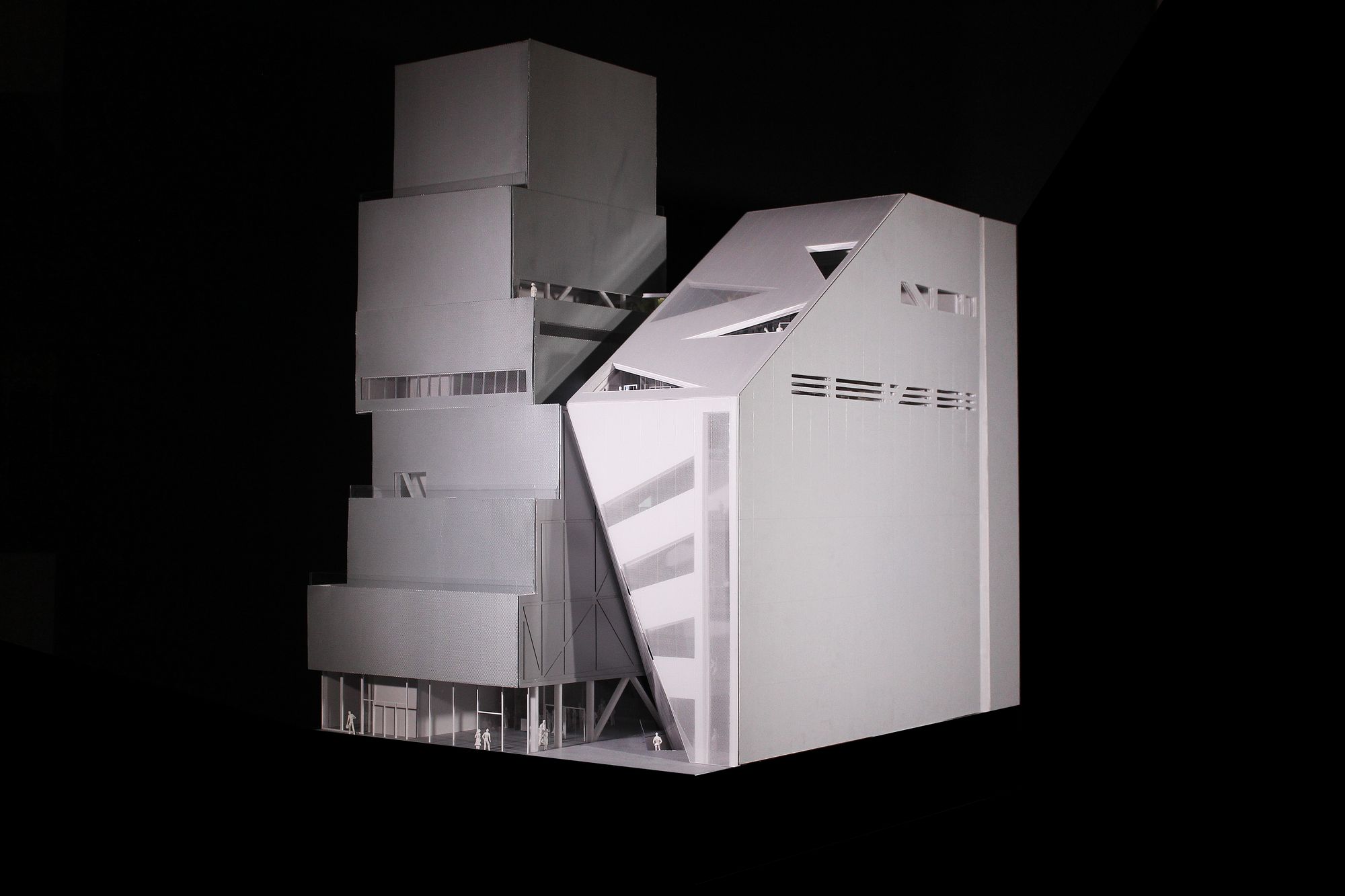
OMA/Shohei Shigematsu’s expansion of the New Museum. Image courtesy OMA.

The seven-story, 60,000-square-foot New Museum addition will double the institution’s exhibition space and include a permanent home for NEW INC, their in-house art, technology, and design incubator. In contrast to the SANAA-designed building’s verticality, Shigematsu’s addition will expand the galleries horizontally, through a transparent façade that honors the original structure. Image courtesy OMA.

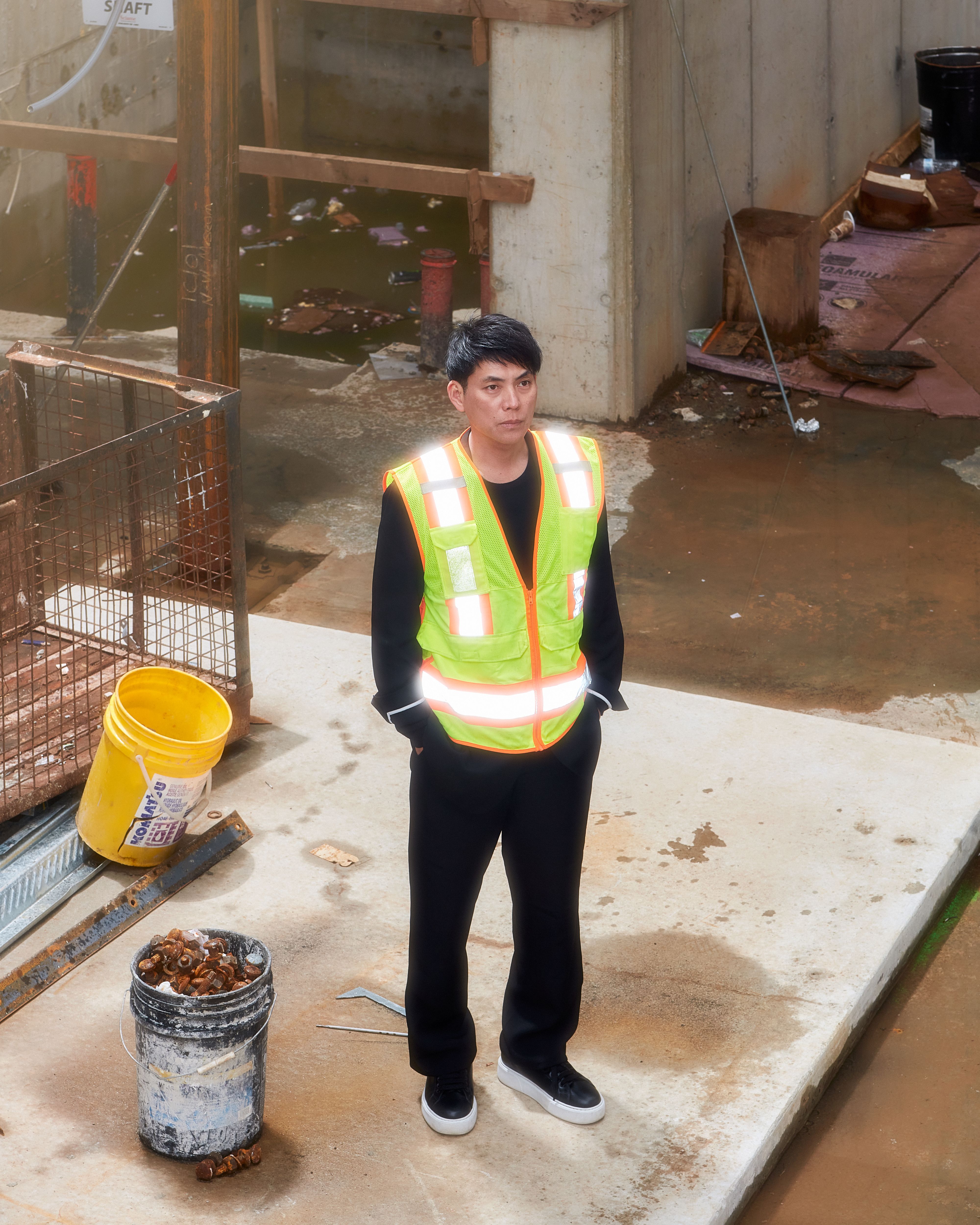
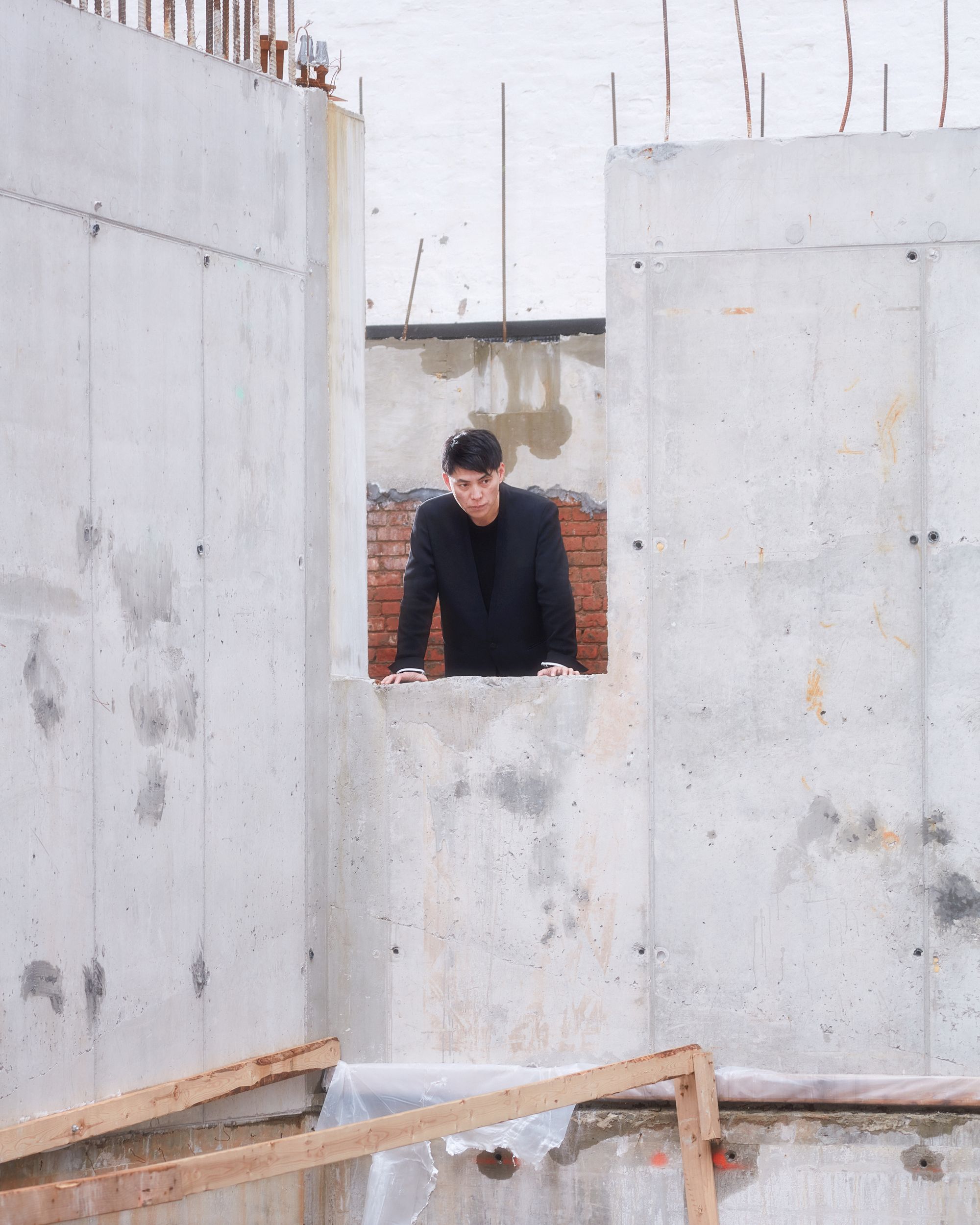
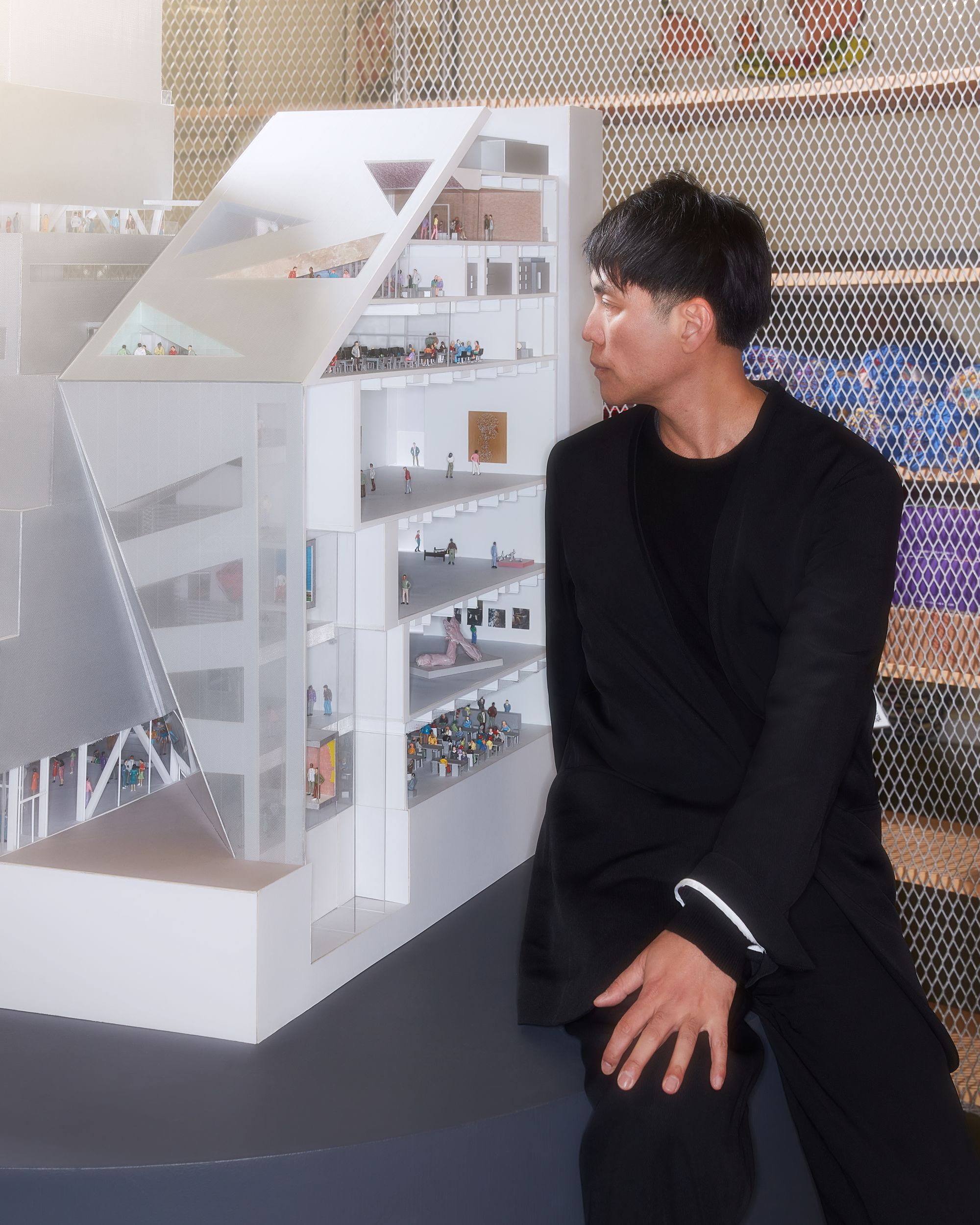
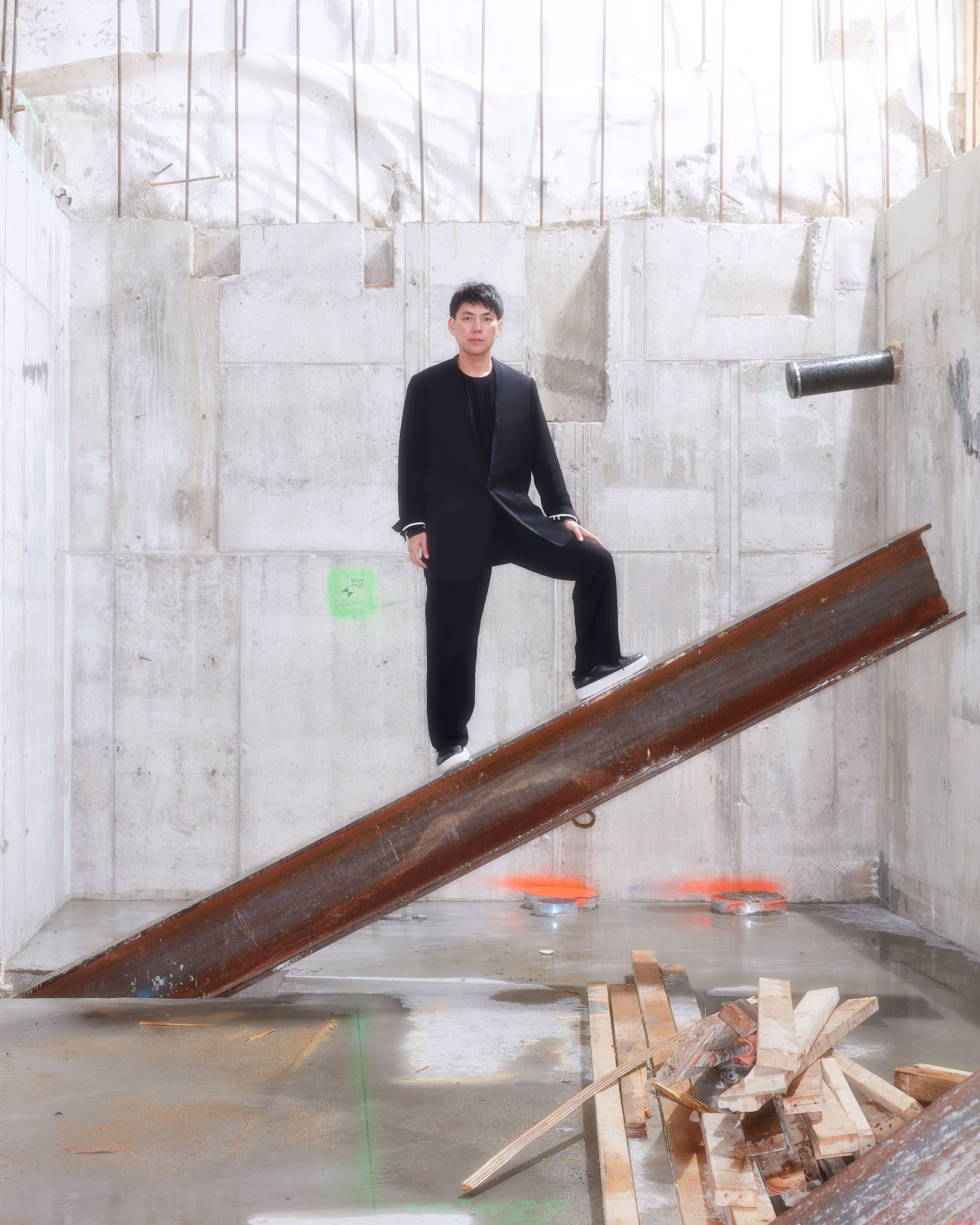
Shohei Shigematsu, OMA partner and the current director of the firm’s New York office, at the construction site for the New Museum’s second building, set to open in 2025. It will be OMA’s first public building in New York. Photography by Chris Maggio for PIN–UP.

Is it because, at the design phase, architects don’t really take construction methods into account? Or is the building industry resistant to change? Or both?

Perhaps both. We complain about construction contractors, but I’m sure they also complain about architects. At the same time, I know there’s a willingness to understand each other, and I also think there’s great acceptance in the construction industry of radical or highly designed architecture. Designers might not get exposed enough to the actual building industry. As design architects in the U.S., we often don’t have the fee to stay on until the very end of a project. Typically, a design architect like myself will do the schematic early phase, after which comes design development, or DD, when a lot of details are thought out and priced, and then it goes to the construction-document phase, or CD, where it’s almost a preparation of the site and a bid to the contractor. Typically, the design architect drops off at the end of DD and hands it over to the executive architect who does CD, where you get into the nitty gritty, the technical reality of the design. In our office, we’re trying to overcome that divide by being involved until the very end.

You work with a lot of different typologies — is there one you feel more comfortable with?

If I had to choose, I think I’d choose art projects. Especially the museum typology, which is evolving quite fast and becoming more like a public space, almost an extension of the urban condition — there’s a variety of activities and events centered around the community beyond looking art happening in between the exterior and interior. The potential of these undefined, unprogrammed buffer zones in between art and urban life is really exciting. In general, I think architecture today is too highly programmed. Cities are so highly regulated. In Japan, you can’t smoke on the street — there’s a designated zone. There’s surveillance in a lot of places, and big data controls the movement of traffic and pedestrians. Although technology allows people to use architecture more freely, it’s lacking this more undefined area. Architecture should respond by providing more open-ended spaces — it’s the architect’s role to create that part of the canvas that’s not painted. With the New Museum, for example, the face of the building that looks out west toward the Bowery was conceived as a kind of buffer zone where a lot of different improvisational programming could happen, almost as an extension of the city.

Can you tell me more about the New Museum project — I know you don’t pick favorites, but this one is clearly important.

As I said earlier, I was a project architect for the Whitney extension back in 2001, an enlargement of the Marcel Breuer masterpiece, trying to create a statement that the museum as a typology was evolving. With architecture, you don’t get exposed to the same conditions so often, but the New Museum is a strikingly similar case: two decades later we find ourselves once again in the heart of Manhattan connecting with a masterpiece of modern, contemporary architecture. With the Whitney project, of course I had different opinions because I wasn’t fully leading the project — but that experience of failure taught me a lot that I can now apply to the New Museum. So it’s very important in terms of my professional evolution.

OMA’s proposed extension to Breuer’s Whitney building came in 2001, 35 years after it was first completed. SANAA’s New Museum opened in 2007, just 17 years ago.

Yes, we talk about that a lot. An extension typically comes around 50 years later, so the previous architect may have died or may not be active anymore. But here, it’s a Japanese duo [Kazuyo Sejima and Ryue Nishizawa of SANAA] who are quite active, and the museum is still considered a piece of contemporary architecture. We were very aware of how tricky it is to add an extension to that. I think we arrived at something slightly different that respects the verticality of the existing structure while using the horizontality of the given site. That fine balance between being not too respectful but not too overriding came out of the initial research. In the end, I think our extension will look like it was built in the same era as the original.

Your design reveals a part of the existing museum that is currently obscured by the neighboring structure.

Yes. We also talked about this with Sejima-san. An extension typically obscures part of the original building, but here we are exposing more of it, because our project is set back a few feet. That previously unseen, now-revealed part of the old building became a kind of collaboration with Sejima-san, a conversation between both buildings.
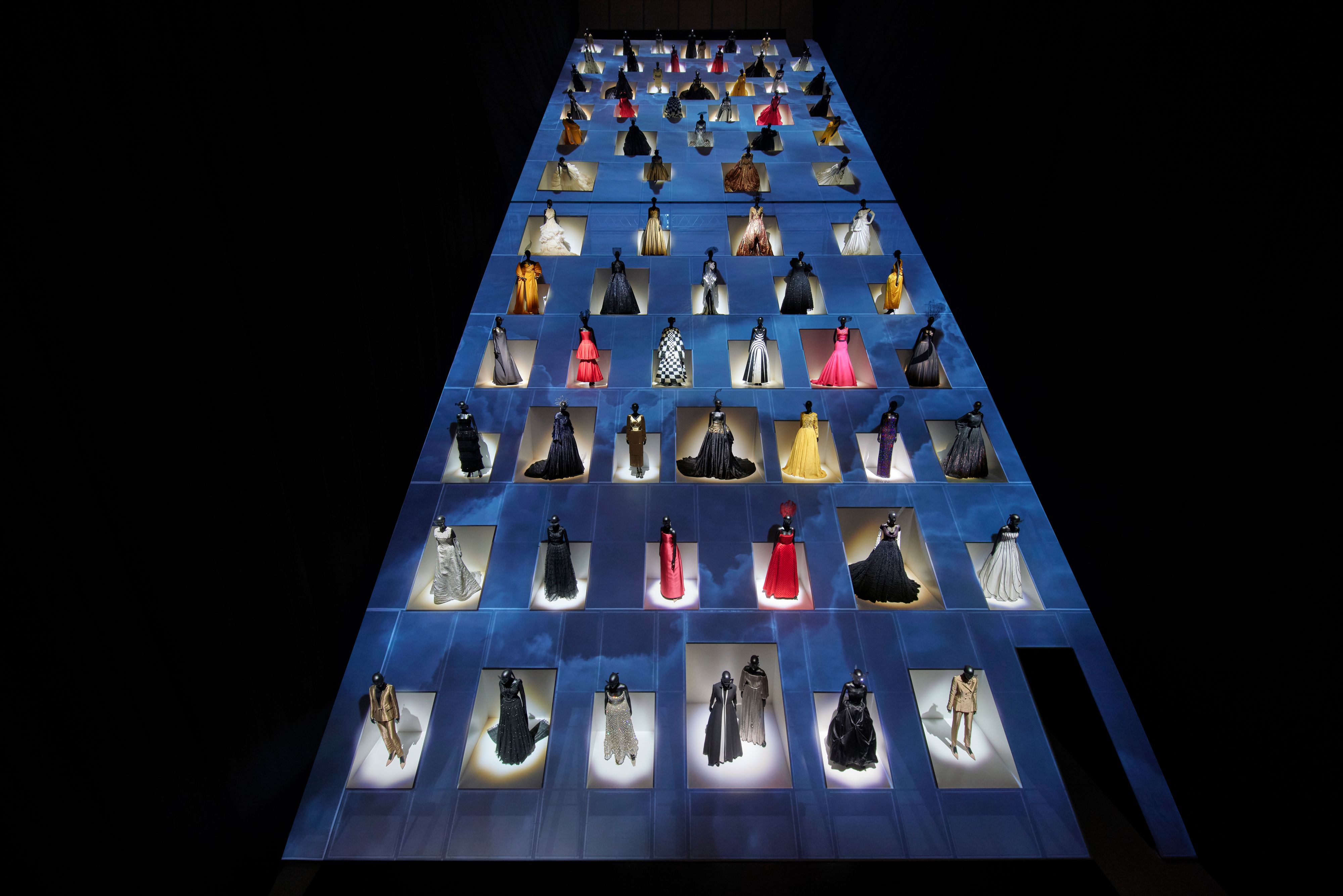
Christian Dior: Designer of Dreams at the Museum of Contemporary Art Tokyo (2023). For the exhibition, Shigematsu finds common ground between Japanese tradition and Dior’s history, using Tenjiku fabric, Awagamiwashi paper. Photography © Daici Ano. Courtesy Dior.

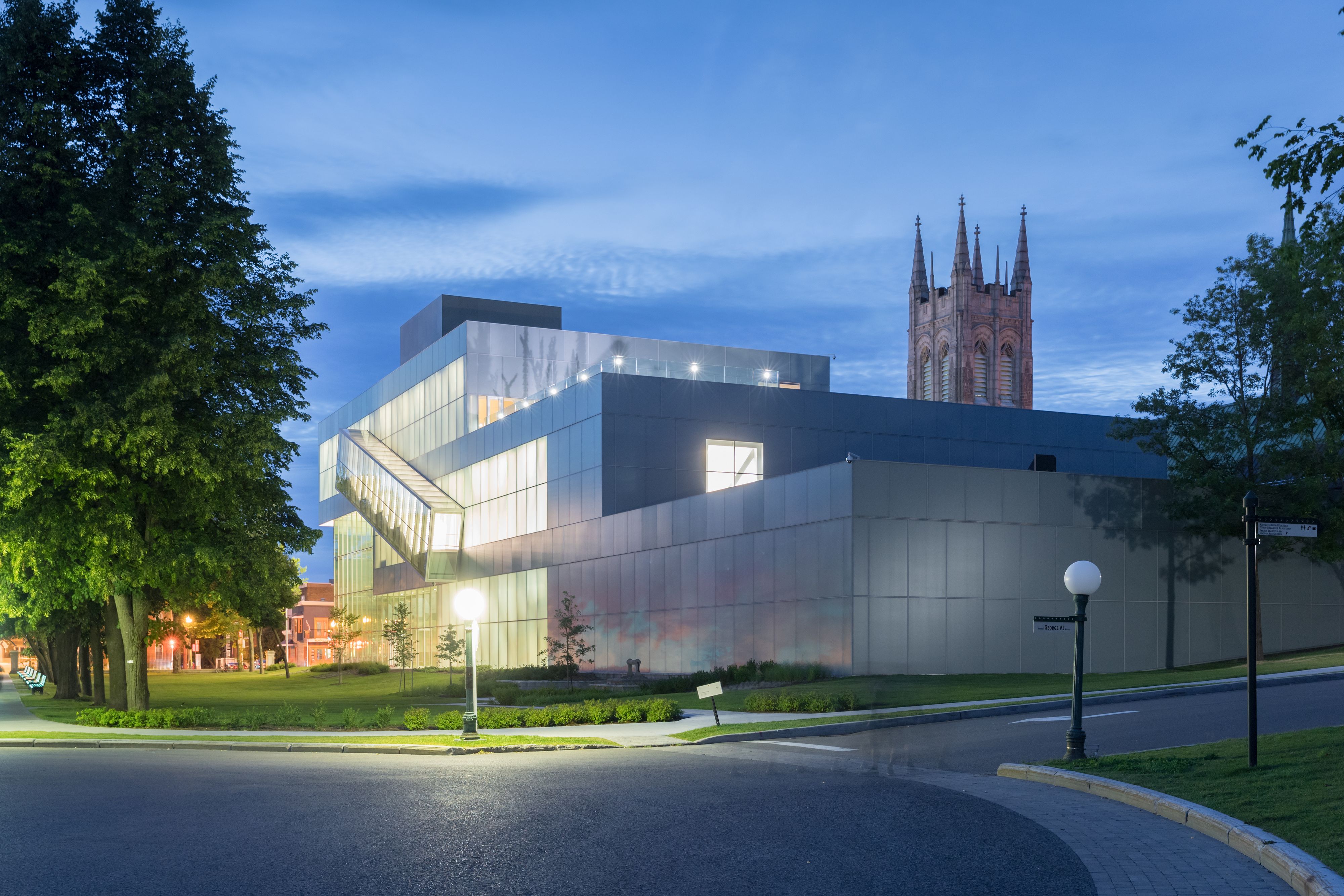
The Pierre Lassonde Pavilion (2016), part of the Musée Nationals des Beaux-Arts du Québec, was a pivotal project for OMA New York. Shigematsu’s museum extension stacks three galleries, a sloping cascade contrasting with the Gothic Revival church next door. Existing buildings are connected to the new structure through an underground passageway. Photography © Iwan Baan.

What did the New Museum ask for in its extension brief?

A lot of museums are acknowledging the importance of education to generate future artists and discourse, and incubation — some kind of productive space in addition to exhibitions, which of course allow you to see art but don’t necessarily produce it. The New Museum now has NEW INC, an incubator space, and the top room of the museum during the day is used for education. It could be turned into an event space — gathering is a core part of architecture. That’s also why we proposed a kind of museum at the top of the Toranomon Hills Station Tower [in Tokyo, which Shigematsu designed for the Mori Building Company and completed in October 2023]. Gathering brings a lot of energy and money, and activation puts the building on people’s mental maps.

Public space has become something of a luxury. What do beauty and luxury mean to you?

Luxury is shifting from owning an object to something more experience-based — providing a unique experience is definitely a kind of luxury. Fashion can be a platform to bring different disciplines together, like art, architecture, design, and food, and I think that’s real luxury. The interesting thing about fashion is that it’s very good at reinventing things, and is willing to take up the challenge of destabilizing something. Deconstructing a brand’s identity and trying to create a new one — construction and deconstruction have equal weight. With respect to beauty, there’s a kind of prejudice against OMA — that we don’t care about it. [Laughs.] We actually care a lot about beauty, but the definition of beauty is a big question. I think that beauty is when your narrative and your design match — rationally understandable but irrationally beautiful. For me, something unexpected is always kind of beautiful. When I manage to create something unknown through known ingredients, it can be quite beautiful. It’s a little bit like cooking: you use known ingredients and then somehow you manage to make something very unexpected. I get super excited about that.

So you get excited about food?

Yes, very. The three fundamentals of human needs are shelter, food, and clothes, and in one way or another all three are scalable from the super local to the super global. In architecture, something very vernacular can be used globally. I think Modernism washed everything out into a single belief, but we need to think about what architecture can bring from before true modernization, when you had more local specificity. The technology of food production is also evolving enormously — nowadays, you can stack food production into a tower to make vegetables without any water or soil. Architecture always talks about collaboration, but when we came up with “Alimentary Design” as a topic for our Harvard GSD course, a lot of faculty in the law, medical, business, and other departments wanted to get involved. That was a pivotal moment for me. I think architecture could be more relevant if it immersed itself more in a topic like food.

If you had to draw an analogy between a dish and your architecture, what would it be?

I like the analogy of bento boxes versus à la carte style. I can only analyze it in relation to the city — before, you had different areas with different characters in big cities like Tokyo, à la carte style. Now, through big commercial developments where packaged programs are repeated, it’s a bento box — Shibuya and Asakusa used to feel very different, but now you start to have the same experience wherever you go. Architects are hired to create some kind of difference compared to these mega buildings, but whether your bento box is round or has a special material or form, if the ingredients are the same, the experience is always the same. So what I always say to developers and ourselves as architects is that you can’t just be involved in designing the container — we also need to change the ingredients.

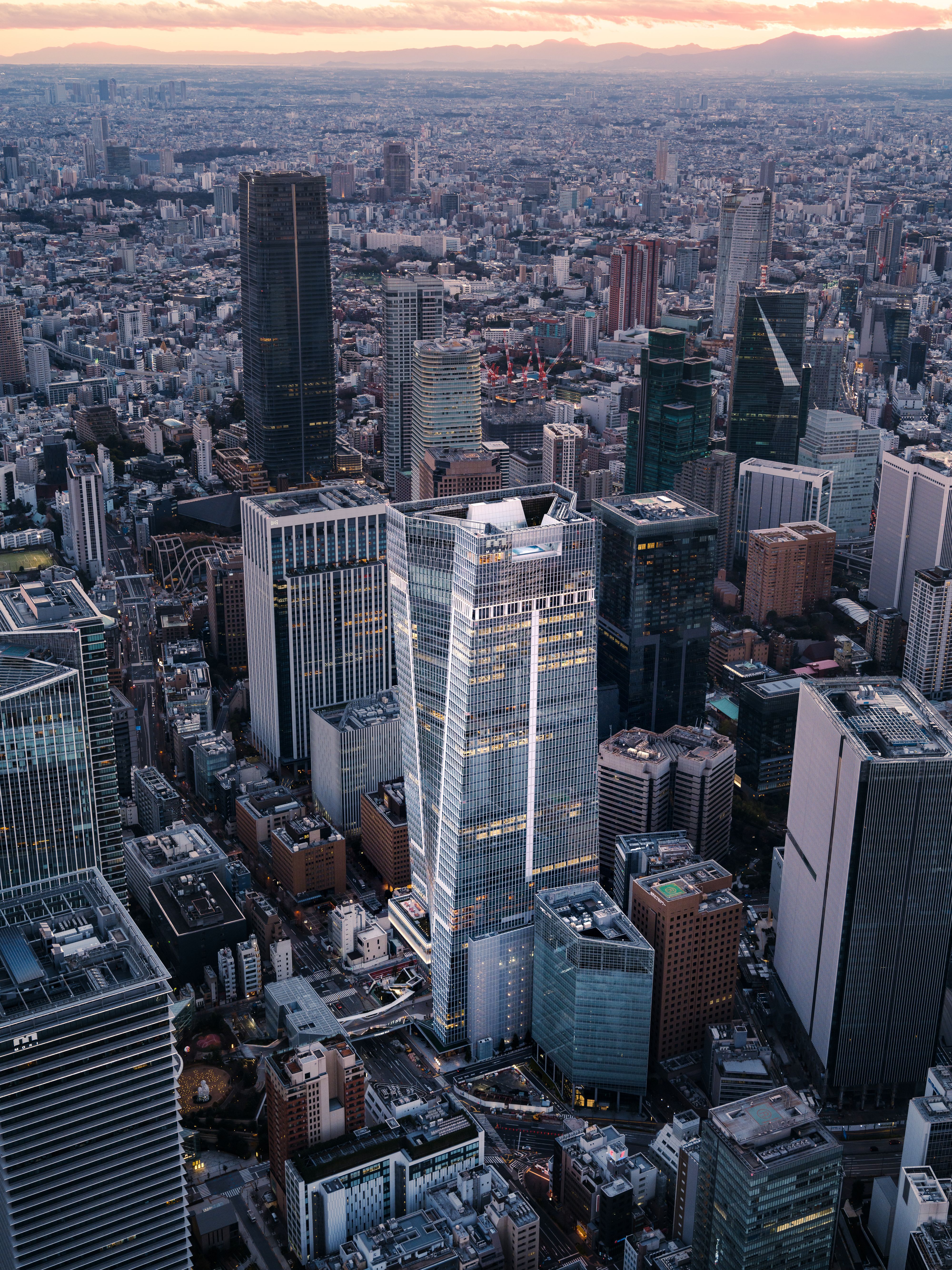
Toranomon Hills Station Tower (2023) in Tokyo epitomizes Shigematsu’s ideas around connection. The tower connects two skyscrapers through an elevated pedestrian bridge, opening up the otherwise hermetic structures to the urban activity beneath them. Photography © Jason O’Rear.

The special Shohei Shigematsu edition of PIN–UP 36 is now available HERE