
The newly redesigned Centro de Arte Moderna (CAM) Gulbenkian in Lisbon. Photo © Joanna Correia.
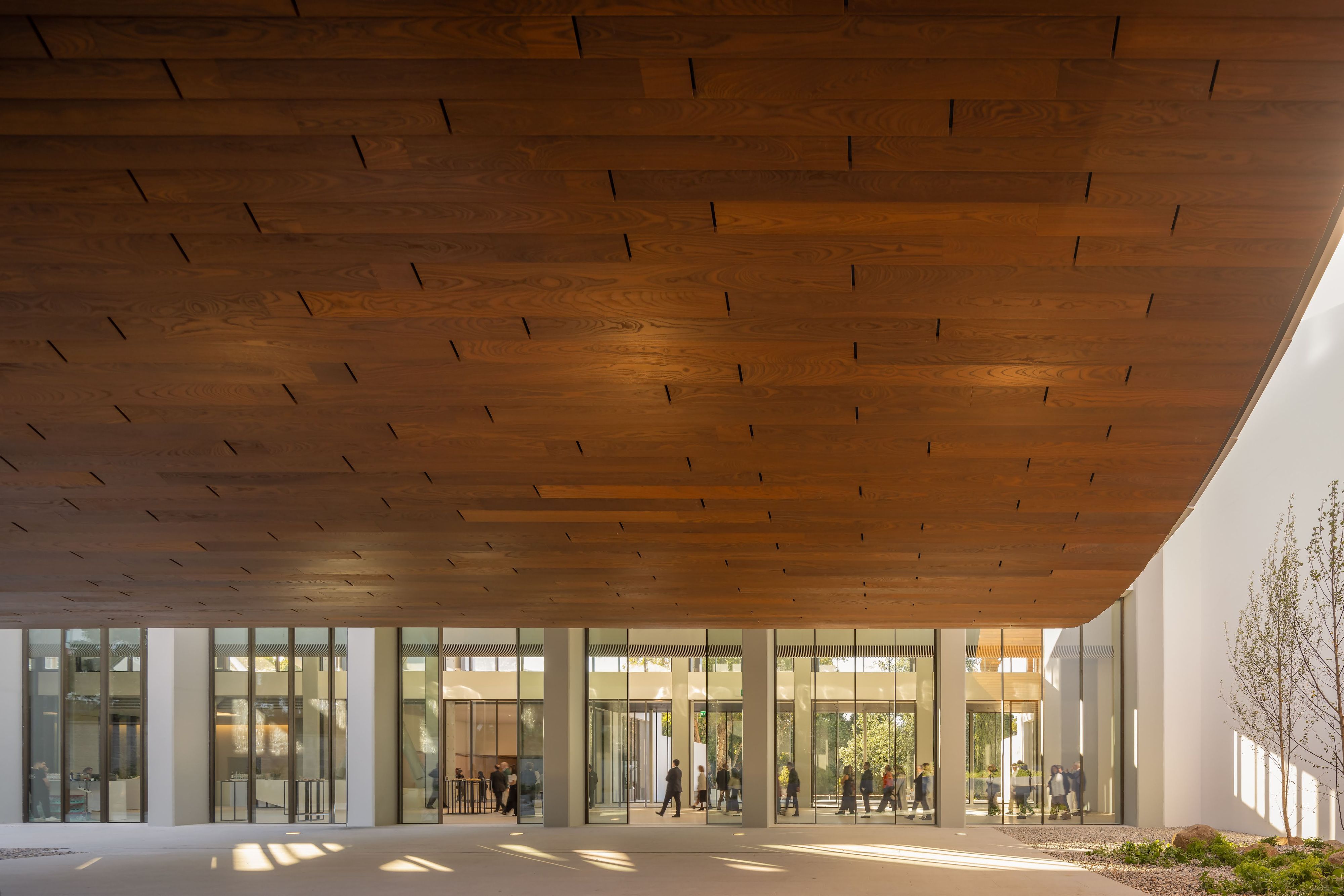
The engawa space of Kengo Kuma and Associates’ new design of the CAM Gulbenkian. Photo by Fernando Guerra, Canon Ambassador.
Like many of Kengo Kuma and Associates’ projects, the new Centro de Arte Moderna (CAM) Gulbenkian in Lisbon is an exercise in simplicity. Founded in 1983 by then Gulbenkian Foundation President José de Azeredo Perdigão, CAM is a collection of Portuguese and international contemporary and modern art and part of the Foundation’s multidisciplinary campus. As the campus is otherwise made up of 1960s concrete buildings, a material that Kuma has noted is emblematic of the twentieth century, the new CAM is a marked move towards Kuma’s vision for twenty-first century architecture. Celebrated for his long-term dedication to exploring architecture’s relationship with nature and connecting Japanese design values with local materials and craftsmanship, Kuma and his team were guided by trees and open spaces within the campus’ 18-acre woodland when creating their design. CAM joins Kuma’s extensive portfolio of projects, ranging from the cedar-trussed roof of the Japan National Stadium (2019) designed for the Tokyo Olympics to the aluminum and wood-clad Albert Kahn Museum (2022) that blends within the surrounding Bois de Boulogne park in Paris.
Kuma’s design for CAM is inspired by the Japanese concept of engawa; traditionally, a wooden deck between a house and a garden, an engawa is a transitional space between inside and outside. Rita Topa, a partner at Kengo Kuma & Associates, explained that their proposal to largely keep architect Leslie Martin’s original museum structure intact, opening new spaces within it rather than replacing it with a new building, likely distinguished their winning proposal from the rest. “By removing existing parts of the building, we created more space for the architecture. By removing things, we are adding things,” she explains. For Kuma and his team, architecture is not necessarily a built structure but empty spaces or “voids” where light and shadow take form and humans can connect with nature.

The newly redesigned Centro de Arte Moderna (CAM) Gulbenkian in Lisbon. Photo © Joanna Correia.
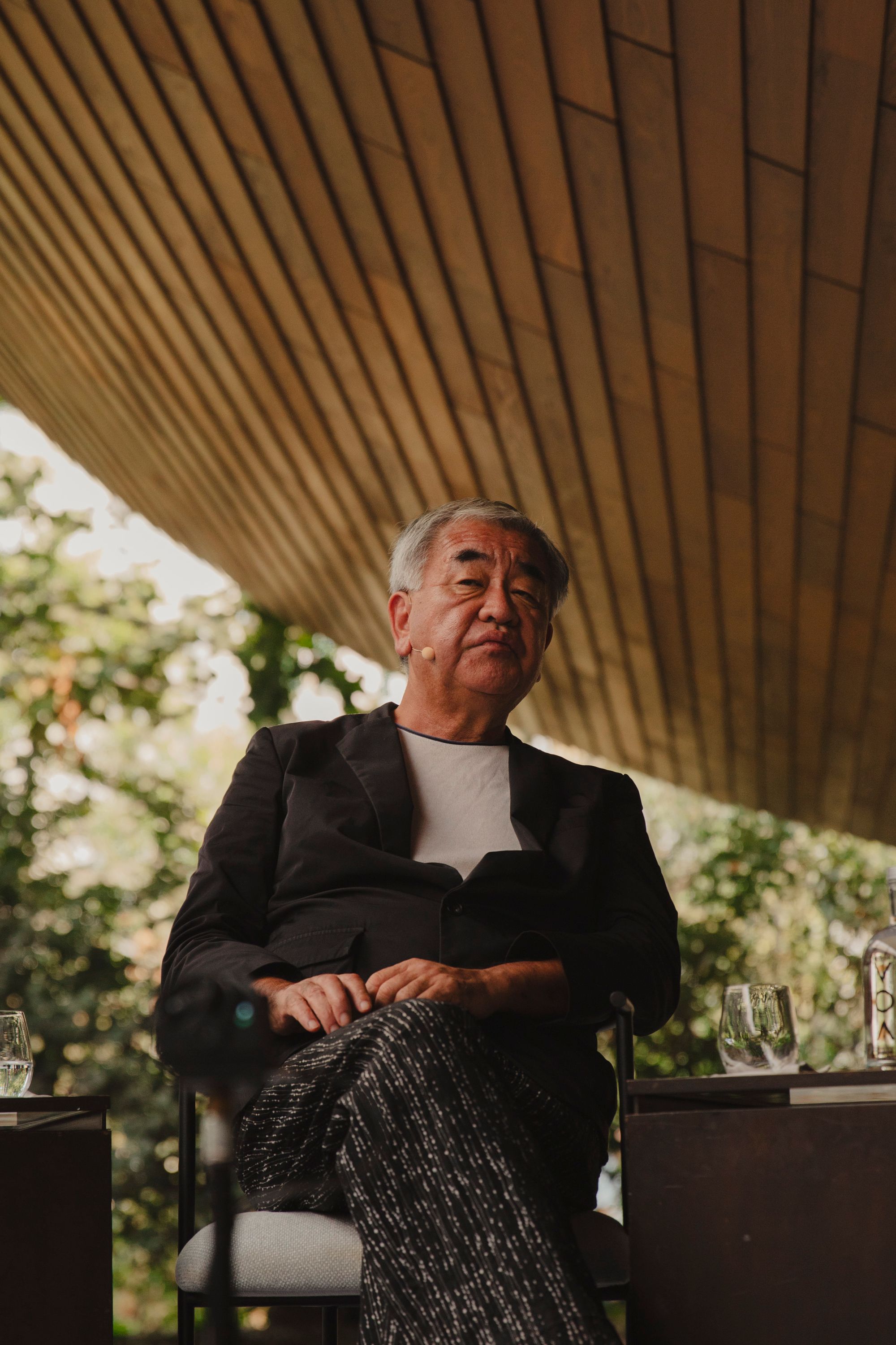
Kengo Kuma at the CAM Gulbenkian. Photo © Joanna Correia.
At its core, Kuma’s new design for CAM is about opening space. He knocked down a nearly 15-foot wall on the campus’ southern edge and replaced it with a low gate, allowing neighbors and passersby to see into the garden. Working with landscape designer Vladimir Djurovic, the team converted the garden, which had become overgrown with invasive species, into one with more open space and entirely native plants. Swooping from the museum’s roof and cutting at a 90-degree edge, a canopy emerges and appears to hover in the air. The symbolic engawa space under the canopy offers a panoramic view of the gardens and will serve as a social space for events and live arts. Constructed with Portuguese dehydrated ash wood and ceramic tiles made by local craftsmen painted in three shades of white, the canopy responds to the surrounding nature. When it’s sunny, the tiles reflect brilliantly. When it rains, water cascades into a stone path at the canopy’s base, transforming it into a stream that will flow into the campus pond and feed the irrigation system, an aesthetic and functional dialogue with nature.
During the bustle of the museum’s re-opening weekend at the end of September, which included a performance by artist Jota Mombaça, a solo exhibition by Leonor Antunes, a film program, a program of exhibitions and events focused on Japanese culture, among other things, I found a quiet moment to speak with Kuma, Topa, and Chief Project Manager Andrea Toccolini about the precious meeting point between man-made structures and the natural world, shared design affinities between Japan and Portugal, and how food plays a role in their design process.
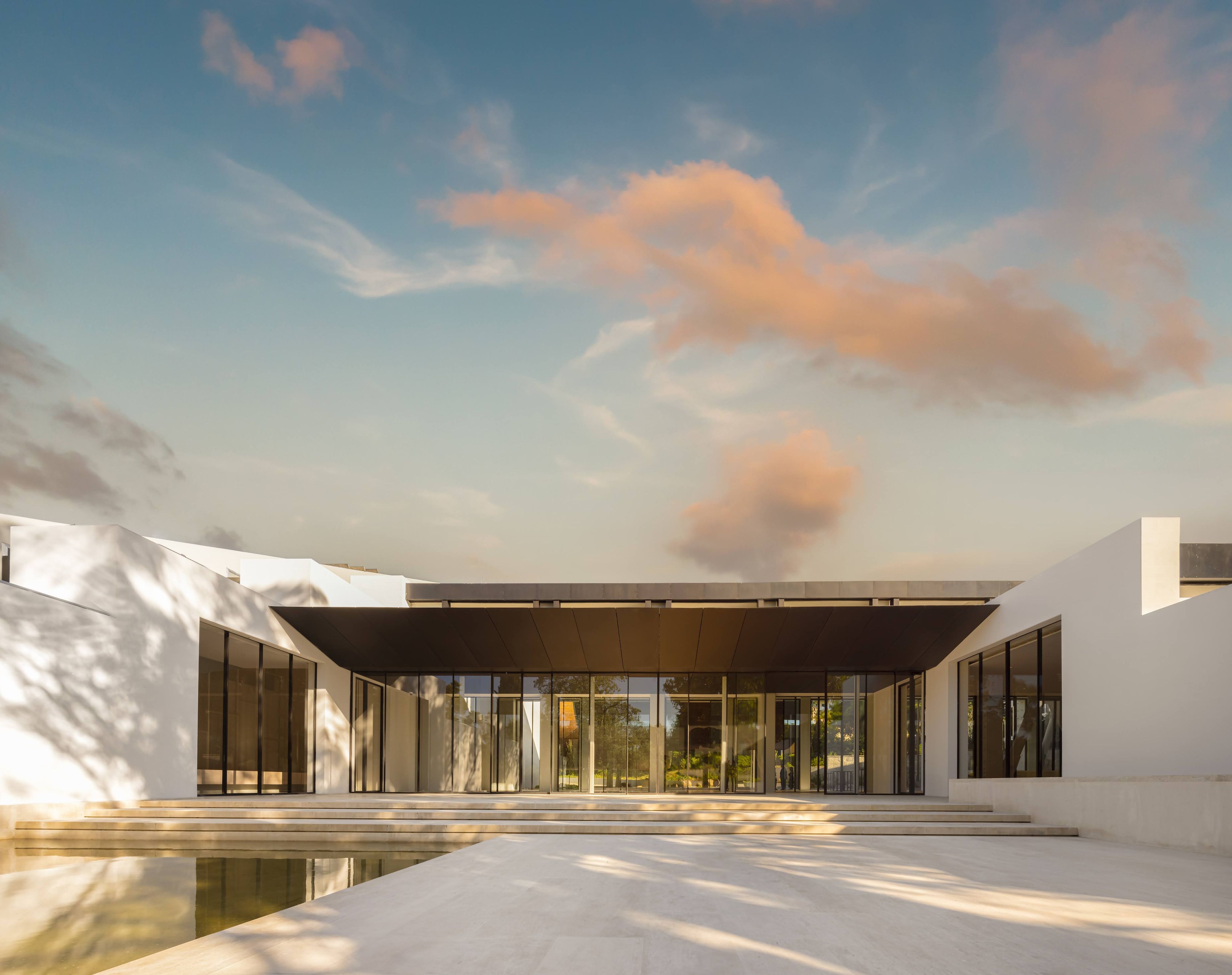
Kengo Kuma and Associates’ 2024 redesign and extension of the Centro de Arte Moderna (CAM) Gulbenkian in Lisbon. Photo by Fernando Guerra, Canon Ambassador.
Samantha Ozer: Your projects are noted for incorporating Japanese design principles with local materials and techniques. As this is your first building realized in Portugal, did this specific setting change your research process?
Kengo Kuma: We have wanted to do a project in Portugal for a long time. I was also very much interested in Portuguese culture, which I feel sympathetic towards. The food in Portugal is amazing [smiles and chuckles] — that is always an important point for us.Food and architecture have some common methods of how to treat nature — bringing nature to us is the basis of cooking and architectural design. When we found out about the competition and visited the site, I was very impressed by the beauty of the gardens. We began to think that the protagonist of the project should be the gardens and not architectural design. And so, we tried to create a kind of engawa space. Engawa space is in-between space — between garden and building. By creating this space, we can connect nature and human, nature and man-made spaces. This is the most important theme for architecture of the future, and that’s the basis of our design.
You’ve designed many museums before. At CAM, featuring the engawa space rather than offering more traditional gallery spaces could suggest you have specific thoughts on how a museum can approach its programming and what it needs from architecture, potentially a different approach than museums you’ve designed in the past, such as the V&A Dundee. I know that the curatorial team shared their desire for more live programming; for you, what is the role of museums today?
KK: The goal for every museum project of ours is to create a whole experience, and an experience in how to approach the building. For example, with the Dundee project, the building has a hole between the two blocks. People can walk along the hole. It’s a kind of a cave-like space. People can see the river from the cave. That kind of experience is a starting point for the Dundee experience. Then, the interior of the museum is, of course, important — we should create some dialogue between art and us, and with the buildings, we should create a dialogue between nature and us. The engawa space here might look non-functional, but many kinds of dialogue will happen there.
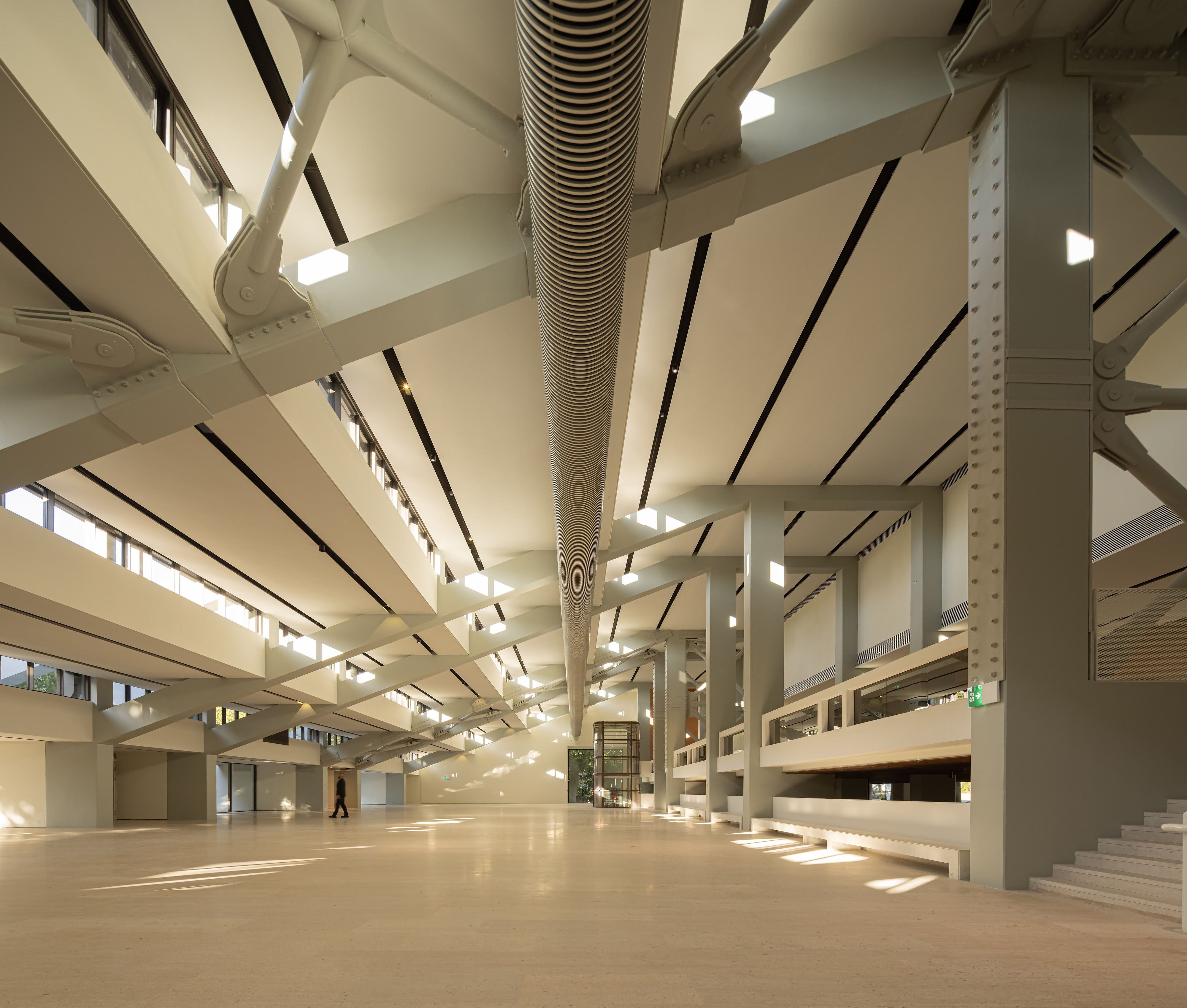
Inside of the CAM Gulbenkian. Photo by Fernando Guerra, Canon Ambassador.
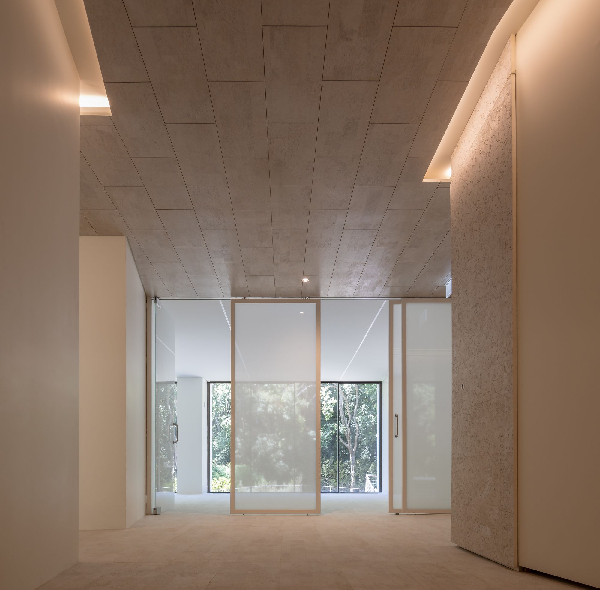
Inside of the CAM Gulbenkian. Photo by Fernando Guerra, Canon Ambassador.
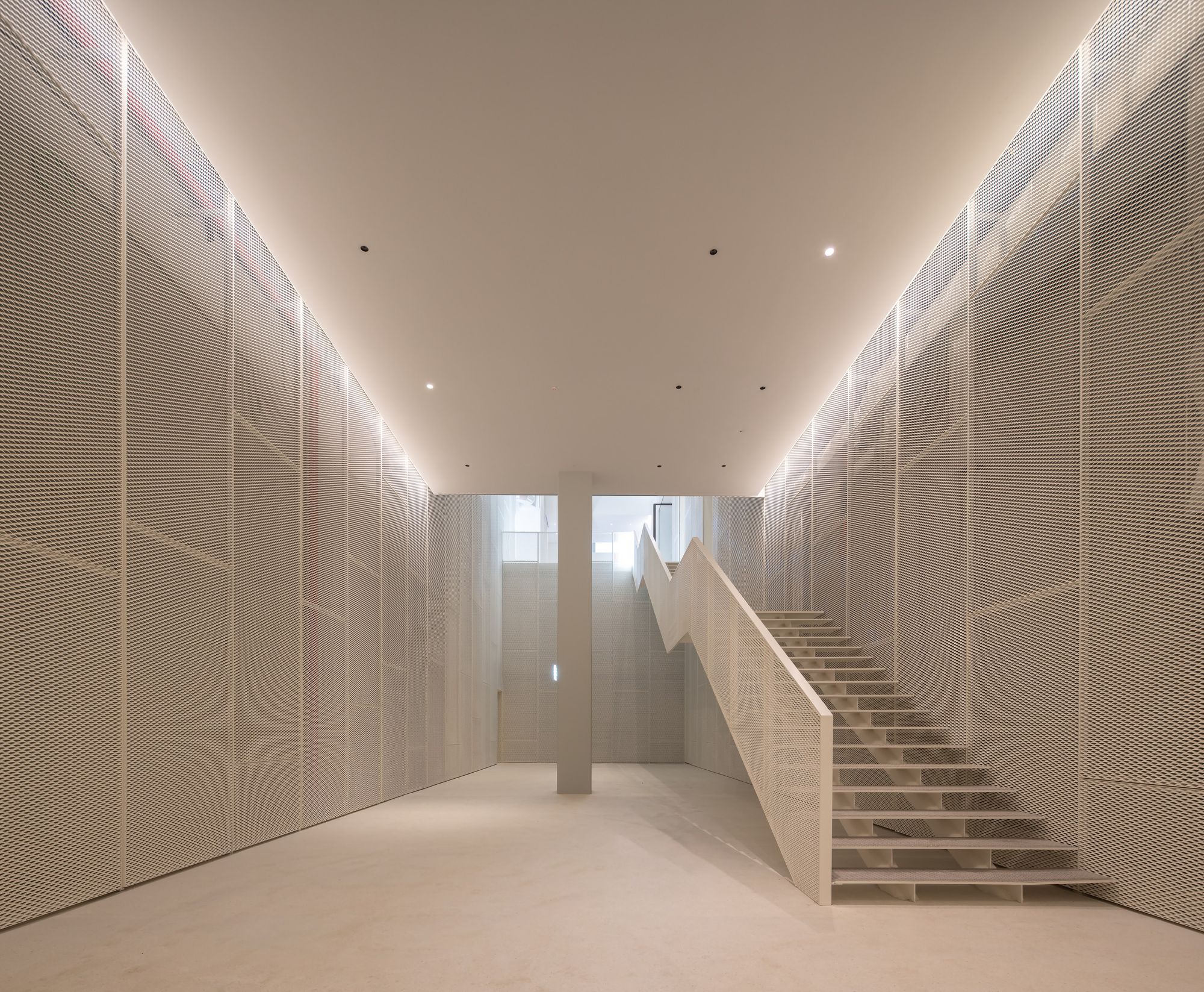
Inside of the CAM Gulbenkian. Photo by Fernando Guerra, Canon Ambassador.
Rita shared with me yesterday that you reintroduced more native species into what was formerly a romantic garden, and that there are more spaces for rest and shadows. Can you walk me through the garden?
KK: Walking through the gardens is an integral part of the museum experience. It should not be a separate thing. Natural, reflective spaces are important for us. We worked with Vladimir [Djurovic] on the garden, and his philosophy for the garden totally matched our philosophy for the museum. The engawa space as this central point and the garden have a common philosophy of the void. Void is important for the solid volume.
When you think about the idea of the void, is it a process of editing? Are you creating a void by stripping away solid volumes later in the design process? Or, from the very beginning, do you have the idea of a void that you are building around? Is it an approach of removal or of addition?
KK: To create a void is not a starting point. In the design process, we found the solution to have the void. And, always, as a process, something naturally came to us, and it was this void. That kind of idea comes from heaven [Laughs]...
Can you speak more about design affinities between Portugal and Japan? There is a notable history between the two, as Portugal was the first European country to arrive in Japan in the 1500s.
KK: When I came to Portugal, I found the beauty of the ceramic tiles on the buildings. The white and blue ceramics are beautiful. They remind me of some Japanese ceramics. Portugal and Japan have a long history of exchange. When the first Portuguese ship came to Japan, it brought new technologies and some food. Do you know tempura? This came from Portugal.
Rita Topa: But they [the Japanese] made it better.
KK: And some cakes — many things came to Japan from Portugal, including ceramics. There was a back-and-forth relationship between Japan and Portugal in terms of design techniques. I feel a sense of nostalgia towards Portugal and the Portuguese. Ceramic tile is good for the garden and engawa architecture. Some of the engawa space should be made of some natural materials like wood because it is between nature and man-made things. Ceramic is created by the soil of the land, which makes it another natural material that bridges nature and the artificial.
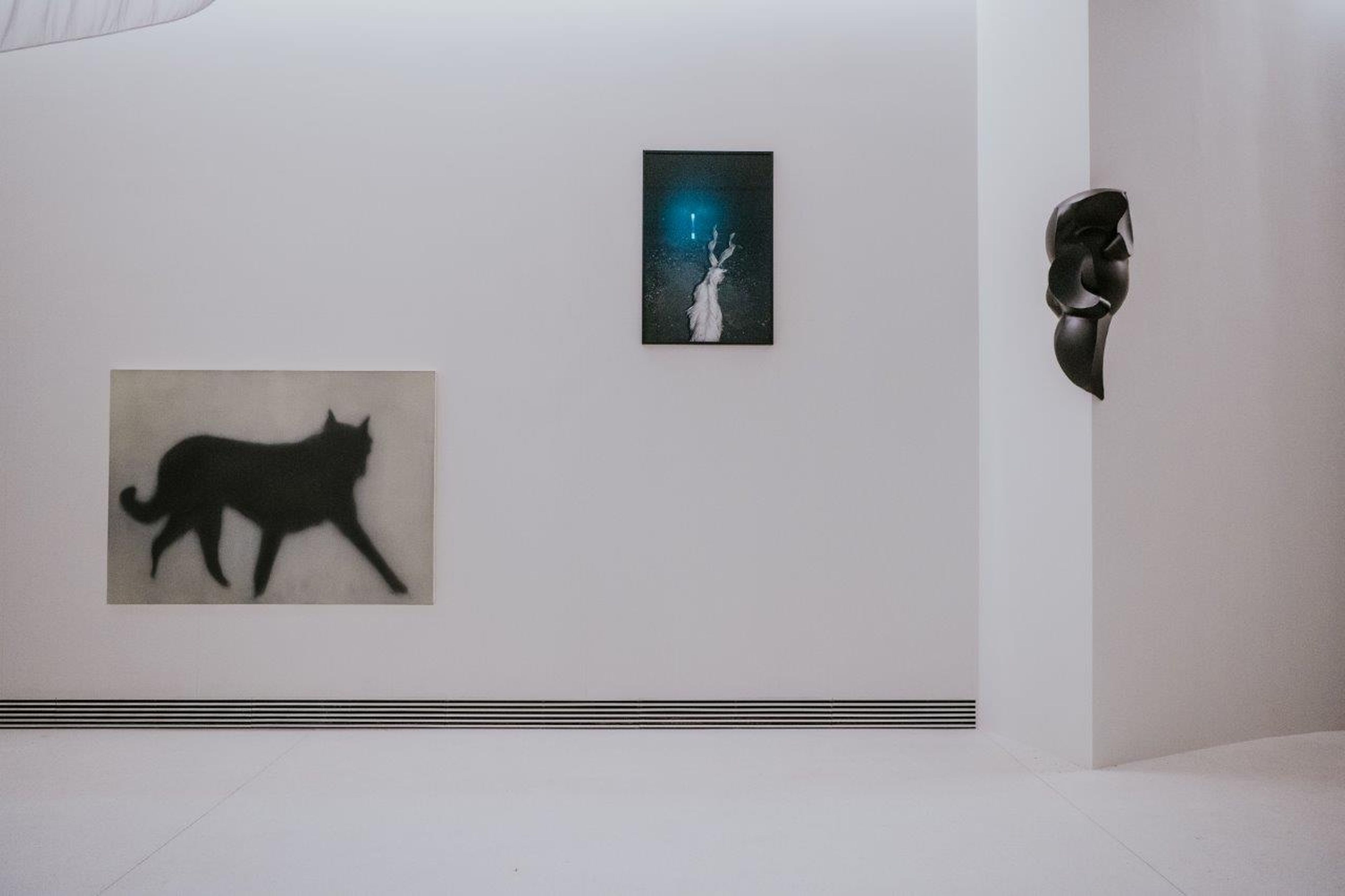
Ana Jotta, Firmeza I, 1989, bronze. Photo by Pedro Pina / CGF.
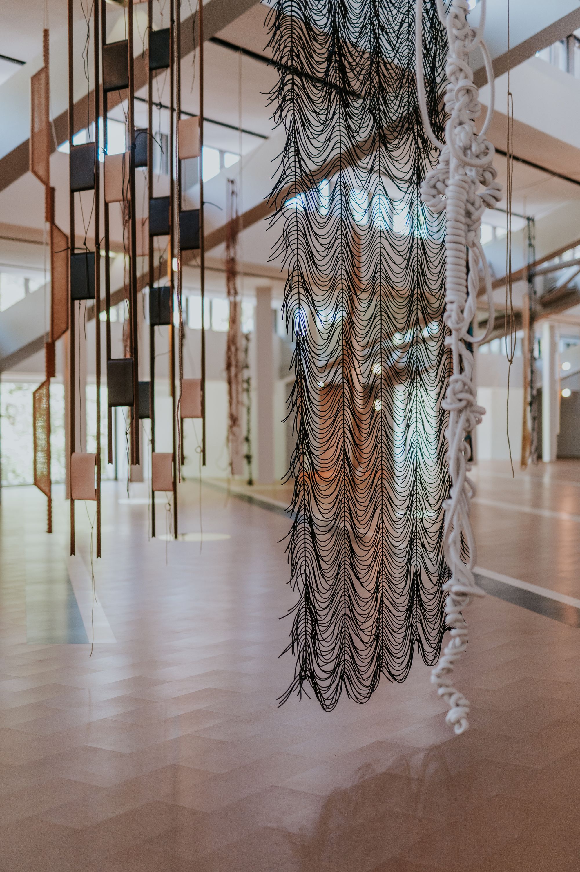
Exhibition view of Leonor Antunes at the CAM Gulbenkian. Photo by Pedro Pina / CGF.
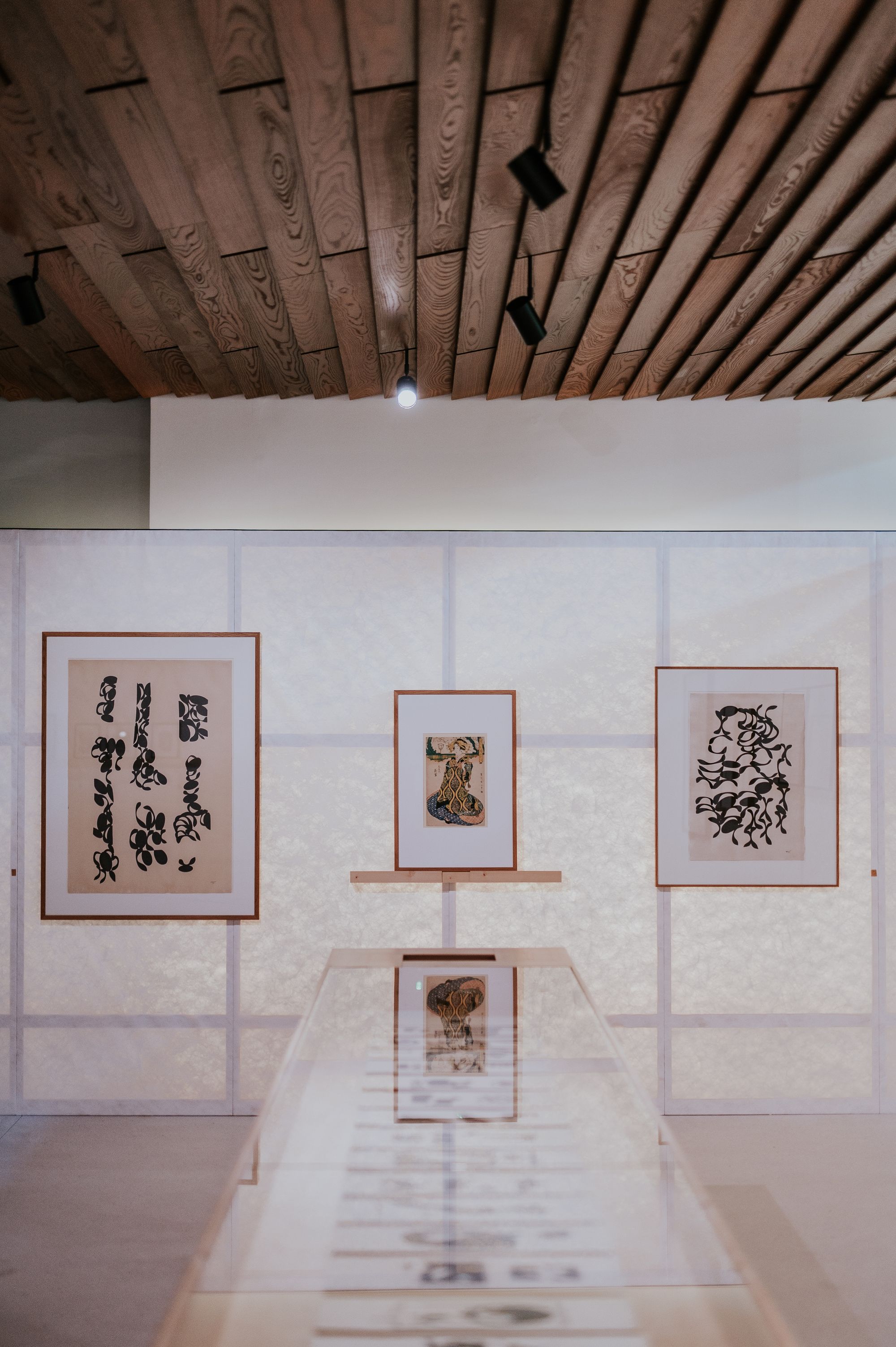
Exhibition view of Fernando Lemos at the CAM Gulbenkian. Photo by Pedro Pina / CGF.
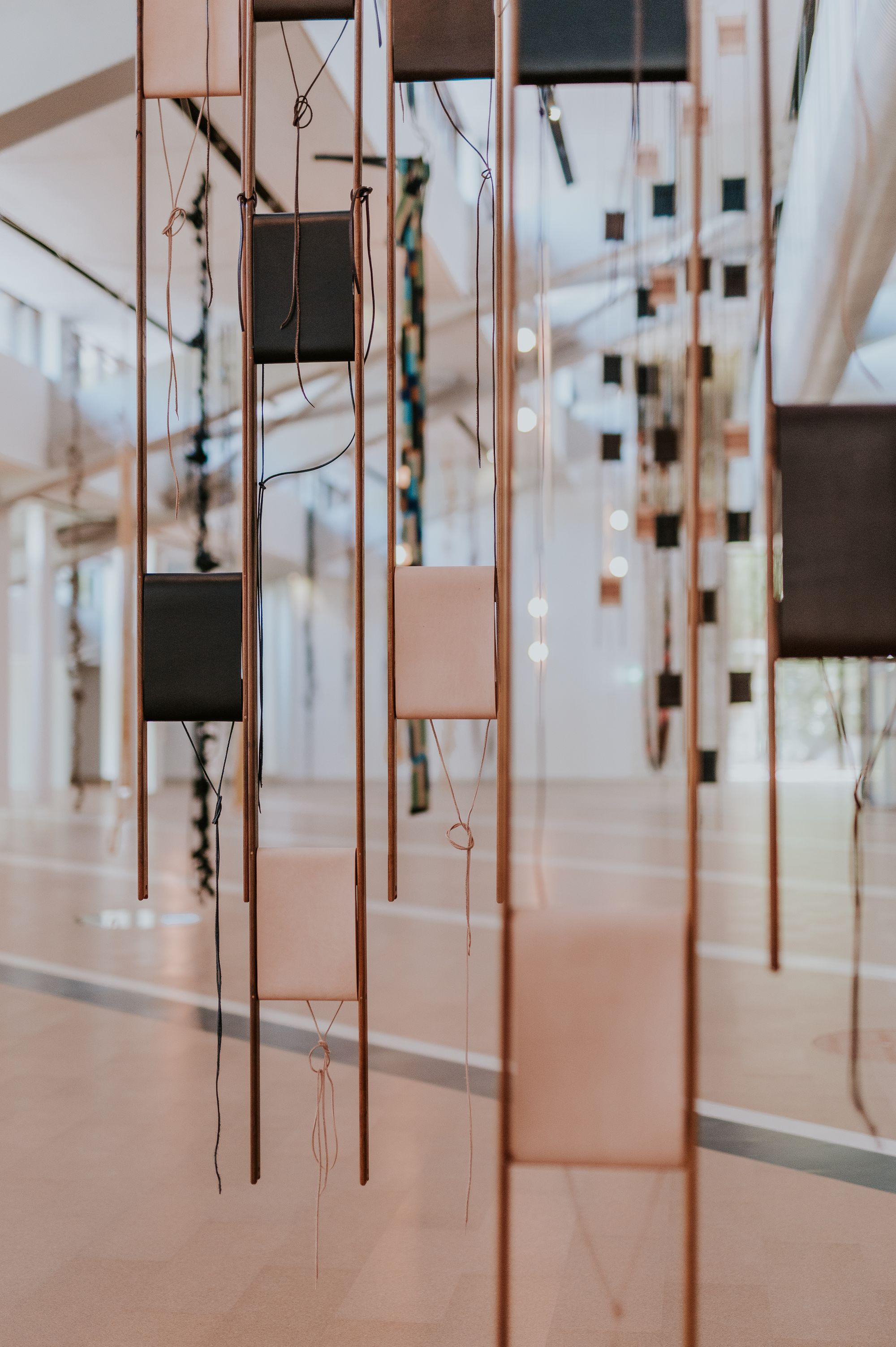
Exhibition view of Leonor Antunes at the CAM Gulbenkian. Photo by Pedro Pina / CGF.
I was excited when I learned about the idea of the stream — of how the canopy will channel water into a stone path that will carry it into the irrigation system on the Gulbenkian campus. You’ve also designed a glass entrance for the museum so visitors can see into another garden on the other side of the campus.
KK: We try to create the connection.Before, the museum was a beautiful building and garden, and we tried to integrate those things as a sequence. The sequence is most important in a museum. Art pieces should be part of the sequence. That is our idea.
Did you speak with any artists? I read that you were really pleased with the V&A Dundee project because the community had such a pleasurable response to it. Some of the curators I spoke with shared that they were meeting with the community to get feedback on decisions such as removing the southern wall.
RT: We worked a lot with the curators. I spoke with the people that come in, that are going to work here. That was a big part of the process for us.
KK: The exhibition today, with Leonor Antunes, really reminds me of the garden, of all of the elements — things that hang from the trees, very natural, ambiguous forms.
There’s a nice conversation between her work and what’s happening in the garden. It’s a holistic idea coming together across all of the spaces. This idea of spaces for reflection and the importance of food is interesting in terms of the new cafe, where you designed the tables, these almost honeycomb-like structures that can be put together in different sizes and pairings.
Andrea Toccolini: We designed all of the furniture in the restaurant and also here [in one of the office rooms]. We designed almost everything.
RT: The museum wanted us to be part of the entire process. As much as we could.
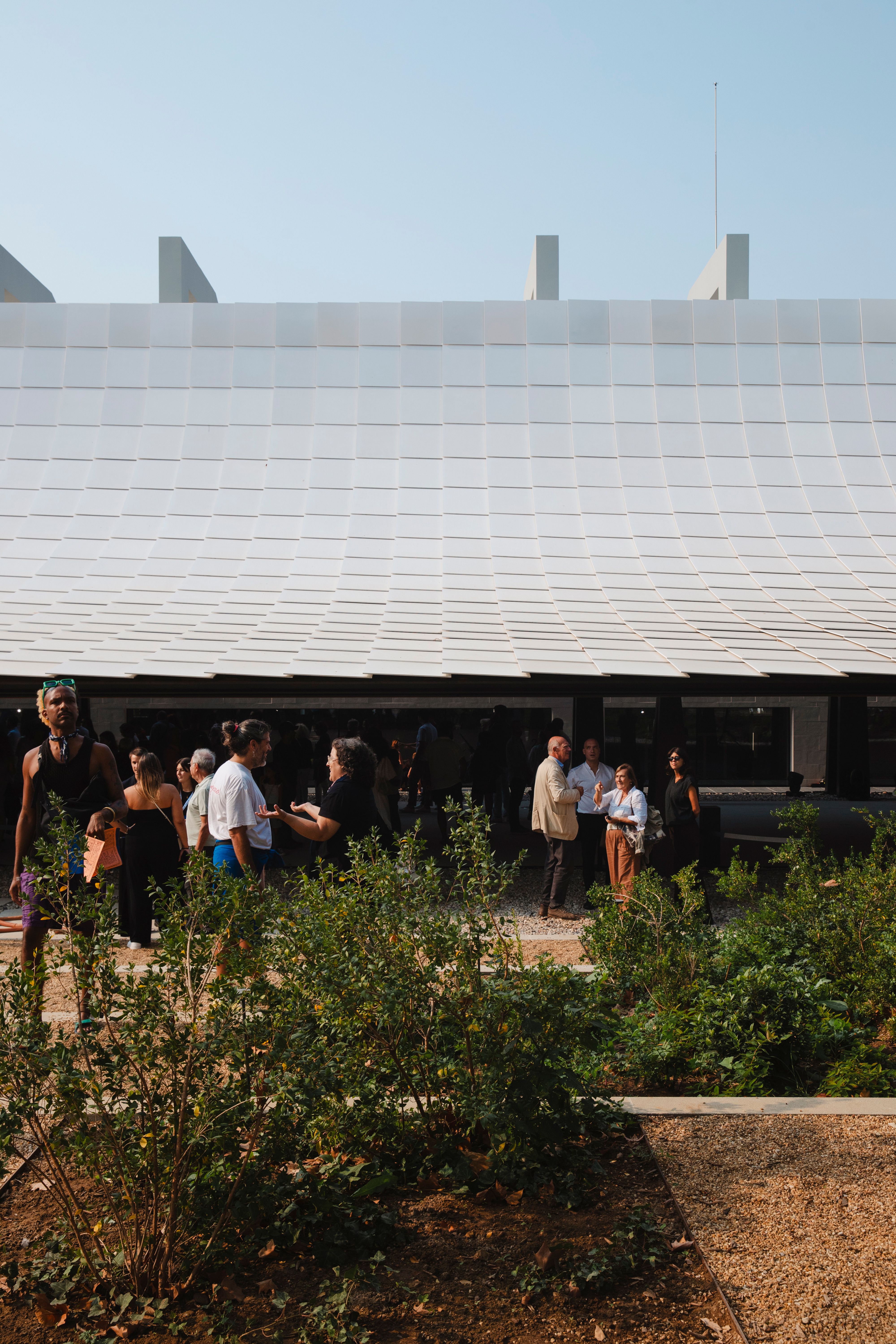
The parametric roof of the CAM Gulbenkian. Photo © Joanna Correia.
From a technology perspective, as your process is materials-driven, I’m curious if there have been any new developments in techniques or strategies that emerged over the last few years for the construction of this project?
RT: We had a very interesting experience on the roof in the engawa space. The tiles are made by craftsmen, and almost all of them are slightly different.
KK: The technique of fixing the tile to the roof is very unique. It is like a fish scale, which is a very traditional way of tiling roofs of Japanese buildings. This fish scale method allows for adjustment because it can be slidable. Most modern joints are not like this.
RT: It’s true that the roof can still be adjustable, but under the tiles, the roof is parametric. So, it’s a combination of traditional technique with high technology.
By adjustable, do you mean that if something breaks or there is an issue, you can replace a specific section without affecting the integrity of the entire roof? It seems the longevity of the building would be accounted for through this approach. The design allows for change and reactivity.
RT: Yes. In the end, any building or house is a living organism, and because we really want to have this connection with nature, maintenance is also very important. With the roof tiles, we needed to be able to remove one piece without damaging all the others or independently. We spent many hours coordinating this.
And the color was always going to be white?
AT: It’s not really white. It is made from three kinds of off-whites.
RT: We did some material tests to see how these colors would react with nature, the colors, and the shadows. We like this idea that you can come to the garden and depending on the sun, each day will be slightly different and the roof will also reflect the light differently.is also very beautiful on rainy days.
KK: We try to create a shadow, so on sunny days, there is a contrast between the shadow and bright light. It’s strong.
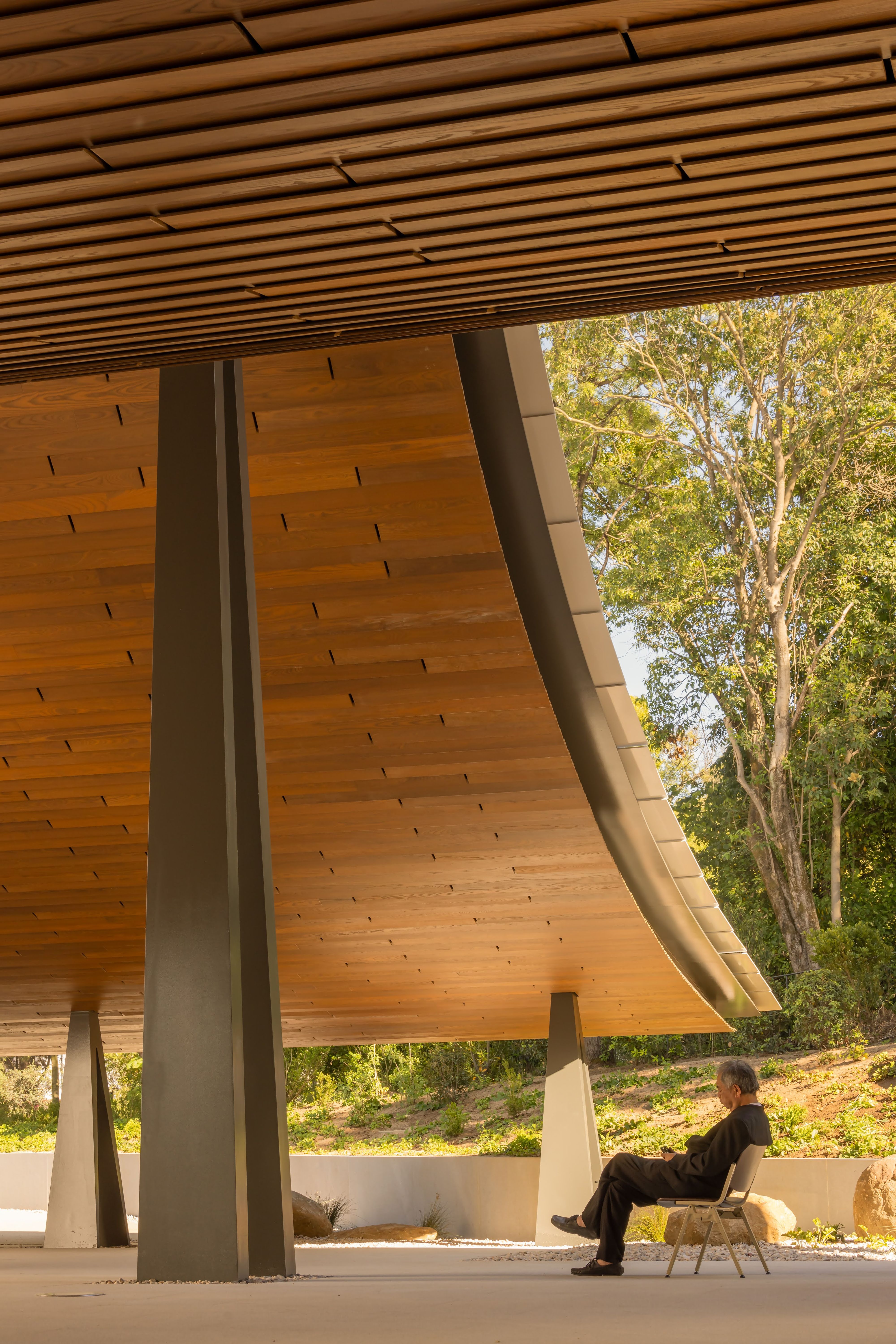
Kengo Kuma sits in the engawa space of the CAM Gulbenkian. Photo by Fernando Guerra, Canon Ambassador.