
Julio Torres photographed by Caroline Tompkins for PIN–UP.

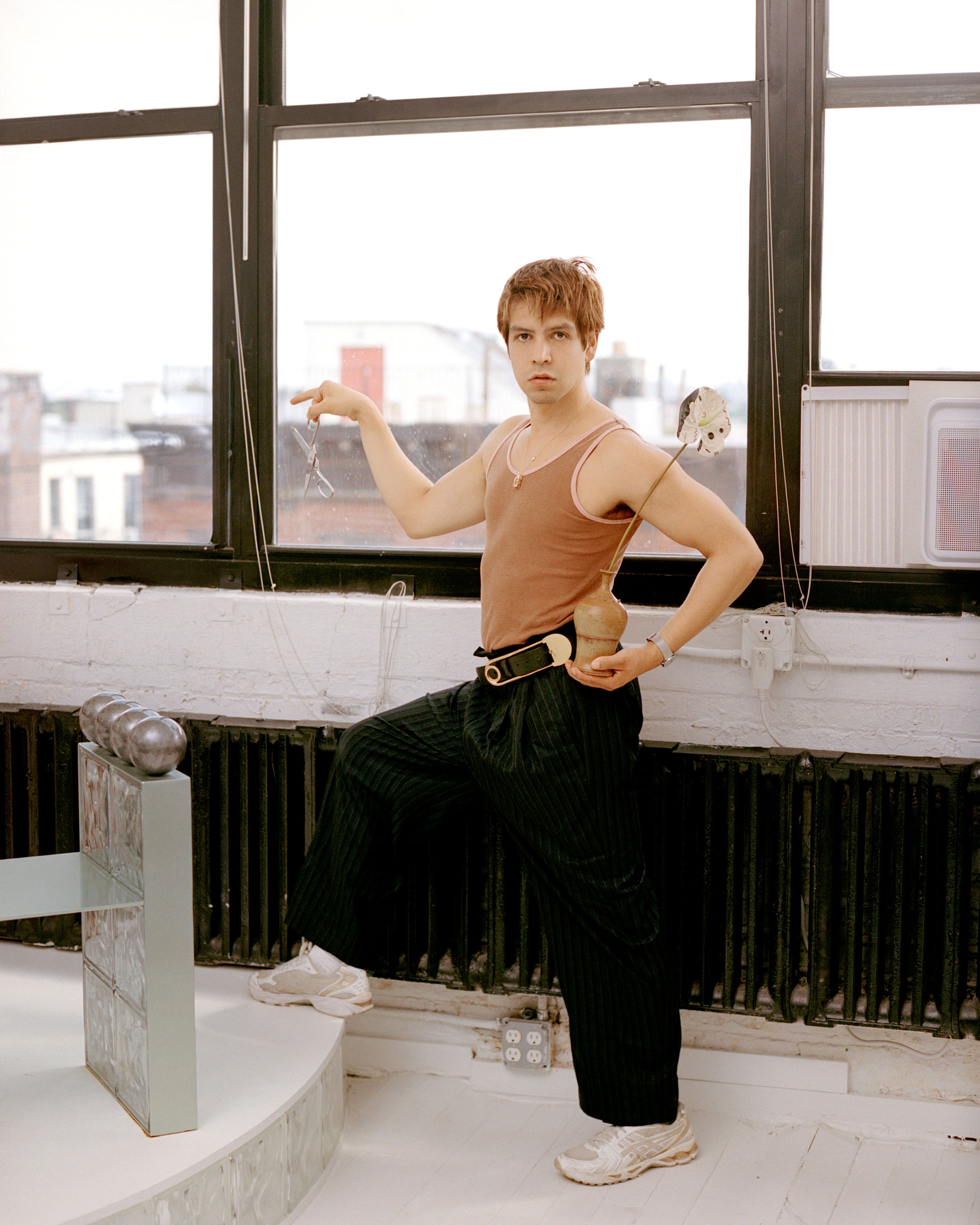
Julio Torres in his Brooklyn office photographed by Caroline Tompkins for PIN–UP.
One day, Julio Torres might design a plunger, a toilet brush, or workout equipment. But before his official foray into the realm of functional objects, the writer-comedian has already grown into a designer-of-sorts. From a well for sensitive boys to whisper secrets into (envisioned for Saturday Night Live) to a cohort of “favorite shapes” delivered on a gleaming conveyer belt for his first comedy special, Torres’s deftly-crafted, narrative-infused objects have consistently announced his distinctive brand of comedy. His directorial and feature film debut Problemista and his HBO series Fantasmas, both released within the past year, build upon this creative language with increasingly complex on-screen environments.
The sets and production design of Torres’s latest projects, like the objects that came before, are far from accessories or backgrounds. Ranging from otherworldly reveries to uncanny distillations of all-too-familiar environments (think urgent care clinics or abstracted assemblages of drop-ceiling office cubicles), sets in Torres’s projects are psychic foils for characters and their entanglements with unwieldy external systems. Torres’s penchant for shaping these sprawling gesamtkunstwerks draws upon the formative influence of his architect mother, who he has collaborated with, alongside his sister, across many of his projects, including the set for My Favorite Shapes and a fantastical play structure central to Problemista. I met Torres in his Brooklyn office to discuss imperfect spaces, design references, and collaborating with family.

Julio Torres photographed by Caroline Tompkins for PIN–UP.
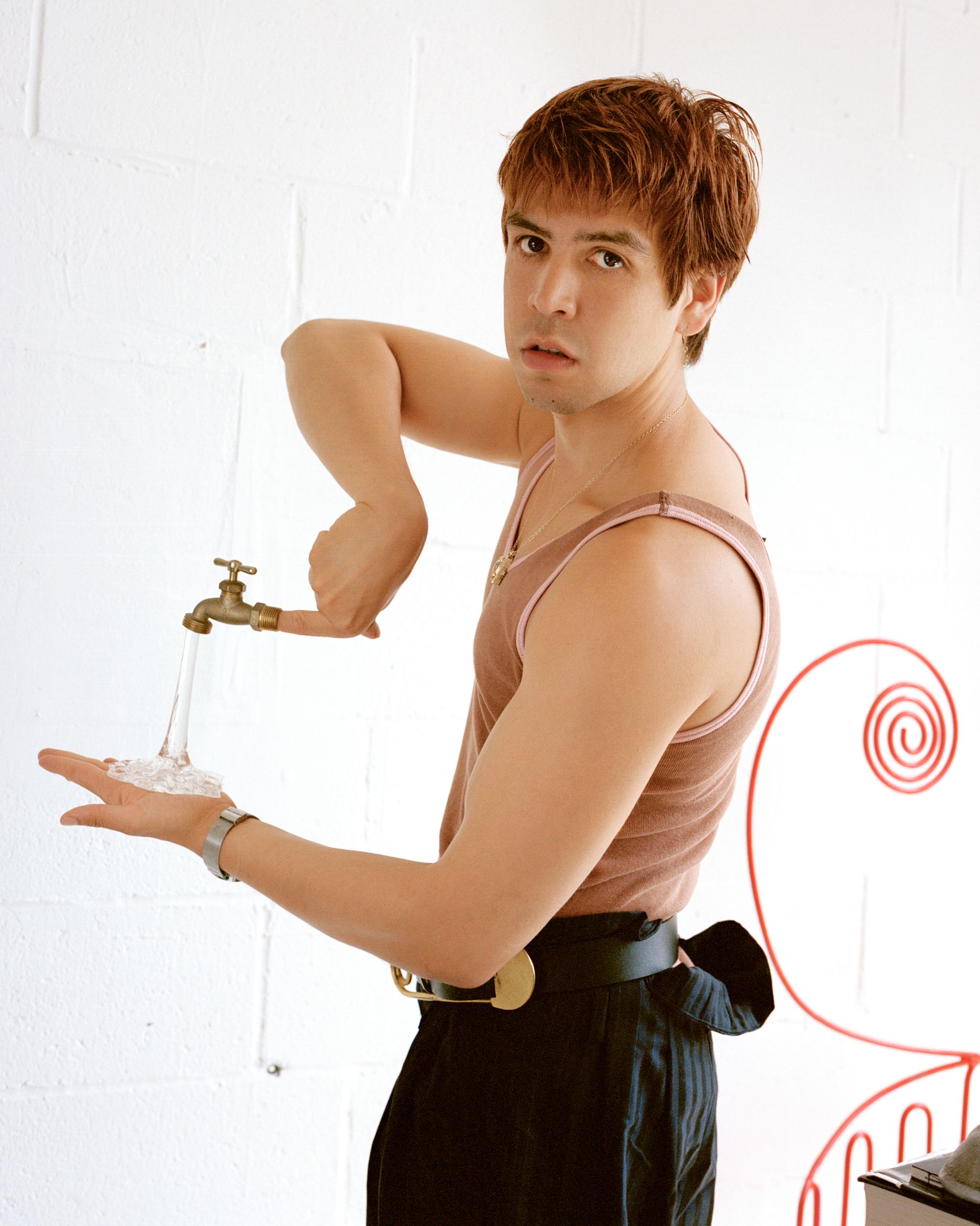
Julio Torres photographed by Caroline Tompkins for PIN–UP.
Ryan Treat Miller: We’re sitting in your office, a loft-like space filled with reference materials, props and models from past projects, and Memphis-adjacent furniture. I’m wondering if you could just tell me a little bit about how this space came to be and how it intersects with your process.
Julio Torres: I have had this space for maybe three years. It’s interesting because having a space feels like it legitimizes your work. I wanted to have a place to be able to collaborate with peers, host photoshoots, or take meetings, that kind of thing. I was hoping to make it feel modern, a little cold and sleek — kind of sexy. I’m a little allergic to perfection, so I don’t mind that I have a dead plant. I love mess. I grew up in a home that was both very designed and very imperfect… and I love that. I don’t like actors that don’t have a hair out of place. I also don’t like interiors that don’t have a sense of self. So, I love interiors that understand themselves very well — ones that are 80 to 75% successful.
How often does the space change?
It hasn’t changed much other than adding things that I don’t need that I don’t want to throw out. I’m interested in a deliberate but imperfect space because imperfection leaves the door open for possibilities. I don’t like things that feel perfectly complete or perfectly round.
I’ve always been struck by the visual identity and aesthetic of your projects. When I found out that your mom is an architect, designer, and collaborator, it made me newly curious about how these sensibilities found their way into your work. I was really moved by the figure of the artist-mother in Problemista and the sense of this kind of creative inheritance and bond. How has your mom’s work impacted you?
She is how I fell in love with creating — with creating as a love language, almost. When I was growing up, we would make little dollhouses and she would make the model out of cardboard. At the time she was a fashion designer, and I would see her design clothes. It was almost as if she had an allergy to buying clothes at the store. There was something kind of crass about that in my household. Our space was very designed — everything mattered, down to the inch. Our first home was quite small, and she loved finding solutions to little problems. And that’s very much in the spirit of the movie and her character in it. I consult her on most visual decisions that I make. She’s looped into so much of it. She and my sister designed the set for My Favorite Shapes, and she designed the little playhouse thing for Problemista. It was nice to have her signature through these. Since I was a child, I thought I was going to have a career that was visual. And then at some point, I fell in love with writing and wanted to write movies and TV. It felt like I had maybe let go of the visual part of me. But I always was very particular with clothes and interiors and things like that on the side, and then my writing started becoming very visual. Now that I’m directing, it’s a nice marriage.
What’s it like collaborating with family?
I have learned the importance of holding on to people who understand you and relying on their feedback, but at the same time allowing them to put their own twist on it. They also need to feel like there’s a part of them in it.
I feel like architects and designers have very unique pilgrimages, talismans, and fetishes of sorts. Is there something or somewhere that your family brought you into contact with that’s stuck with you?
I think with my mom it was always fabric stores, wherever you can buy supplies, or wholesale places — that kind of environment. Feeling at home and loving a plastic store, or a store that sells different kinds of vinyl. Even when I just moved to New York, I would go to Canal Plastics just because. I have no business doing anything there, but that place just sort of feeds me because it’s not complete. It’s giving you the pieces to go make something. It offers possibility.
Are there certain designers that interest you or that you find yourself coming back to, furniture or otherwise?
I feel like because of my mom’s aesthetic, my compass is never too far from Memphis. And you know, everyone’s doing Postmodernism right now. But it definitely feels like I gravitate towards cleaner, playful lines, and if there’s something Baroque or ornate in the mix, it’s there to make fun of it. The idea of having curtains is mortifying. Too much fabric and I feel suffocated.
The set and the production design of Fantasmas has a bit of a noirish and Expressionist feel. It made me think of everything from Blade Runner to The Cabinet of Dr. Caligari.
German Expressionism, for some reason, has captured my imagination for a long time. And I have a fondness for it because it’s both scary and a little playful. And then the mess and chaos of New York is layered on top of it. And just chords and wires. I love chords. I love trash. The subway paintings of George Tooker were a reference point for both Problemista and definitely for Fantasmas.
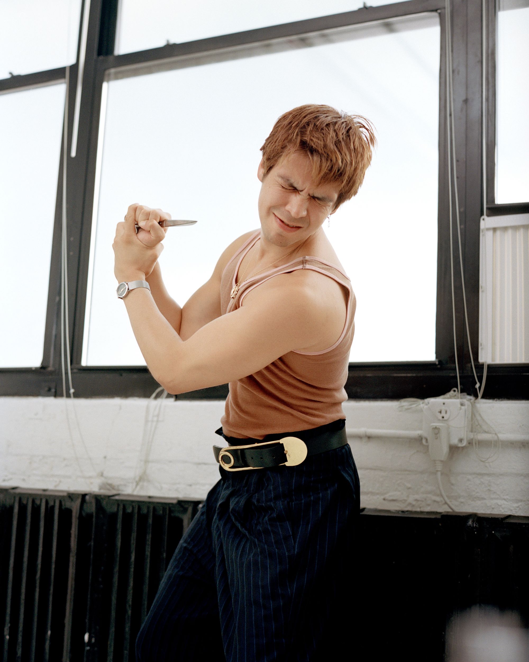
Julio Torres photographed by Caroline Tompkins for PIN–UP.
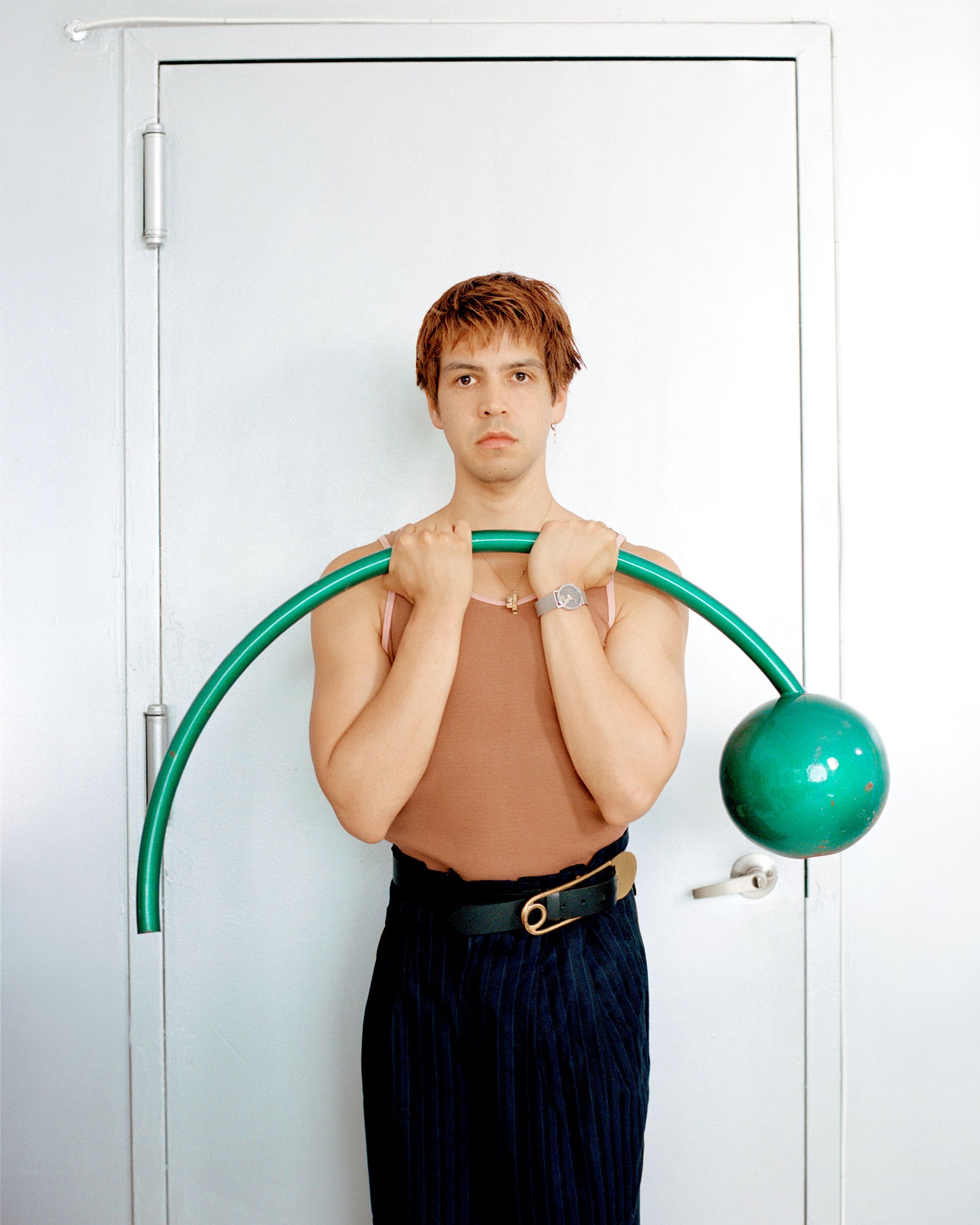
Julio Torres photographed by Caroline Tompkins for PIN–UP.
Problemista and Fantasmas play with distorting mundane environments ever-so-slightly so that they become uncanny. I was particularly amused when Alexa Demie’s character in Fantasmas reaches through a hole cut into her office cubicle wall made specifically to access a Purell dispenser on the other side.
Yes. Characters engage with sets in a way that makes them more than just a backdrop. That set was about amping up the volume of what it feels like to be in a dreary office. The walls are actually made from that horrible ceiling material, and there’s vents everywhere. Freezecorp in Problemista — at first I had written it as a Brutalist interior, but then I thought you need to see those scenes and doubt — highly doubt — that this service actually works. So we modeled it after an eyebrow threading place. They’re not dermatologists, they’re aestheticians. I love environments like that. I really love the urgent care in Fantasmas because it just exaggerates what it feels like to be in those environments. So I was like, “We need so many signs. We need so many signs and we need to layer decorations for every holiday, like just layer them on top of each other.” So we have these layers of Halloween, Easter, Christmas, because that’s what those spaces feel like.
Going back to the Expressionist element, I feel like Fantasmas really highlights the dystopian elements of the world we’re living in at the moment, especially in New York. How did you want to express through the set? And if Fantasmas is leaning into dystopia, are you attracted to exploring a more utopian element in another work?
I think with Fantasmas, I wanted to express that the characters’ lives are ruled by systems and bureaucracy. We live in a world with so many companies that are subcontracting from other companies. And you need a password for everything. It’s sort of the experience of like, okay, I did this one-off gig with this thing and they want to give me $50 for it, which is nice. But now they want me to download this app so I can upload my W2 which is different from all the others. And then they’re like, “Okay, we’ll have to reset your account.” That is what I feel like the sets of Fantasmas feel like, — a little bit like they’re their own headaches and they’re not talking to each other — those sets aren’t really communing with each other. They’re surrounded by darkness. And in a way that feels very true. It’s not dystopian to me, but rather an expression of what it feels like to live in New York today. And then in terms of utopias, I have a fantasy of doing something with fairies. Like a FernGully or a Thumbelina sort of thing.
Either from your experience or from collaborators — what does it feel like to be in your sets? They often play with perspective, scale, and exaggerated geometries, so I’m curious what it's like to inhabit them or be in proximity to them.
I think that people tend to be charmed because they’re a departure from perfect sets or green screens. Something that I love to do is building characters and being very specific with their sets, because they communicate a lot about the people supposedly inhabiting them. I think Alejandro’s apartment in Problemista is very specific to the period of life that he’s in. I was like, no, you need to be able to see a shit ton of shoes and a blue IKEA bag and IKEA furniture.
Are there particular places in New York that really nourish you? At first, I was thinking in a more positive or generative way, but you know, an urgent care could be the case — these kind of strange liminal spaces.
I love liminal spaces. I love anxiety-inducing spaces, or ones that are sad, and then because they’re so sad, they become sort of funny. So like, an urgent care. I recently had to renew my passport. The Long Island Salvadorian Consulate, let me tell you, it fed me.
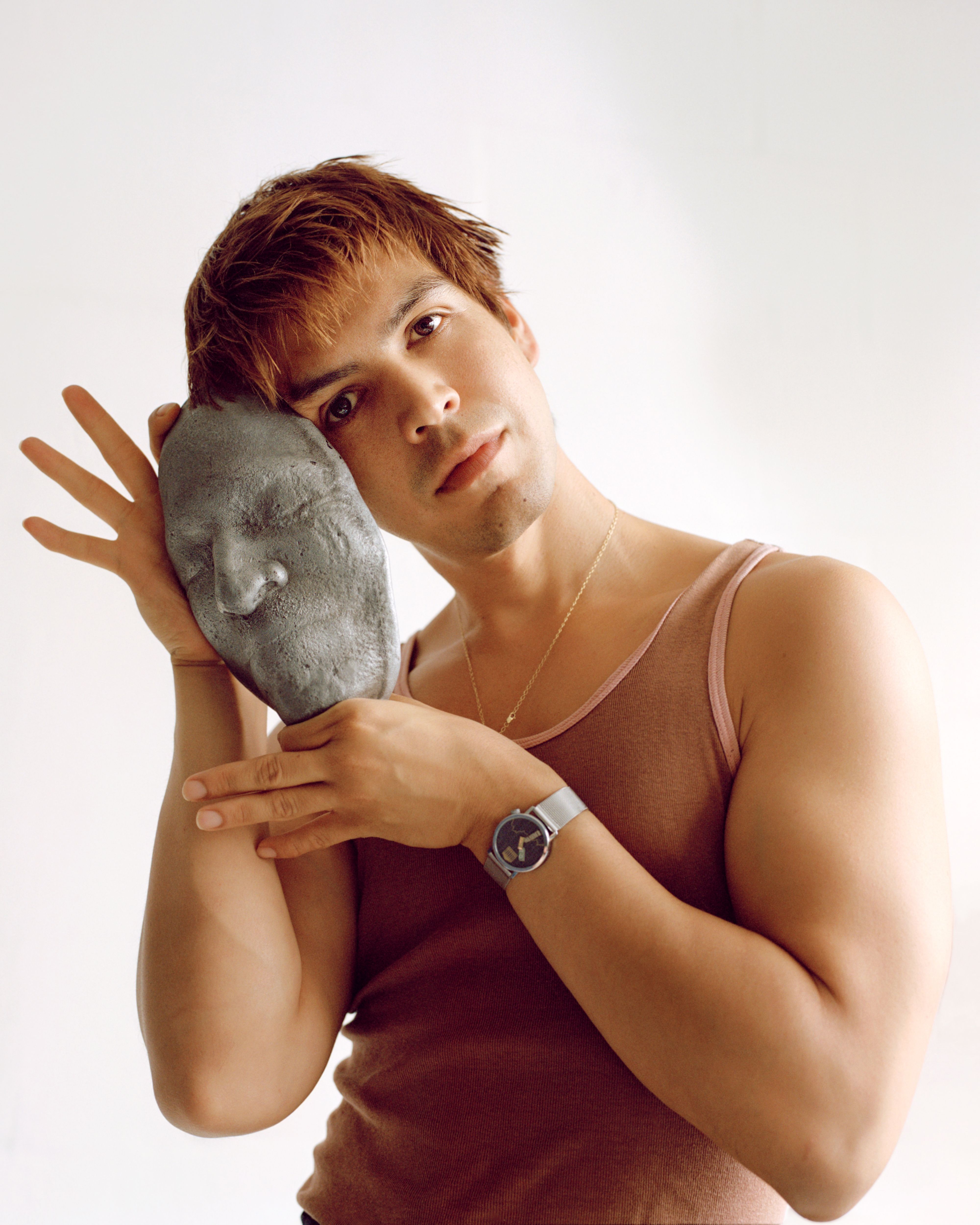
Julio Torres photographed by Caroline Tompkins for PIN–UP.
What does it look like?
It looks like someone tried really hard with its design five years ago, but no one kept up with it. There are presidential portraits that are too big, outlets that are a little askew, with signs everywhere. It looks like there was water damage at some point and they fixed it, but the paint they fixed with is slightly different from the original. It looks like it’s constantly trying to make sense of itself.
When you’re making objects or environments, do you tend to work from an image as a starting point versus an idea from your writing? With the maze in Problemista or, you know, a given favorite shape, do you usually start from drawing or descriptive language?
I’m working from feeling — trying to convey what that feeling is. [For Problemista] I understood the feeling of a bureaucratic loop that doesn’t make sense, but I didn’t know what that would look like. With Fantasmas — I don’t like to make design choices just for the sake of it — the goal is to create a sense of isolation, imperfection, and loneliness. Tommaso Ortino, that production designer, understood that very well. It was a fun challenge to feel like you’re building a world from the ground up. I have definitely had moments where I had a clear image, and just because I arbitrarily liked this image, I wanted to reverse engineer it — and it never works. It’s like my instinct with hair with actresses. It’s always like “Oh, she should have a bob.” Never have I ever actually put someone in a bob because none of the characters actually called for it. You just have to let the feeling that you’re trying to convey lead the way.
As you embrace directing and all its offshoots into sound, lighting, costumes, sets, etc., is there an element of craft or particular media that you’d like to work with more?
I’m very much a visual person. I’m completely divorced from scent; unless it’s unpleasant, I don’t care. I’m also very disconnected from taste. I’m not a foodie. I don’t seek joy via food. But I’m very visually gluttonous. I want to design objects, and design objects that normally don’t get much love, like a plunger or a toilet brush or workout equipment, these things that are usually ugly. I want to design them and make them stellar, beautiful little pieces that are also functional. That’s sort of where my mind keeps going.
Julio Torres photographed by Caroline Tompkins for PIN–UP.