CHRISTINE BINSWANGER AND KATHY HALBREICH ON HERZOG & DE MEURON’S COMMUNITY-BUILDING ART SPACES

by Felix Burrichter

Walker Art Center, Minneapolis, Minnesota, 1999-2005. Photo by Duccio Malagamba. Courtesy of Herzog & de Meuron.

Whenever an important art institution seeks to build somewhere around the world, Herzog & de Meuron is often at the top of the designer shortlist. Over the past four decades, the Basel-based architecture office, founded by Jacques Herzog and Pierre de Meuron in 1978, has built a reputation for conceptualizing spaces dedicated to the perception, presentation, and production of art. Hong Kong’s M+ museum (2021), Miami’s Pérez Art Museum (2013), San Francisco’s de Young (2005), and London’s Tate Modern (2000) are among the best-known, but they’re just the tip of the iceberg when it comes to the firm’s art-world portfolio, which spans an array of dynamic projects, from temporary installations in collaboration with artists to private collections, artists’ studios, Kunsthallen, and national museums. Together, they represent an ecology of spaces that formally and conceptually inform one another. A pivotal project for Herzog & de Meuron was the extension of the Walker Art Center in Minneapolis, planned as of 1999 and completed in 2005. Combining all the ingredients of a modern art center — adaptive reuse, urban planning, direct community exchange, an array of different art forms, a growing collection of international repute, and ambitious public programming — it was one of the first large-scale cultural projects undertaken by Herzog & de Meuron partner Christine Binswanger. For PIN–UP, she joined Kathy Halbreich, former director of the Walker and today head of the Robert Rauschenberg Foundation, to revisit the making of the art center, reflecting on the lessons they learned from that process and from each other.

The Walker Art Center is a famously progressive institution, a fact that is reflected in its programming. In the late 1990s, instead of merely adding square footage for its growing collection of Modern and contemporary art, the Walker approached Herzog & de Meuron with a brief to emphasize the community aspect of a museum in their extension project. Rather than just a sanctum of preservation for a certain museum culture, the Walker sought to be an active cultural space, one “that umbrellas the individual in a collective urgency,” as former director Kathy Halbreich puts it in her conversation with project partner-in-charge Christine Binswanger. The Walker represented an evolution for Herzog & de Meuron in their approach to art spaces, making room for more public programming (the extension included a multifunctional theater space), and carefully examining the relation between the institution and the urban fabric. Photo courtesy of Herzog & de Meuron.

Walker Art Center, Minneapolis, Minnesota. Photo by Peter Tolkien. Courtesy of Herzog & de Meuron.

Felix Burrichter: Let’s start from the beginning: How did the two of you meet?

Kathy Halbreich: Christine and I met when my colleague Richard Flood [former deputy director of the Walker] and I were making pilgrimages to a variety of architectural offices. We originally didn’t plan to go to Herzog & de Meuron because Tate Modern had just opened, and we didn’t want it to be a little Tate. So, despite our love for their work, I think they were actually the last architects we visited. But it was clear to us immediately that they were the right firm for us. There was something that stood out to Richard and me at the Basel office: a big table with large bowls of apples on them — that’s where everybody gathered. And while that sounds like a silly little aside, it was in fact the model for how we wanted the Walker to operate: as a place of convergence, gathering, and comfort, with a very high level of discourse. And so that table became, at least in my mind, the metaphor for the whole project. There were other reasons why their practice made real sense to us. The building designed for the Walker by Edward Larrabee Barnes, which opened in 1971, is very enclosed and introspective, with few windows and little natural light, and while it made for beautiful galleries, it seemed to Richard and me that it was kind of a vestigial idea of this hermetic place called a museum. Herzog & de Meuron’s real gift with transparency was a very important ingredient in the mix for us.

Christine Binswanger: In 1999 I was at a very different place in my career. I was a partner at Herzog & de Meuron, but my only built art space was a pavilion for the 1994 São Paulo Art Biennial, which was a specific display tool for artworks by Pipilotti Rist and Hannah Villiger. At first Kathy and Richard were mostly talking to Jacques and Pierre. It was a great conversation — listening to their exchanges made me really excited about what would come. You have to imagine that it wasn’t a competition — the board of the Walker really trusted Kathy and Richard, so they had the luxury of picking their architect.

For the 1994 São Paulo Biennial, Herzog & de Meuron designed a temporary pavilion for the work of two contemporary Swiss artists, Pipilotti Rist and Hannah Villiger, in which interior and exterior spaces interrelated in a variety of ways. The visitor experienced bright rectilinear spaces for Villiger’s blocks of photographs and dark dematerialized spaces for Rist’s video projections. The star shape results from the angles of the front and rear projections, on the undersides of which artwork was displayed. Drawing courtesy of Herzog & de Meuron.

The act of seeing thus found an architectural form, with the active and intentional perception required to view the works displayed on the outside being set off against the sense of passive submission on being immersed among the images within. The pavilion’s exaggerated pointiness is an example of a recurring motif in the firm’s work, from pitched roofs to triangular building shapes (see SONGEUN Art Space, p. 177). This was Swiss architect Christine Binswanger’s first project in the realm of the visual arts and that same year she was made a partner at Herzog & de Meuron — the first, alongside Harry Gugger, since the firm’s founding in 1978. Photo courtesy of Herzog & de Meuron.

KH: [Laughs.] Well, they thought we were going to come back with three options, and in fact we just came back with you. So it took a little convincing.

CB: And then the journey started. You know, Kathy and Richard are extremely articulate people. The conversations we had about the building, its plan, and the material of the extension were always embedded in a more general discussion about what these things meant to the community, to the artists, and to the staff. I began to understand the complexity of what a museum is. It’s not just about doing a good-looking piece of architecture, it’s about building community infrastructure.

KH: I don’t want to sound too prideful, but I think the Walker was a model. It was very much part of our mission to be multidisciplinary, diverse, and global. We had a community group — politicians, local activists, retired people — who were there because we believed in engaging the community to help us design this building. And at first I was worried because all they could talk about was bike racks. [Laughs.]

CB: People think architecture is just about designing buildings and then off you go. In reality, when you begin a project, you are ignorant. Every project is made to fulfill the wishes and needs of a specific group, of a particular place. The first thing you do as the architect is to learn.

Studio Rémy Zaugg, Mulhouse, France, 1995–96. The studio of the late artist Rémy Zaugg, a longtime friend of Jacques Herzog and Pierre de Meuron’s, was a unique challenge for the Swiss architects. Zaugg, who often worked on Herzog & de Meuron projects, spent a considerable part of his career dreaming up ideal spaces where art could be made, viewed, or presented (he titled a 1986 book The Art Museum of My Dreams, or A Place for Works and the Human Being). It was therefore all the more fitting that Zaugg’s atelier in Mulhouse served as a laboratory of sorts, where Herzog & de Meuron and Zaugg tested the type of simple overhead lighting they would go on to use for Tate Modern and many other art spaces thereafter. Photo courtesy of Herzog & de Meuron.

Do you think there has been an element of the Walker in every subsequent arts-related project you’ve designed?

CB: I hope so! The Walker was essentially a countermodel to Tate and MoMA: it was distinctly an art center and not a museum. Kathy and Richard pushed us to think about museums as tools for the local community more than vehicles for international exposure. Since then, we have tried to incorporate this community-building approach in every project we take on, not just art spaces.

KH: Most people come to a museum with one other person. So the institution is really a machine for exchange — it umbrellas the individual in a collective urgency. And that was something very much on our minds when we called this project “More Than a Museum.” It was more than galleries for art. I think part of the scheme’s brilliance was that circulation became a program. The traditionalists would say, “This costs this much per square foot. The price is too high for circulation.” But circulation is a program. As you go through the building, there are small areas, often with a view, where you can sit and listen to music being performed that season or ask an animated dolphin questions like “What is art?” something you might be embarrassed to ask a docent. This was
one of the first new-media projects we did. Some museums put artists’ work in the worst public places, as if it were décor. I hate seeing art by elevators. That’s why our building did not allow for any art in the circulation spaces.

Sammlung Goetz, Munich, Germany, 1989–92. Home to the private collection of Ingvild Goetz, this was a pivotal project for Herzog & de Meuron. By the early 1990s, the firm had already made a name for itself blending minimalist plasticity with material exploration. Sammlung Goetz’s simple three-story glass and wood structure not only increased attention from architecture lovers, but also cemented the firm’s reputation as a go-to practice for art institutions and collectors, who found in the Basel-based architects a partner to whom they could safely entrust their collections. (In Goetz’s case, this included works by Helmut Federle, Jannis Kounellis, Ulrich Rückriem, Bruce Nauman, and Cy Twombly.) Goetz gifted the building and her collection to the state of Bavaria in 2014. Photo courtesy of Herzog & de Meuron.

MKM Museum Küppersmhühle Extension, Duisburg, Germany, 2013–21. Long before “adaptive reuse” became an architectural buzzword, Herzog & de Meuron stunned the world with Tate Modern (London, 2000), the spectacular transformation of a former power station into one of the world’s foremost art museums. But, only a year before, they had already completed the conversion of a 19th-century grain mill for the MKM Museum Küppersmühle in Duisburg. And, just as the Tate soon outgrew its premises and commissioned a Herzog & de Meuron extension, so the Küppersmühle recently opened an addition built by the Swiss firm. Providing extra gallery space for the private institution’s impressive collection of German post-war art, the 53,000-foot structure is accessed vertically via a dramatic sculptural stair cast in brick-colored concrete. Visitors also enjoy vertiginous views into the former grain silos, which were opened up as part of the extension. Intricate brickwork on the façade echoes both Herzog & de Meuron’s first intervention at the Küppersmühle and the vocabulary of the original building from 1860. Photo by Simon Menges. Courtesy of Herzog & de Meuron.

CB: Do you still think that was the right thing to do? Because now there’s this idea that the museum should feel more like a home. Décor on the walls is part of that concept.

KH: I think we still created a domestic feeling. We had chandeliers, remember those? They were made from waste — leftover glass. The walls, the seating, the lighting, the decorative elements of the screens, the theater — it was all very decorative. A domestic feeling was very much on our mind. But it wasn’t to be decorated with art. That’s just the wrong function for a museum.

CB: I must say, I like to enter a museum and immediately see art. For example, at the Pérez Art Museum Miami, you come through the door and are immediately in the galleries. Your experience starts with seeing art. I prefer that to a lobby with a shop and a ticket desk, where you have no idea it’s a museum when you walk in. Which brings us to the comparison between the Walker and the Musée Unterlinden, which were both extensions of extremely different buildings. It was a similar task with a very different mission. At the Walker, one of the key features of the extension was the theater, to give visual and experiential prominence to this performing artform, and we chose a radically different materiality for it. The Unterlinden has first and foremost an unbelievable medieval collection, including the early 16th-century Isenheim Altarpiece, which is shown in an impressive cloister. The extension was going to house their 20th-century collection, on the other side of the street, which became the museum square. This project was about balancing urbanism, architecture, and the presentation of art from different times, and was as much a renovation as a new build. We took the existing architecture of the church and mirrored it along the canal, with more or less the same dimensions, and applied a materiality that would relate. We worked with art historian Jean-François Chevrier, and together we were even commissioned to curate and design the opening show, to use the space for the first time. It was called Agir, comtempler and covered all phases of the museum’s collections, putting human action center stage — from the depiction of it in ancient paintings to the act itself as the art, i.e. performance. The craziest possible performance artists, like Volmir Cordeiro, Jérôme Bel, and La Ribot, were programmed during the opening exhibition in the historic former public baths.

Musée Uniterlinden, Colmar, France, 2010–15. The Musée Unterlinden comprises three parts: a deconsecrated medieval convent, which is home to the 16th-century Isenheim Altarpiece (considered a masterpiece of late-medieval European art), repurposed former public baths, and a new gallery designed by Herzog & de Meuron. Photo by Ruedi Walti. Courtesy of Herzog & de Meuron.

The challenge for the architects was threefold: renovating the existing structures, building a new wing for the museum’s Modern collection, and redefining the urban context in order to create a new public space in the heart of the city of Colmar. Musée Uniterlinden, Colmar, France. Photo by Ruedi Walti. Courtesy of Herzog & de Meuron.

KH: What Christine can’t say, but I can, is that when it comes to the Modern pieces, the quality of the Unterlinden’s collection is not so good. In my mind, I saw the below-ground galleries as secondary to the Isenheim Altarpiece. I always wondered why, for Modern works of a certain scale, you chose that method of exhibition display where the walls don’t reach the ceiling or the floor?

CB: When we starting designing for the Unterlinden’s 20th-century collection, we did everything we’d learned on our other museum projects: proper galleries with walls that touched the floor and the ceiling, doors in proportion, etc. We had a lot of discussions with Jean-François about the collection. He was not pejorative or judgmental about it — for him it was more important to document what the institution had bought at a certain time. He was convinced that the white cube was the most brutal thing for not-excellent art, and would ideally have shown the collection as storage. So we decided that movable walls in a rather open space were interesting because the relationship between works is more important than the individual pieces.

KH: I keep harping on about the exterior space and the way you recalibrated the position of buildings at the Unterlinden. I think the public got something huge out of that, even if they never stepped inside the museum. You gave the city back its ancient public gathering spaces. And I think that is very Herzog & de Meuron. At core, they are interested in urban design. It’s never, as Christine would say, just a “jewel box” plunked on any site. The site tells a story that ultimately is filtered into the architecture, the history of the city, and the culture of place. And every place has its own culture.

Musée Uniterlinden, Colmar, France. Photo by Ruedi Walti. Courtesy of Herzog & de Meuron.

How has your relationship to creating contexts for viewing art changed over the years?

KH: Art spaces are really tough. Though collections have become increasingly global, which is good, I don’t see it reflected in the architecture of any building. I wish things could evolve more.

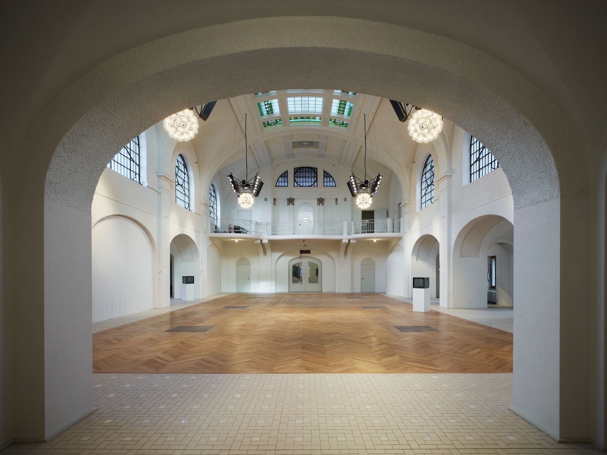
CB: I think in general, at least in the West, we’re heading toward more reuse. Why build a new space if there are so many post-industrial buildings around?

KH: But that’s Tate Modern — you guys already did that 25 years ago. Richard and I used to talk about this: why have so many of our brilliant architect friends failed at building a good museum? To this day, there are still more bad museums than good ones. We concluded that it must be the archetype of the museum. We wanted a new architectural narrative. I think we succeeded as much as we could with the Walker. The multidisciplinary nature of the Walker was a beacon. But I often wonder: if we weren’t all white people of European extraction, would we have a different image in our heads of what a museum should be like and function? I think we might. I think about this a lot, because it seems to me museums should be the apex of diversity. A few years ago, I was on the jury for the M+ competition in Hong Kong. Every great architect I admire presented. I dimly remember there were attempts to make things that were culturally specific — one architect even made a roof shaped like a coolie hat, which made me shudder. The cultural references are usually very mundane because we really don’t have a language for this yet. Herzog & de Meuron made the most of the site, and they rightfully won the competition. I’m curious, Christine: what did the team come back and say about these things? Were there conversations? Did the building’s location in Hong Kong have any influence on the museum’s formal or conceptual attributes?

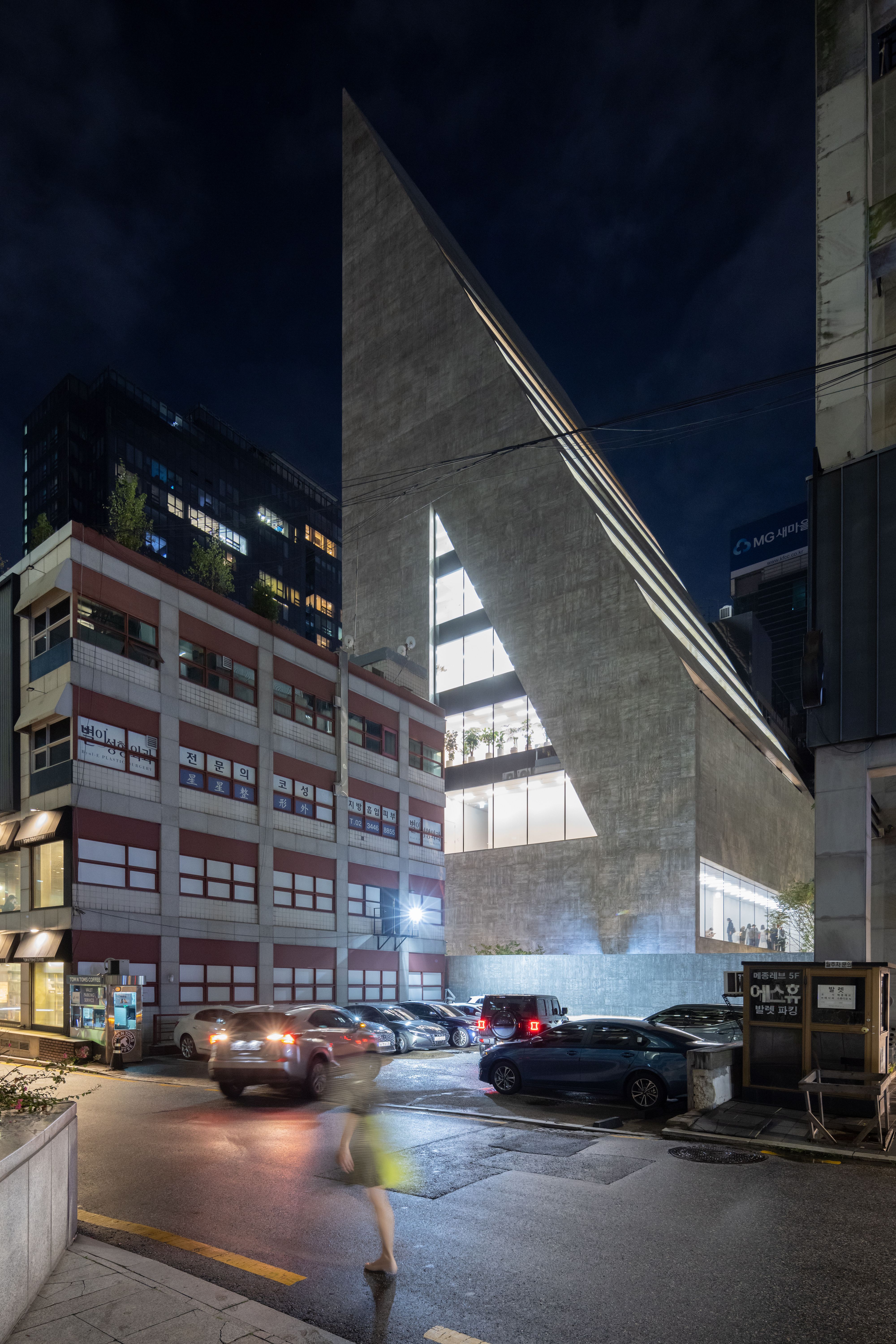
CB: Well, formally speaking, the cladding is dark-green ceramic, which is a local reference to the architecture of the place. But it was much more about what we found on the site, which was a landfill. All we had was an existing underground tunnel, a physical piece of infrastructure, to work around. At first we thought it was a problem, because it cut through the site diagonally, but we decided to use it as something to react to, to use its force. Of course we try to identify and react to local specificities, both physical and mental. When you build a museum in a city where there is no comparable cultural space, you have to expect huge visitor numbers and design for that. This thinking informs the bolder gestures of M+ — the large lobbies, but also the giant screen that faces the harbor.

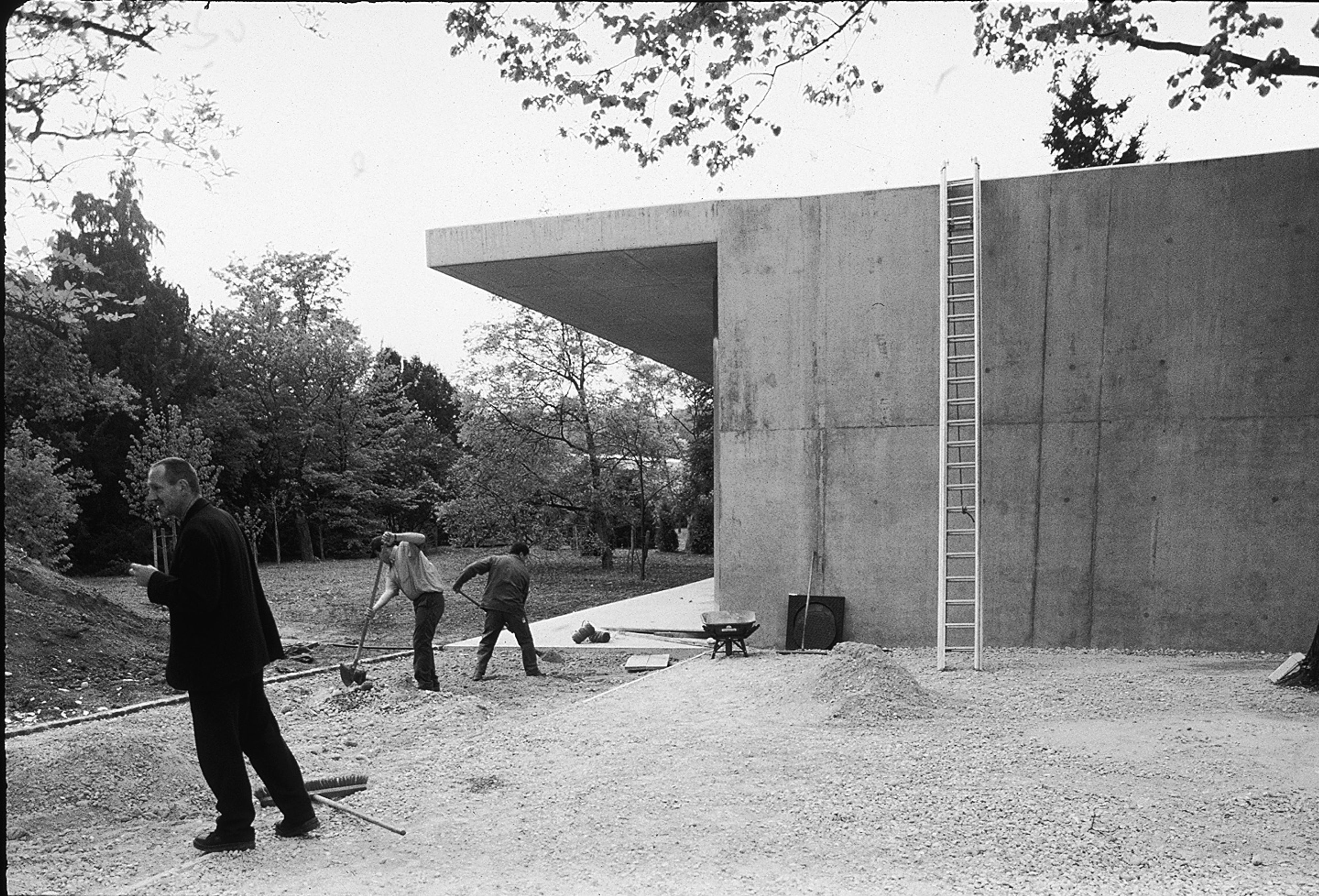
KH: I think what Christine just said is really important. We talk about the museum, but actually it’s always a museum. Scale, context, and collection make every single project unique. At M+ or MoMA, for example, you have to design an abundance of unprogrammed space, which often has a corporate feel, because people have to figure out immediately how to circulate. So there are restraints put on you. And I think Herzog & de Meuron understands restraint. At one point, we ran into a terrible financial situation at the Walker, and we didn’t know if the building would be completed. Remember that, Christine? We ended up value-engineering out a huge slice of space, and it was a painful process. But Herzog & de Meuron were brilliant and knew how to make use of the restraints, so the building got better because of the so-called compromises.

SONGEUN Art Space, Seoul, South Korea, 2016–2021. The recently opened SONGEUN Art Space belongs to a certain category of Herzog & de Meuron cultural projects whose sculptural quality in itself passes as art (CaixaForum in Madrid is another example). Slashing the air like a triangular blade, as if to cut through the hustle and bustle of one of Seoul’s most commercial areas, the building is in some ways reminiscent of the firm’s 1997 MoMA competition entry and São Paulo Biennial pavilion. Photo by Herzog & de Meuron. Courtesy of Herzog & de Meuron.

Upon closer inspection, SONGEUN’s concrete façade displays the imprint of the wooden formwork used to cast it, a detail that reveals Herzog & de Meuron’s ongoing fascination with materiality and surface treatment. The spiral pedestrian ramp leading to the galleries matches that which takes cars down to the subterranean garage. The latter is exposed in a full-height void — a highly dramatic space descending three stories underground. Photo by Herzog & de Meuron. Courtesy of Herzog & de Meuron.

What do you think the future holds for the architecture of art institutions?

KH: The honest truth is you couldn’t pay me enough money to be a museum director at the moment. I believe in museums, but I don’t want to lead them any longer. What I’m most interested in now is a more direct route to social change and to helping artists make new work. Those are not necessarily the priorities of an institution that has a massive collection or a huge staff to care for. I think at this point in my life, I’m becoming really deinstitutionalized. I just don’t feel I’m in a position to create a dream of the new institution. It’s the next generation who really need to imagine that. I’ve done my best. It wasn’t necessarily good enough, but nothing is ever good enough.

CB: Some places are questioning the role of “museums” while others still create them because they’re in a different moment in their own history. What won’t change, I think, is that the physical experience of art will remain essential and vital.

KH: I recently put together an artist council to help guide philanthropy at the Rauschenberg Foundation. Paul Chan is the public spokesperson for the council, which is anonymous, and I’d like to read a quote from something he wrote, because if I had a dream for anything to do with our culture, this would be it:

These grants reflect our commitment to honor and expand Bob’s artistic legacy. At their best, Bob’s works made room for all that was not or not yet worthy of aesthetic attention and was enriched by the multitude of social and political experiences that tend to enrich life itself, if living allows them to. The council’s work fosters the overarching idea that art is enriched by all that is not art because art that is multidimensional is more capable of envisioning a more vital and festive reality. This is why all that is not art must also be protected and supported, if art is to flourish at all. The diversity of what we have funded is an argument for this idea.

SONGEUN Art Space, Seoul, South Korea. Photo by Iwan Baan. Courtesy of Herzog & de Meuron.

Let’s end there. That’s a beautiful closing statement.

KH: Actually, the best closing is to mention the happiest outcome of the process with Herzog & de Meuron: that Christine has become a lifelong friend.

And that’s on record.

KH: It’s true.