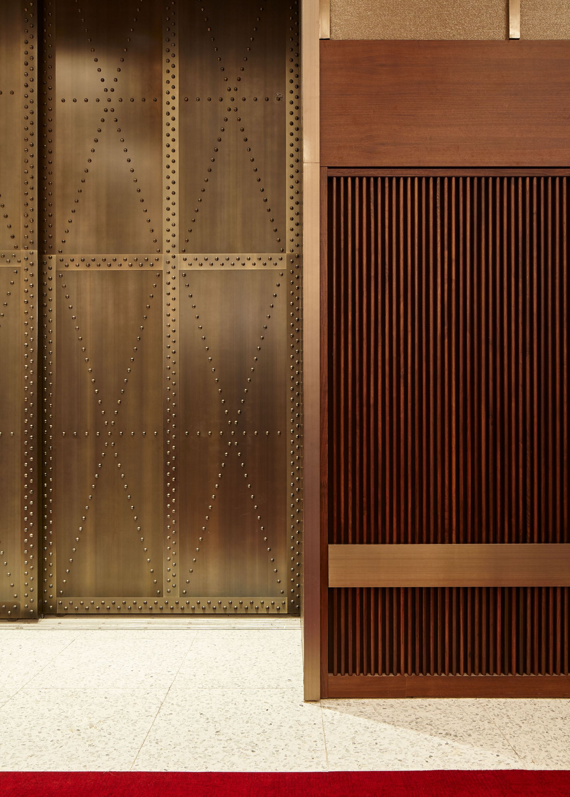
Lobby detail at TWA Hotel at JFK Airport, New York. Photography by Joshua McHugh.
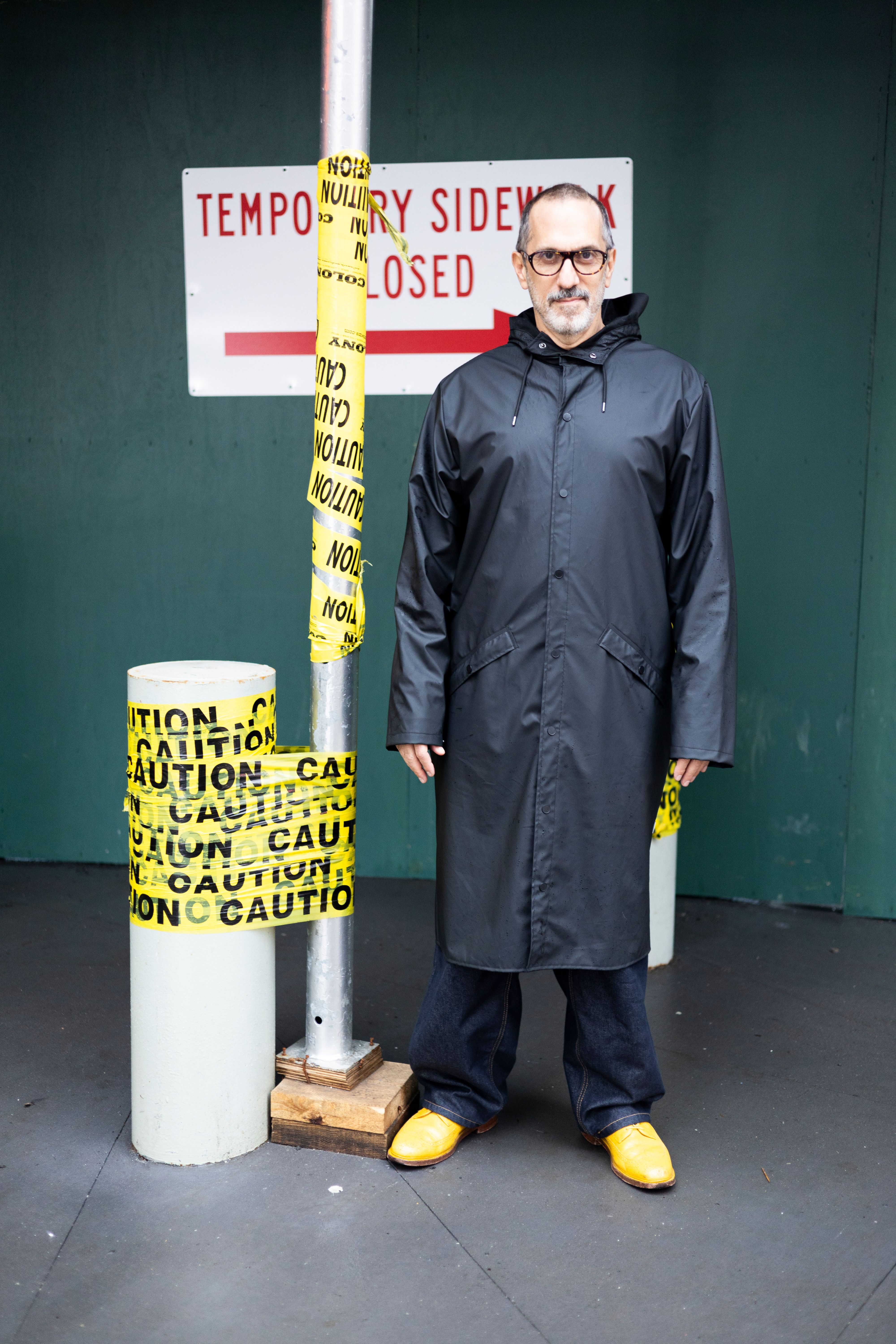
Adam Rolston photographed by Thomas Polcaster for PIN–UP.
In 2006, Adam Rolston and partners Gabriel Benroth and Drew Stuart co-founded INC Architecture & Design, its acronym a joining of Latin terms for joy, utility, and creation (”Iucunditas necessarius creo.”) Almost two decades later, the firm has brought those three design priorities to bear on extraordinarily balanced private residents across the country, skyline-changing buildings, like Saint Marks Place in downtown Brooklyn and 1 West 60th Street in Manhattan, fitness and wellness clubs, and the furniture that fill them. INC might be best known, though, for their high-stakes reworks of some of New York City’s most beloved environments: their TWA Hotel within Saarinen’s JFK landmark honors its legacy without succumbing to the kitsch sentiment of a Modernist diorama, while their airy refresh of the Rockefeller Center rink level just might make you believe in a humane midtown. As INC contemplates its upcoming 20th anniversary, Rolston has been thinking about his roots — as both an activist in ACT UP and an avid reader of Rem Koolhaas. He recently sat down with PIN–UP to reflect on his career, from respectfully appropriating the strategies of advertising and activism to reinterpreting those Modernist pileups Koolhaas decried as Junkspace as what Rolston is calling “Joyspace.”

Lobby detail at TWA Hotel at JFK Airport, New York. Photography by Joshua McHugh.
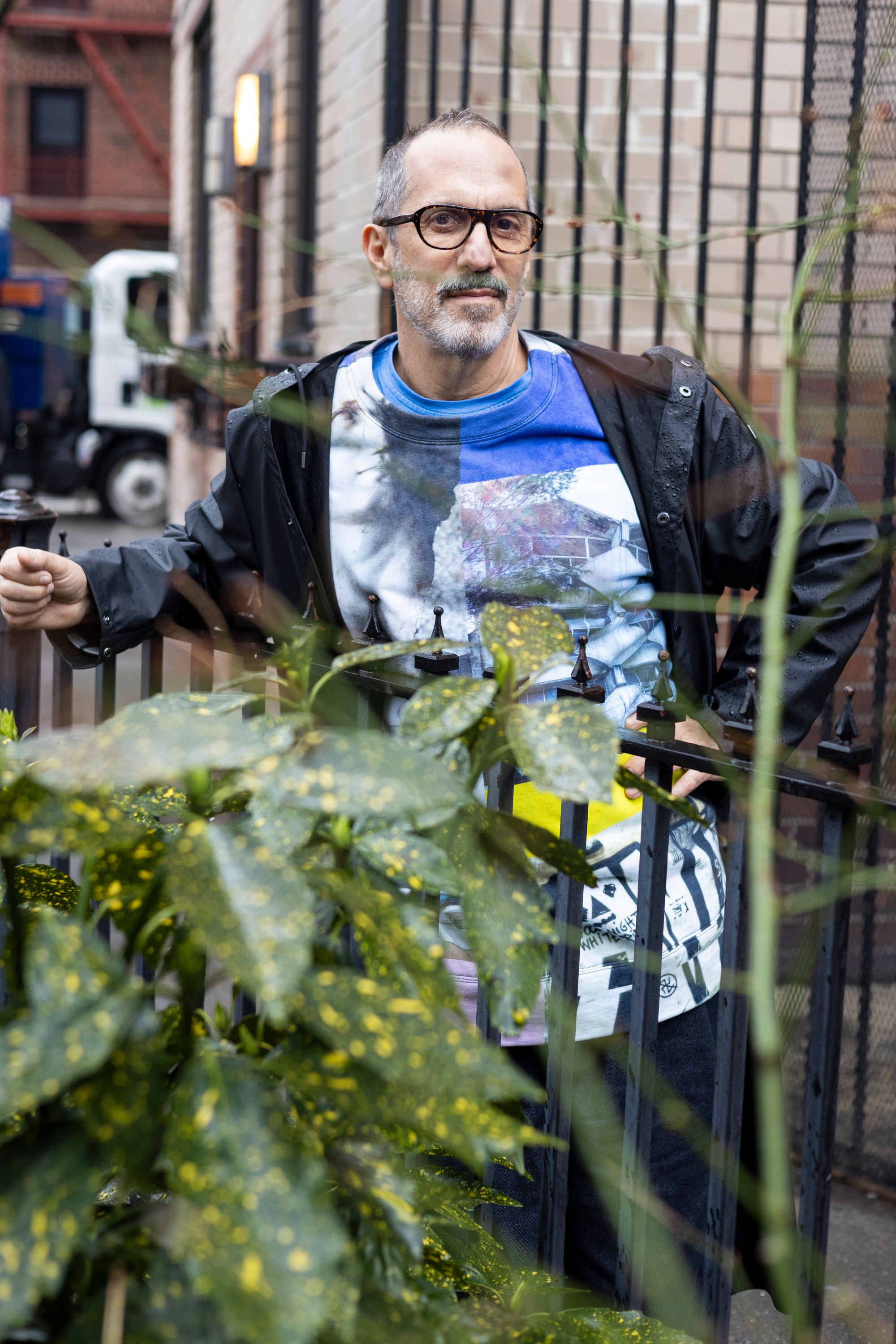
Adam Rolston photographed by Thomas Polcaster for PIN–UP.
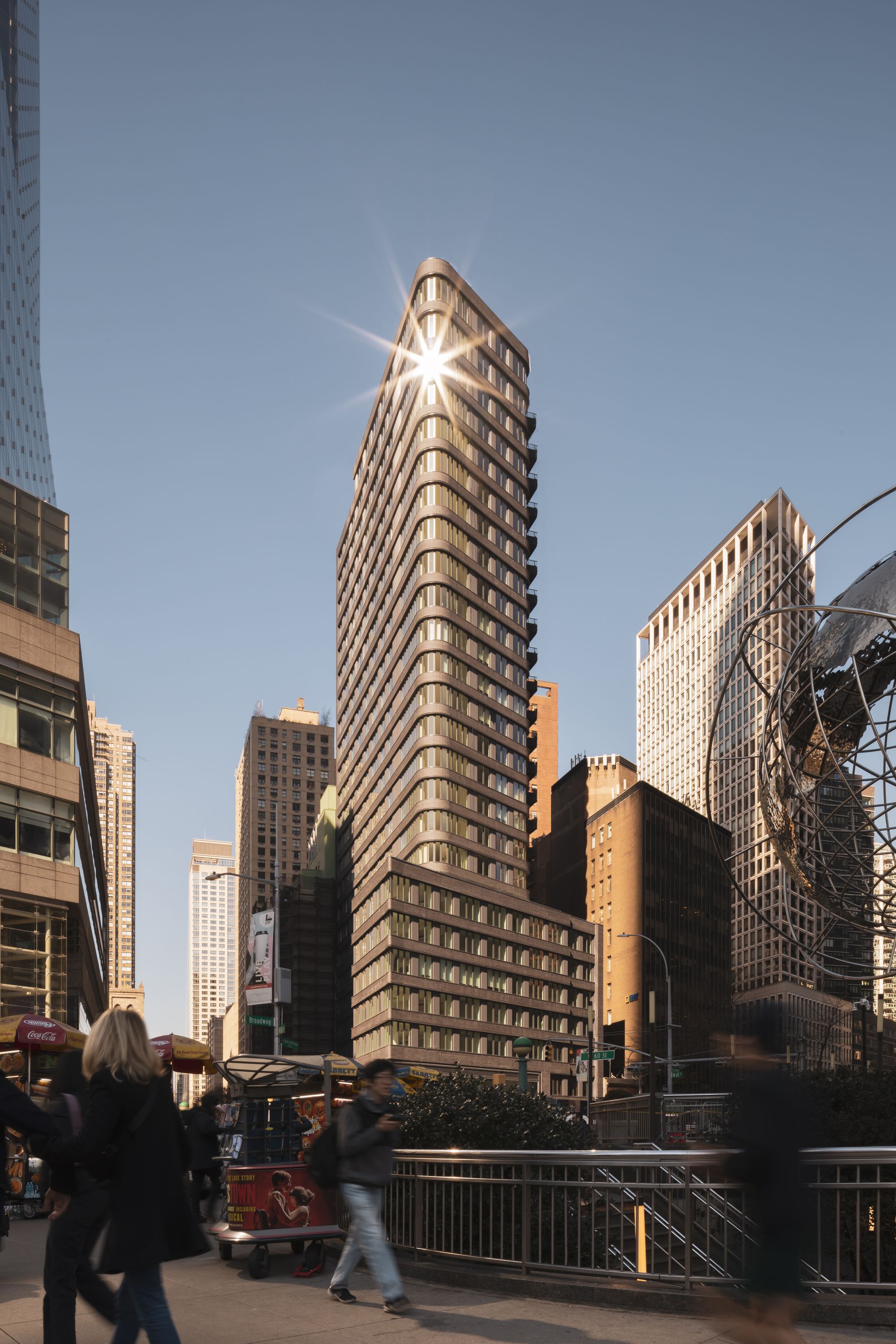
Anagram Columbus Circle, New York. Photography by Ivane Katamashvili.
Jesse Dorris: INC is beginning to look ahead to its 20th anniversary. Does the firm’s history look like you thought it would? Or has it become itself, through the work?
Adam Rolston: In my approach to design, my professional life is informed by looking back at my lived experience. I came up in a world within the closet. Everything was, in some way, a performance. So I came up and came out of the closet, and became an activist with ACT UP. I was an artist showing at galleries at that time, trained and educated in a world where this shiny object was the goal. For me personally, I evolved because of my activist experiences. And once we founded INC, we developed in an incredibly communal, collaborative way. I know everybody claims to be ‘collaborative,’ but we actually are structurally. We’ve put work into creating structures that will facilitate collaboration across generations.
What does that mean?
Almost all design is done within the context of a meeting, but groups are an activist tool: sitting in a circle with no hierarchy, throwing out ideas. What made ACT UP so successful was a really clearly defined initial structure that ran those groups. It was a good model to think about: taking a big idea through the various scales of a design process but always reflecting back to what was established at the beginning. The youngest person can contribute to that conversation meaningfully because they know what the structural goal is. They can bring things to the table that sometimes don’t even make sense, but that can create incredible things.
So striving towards a lack of hierarchy is a source of tension — hopefully a productive energy. But power exists. How do you harness the reality of those power dynamics in ways that are both good for INC and that also allow you to sit here and tell me that it’s related to ACT UP in a way that feels true in your heart and doesn’t make you want to throw yourself out of a window?
[Laughs]. What I’m about to say is corny, but it’s about trust. The fish rots from the head, so trustful, consistent leadership is foundational. How did we do it in ACT UP? There were people who were really dominant and aggressive and took up all the air in the room, and then people who contributed in quiet ways in that same circle. It's a similar process with INC. Gabriel [Benroth] and I enjoyed working together, so we started a studio. And then we had to figure out how to work together. I had to accept what I’m good at and accept what I’m not good at. We had to understand who Drew [Stuart] was and vice versa, in all our weirdness and brokenness. We create the most meaningful work when we really get into the head of our audience. Sometimes what they articulate they want is not actually what they need. That’s a tension that creates amazing things.
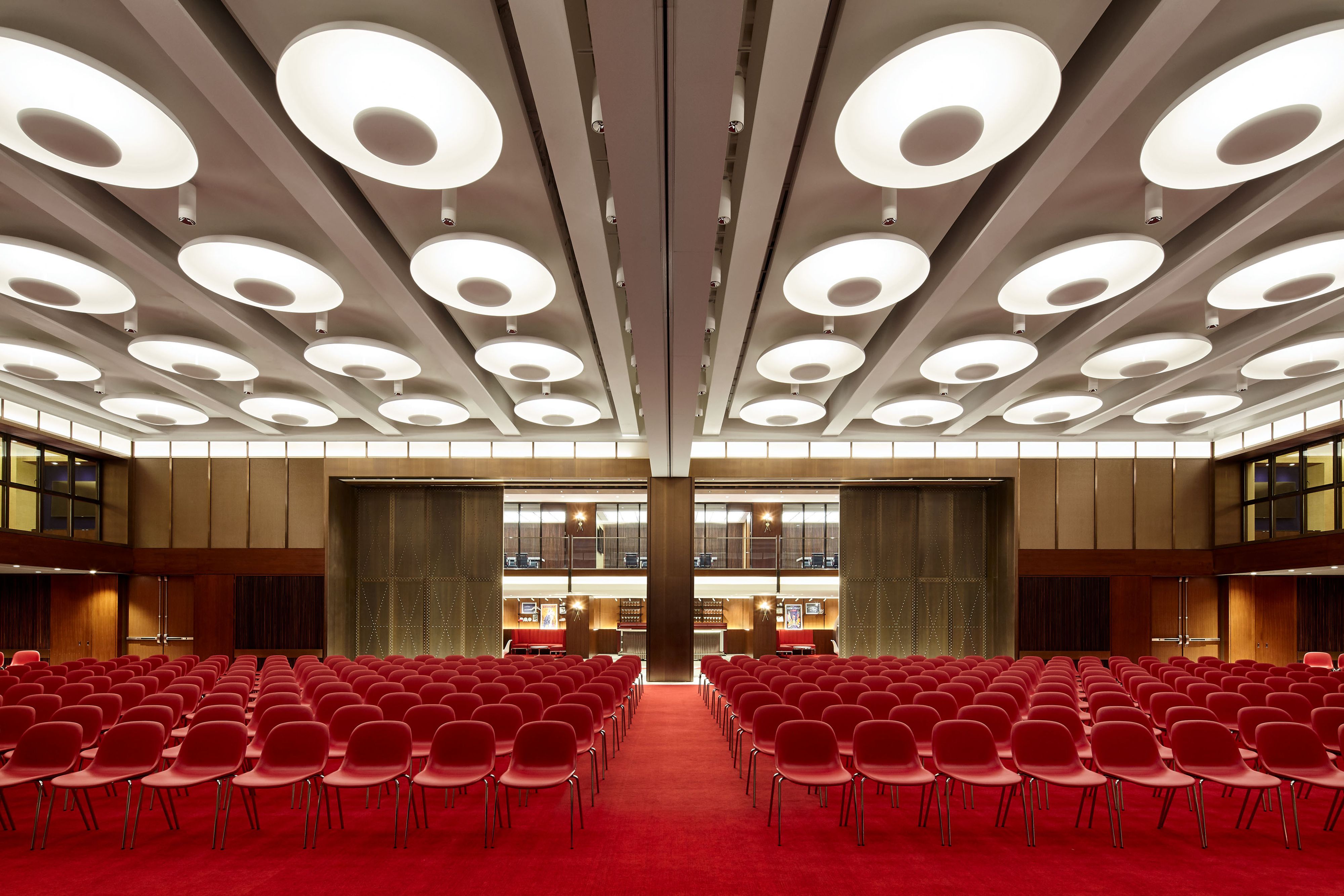
TWA Hotel, New York, United States. Photography by Joshua McHugh.
What’s an example of a project with that tension?
One was a project with the smallest budget and a very high profile. It was for a museum that wanted to turn its atrium into a restaurant — it’s not going to happen because of institutional changes. But the mission of the institution beautifully aligned with our own in terms of the museum as a form of service. We took a deep and kind of forensic approach to understanding what its audience wanted and desired — its actual audience, from the wealthiest collectors in the world to the most disenfranchised immediate neighborhood audience coming in to just look at the art. What a fascinating thing to try! One of the reasons we love hospitality is that it’s about people collecting. Their goal was to create an interesting, temporary space that could be a place for voting during election week and could also convert into this peripatetic restaurant.
Atriums are so often Junkspace — I know you’re very interested in opposing that idea. Airport atriums are so diabolical, because it’s a space that’s about transportation and moving from one space to another, but they never seem to lead anywhere but to security apparatuses — that modular security theatre. The modern atrium can always turn into a holding pen.
The thing is, Joyspace is like a fungus that can infect or take over Junkspace under the right conditions. We were invested in turning that museum atrium into a place of joy and connection versus a threshold. But the problem was that everything was about the guard and the ticketing, so there was nothing welcoming, open, or public about it.
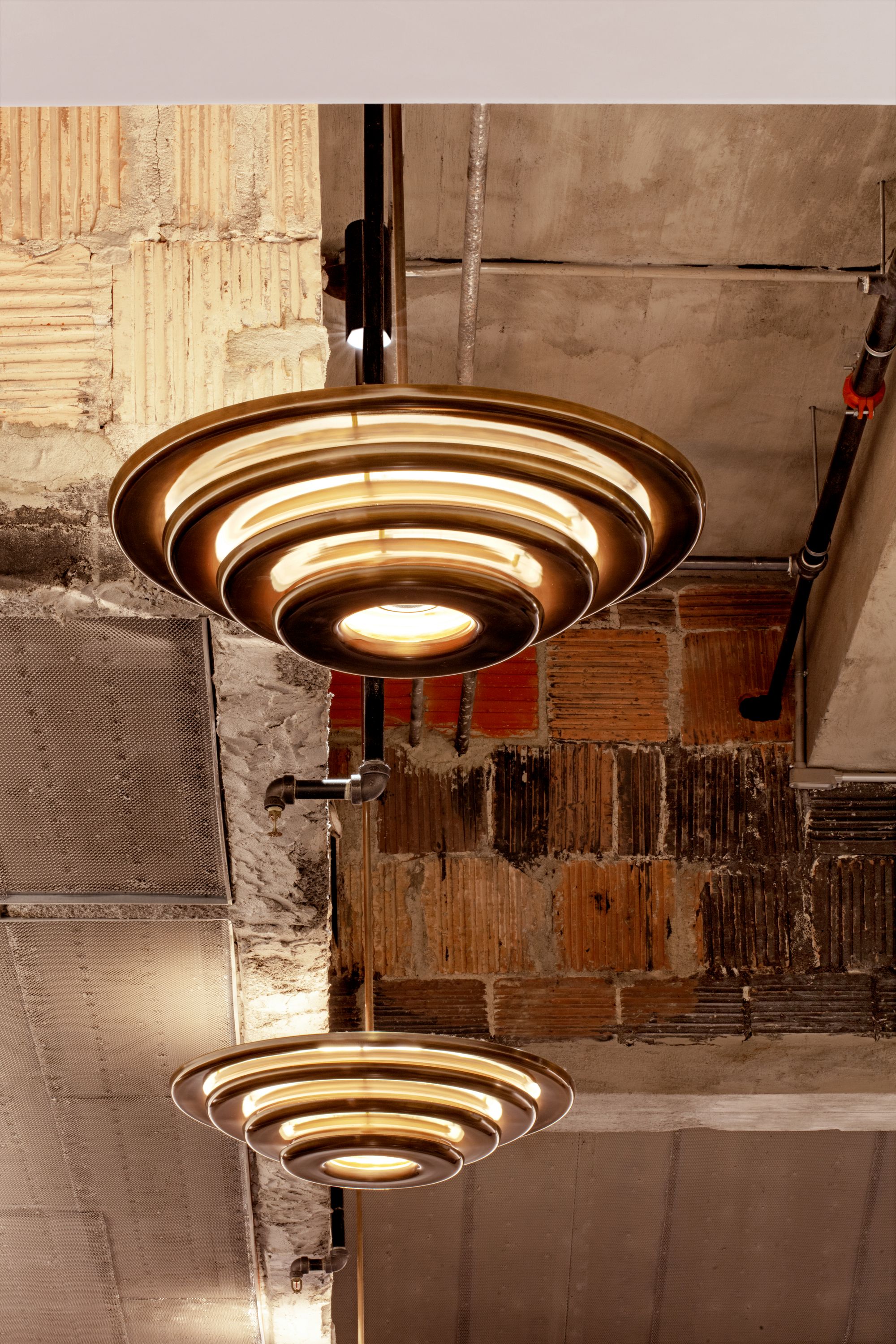
Rockefeller Center Rink Level, New York.
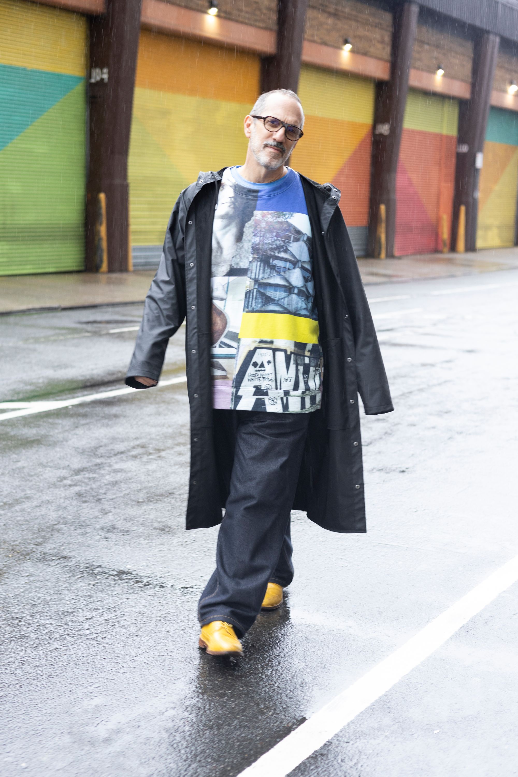
Adam Rolston photographed by Thomas Polcaster for PIN–UP.
Let’s talk about joy, then. Why do you feel joy is the correction to junk, as opposed to, say, value or meaning. Like, what is joy?
I think Rem Koolhaas articulated Junkspace as a failure of Modernism. I would call it Modernism without a mission. At this stage in the world, Modernism addresses a very specific community. We have a client who hails from a marginalized position, and he specifically wants to mobilize Modernism as a symbol in the context of his projects because he wants to appropriate that symbol of power. It’s a symbol and you can’t ignore what it means. When Rem rails against Modernism, it’s about failure: its collapse into just HVAC systems, sheetrock panels, and acoustic ceilings. He’s talking about the failure of that particular symbol in terms of capitalism and its use as an efficient way to mobilize the layout of the planet as opposed to something that is invested in what the symbol wants to do. Right? Modernism is just a form that brightens.
I’ve always thought minimalism is just another form of drag, anyway.
When I was in ACT UP, one of the things we did that was incredibly effective was inhabiting and appropriating the language of advertising in the context of activism. That was a way to seek joy. Joyspace is about human desire and resisting the deadening effect.
But how did you put that into practice?
For our project for TWA, we spent months looking at the Saarinen building to try to literally understand its components. The grid and the curvaceous became two fundamental elements. That was the first phase. Then we re-assembled those pieces over a skeleton that’s meaningful in relation to the more fundamental, functional program. So all that emotional stuff gets laid over the functional stuff, and hopefully you get awe-inspiring rejoicing. But the historic structure is a very small portion of the project — all the square feet done by us was done under brackets, so there’s literally no architectural context. It’s like a concrete bathtub. It could have been Junkspace. But instead, I think the space inspires awe and wonder. The same thing happened with our work at Rockefeller Center.
How?
Well, they were interested in us because of what we’d done with TWA. We had understood its historical context and were able to inhabit that historical context and make it meaningful in the present. Two of the ways we did that were in terms of high performance and nostalgia.
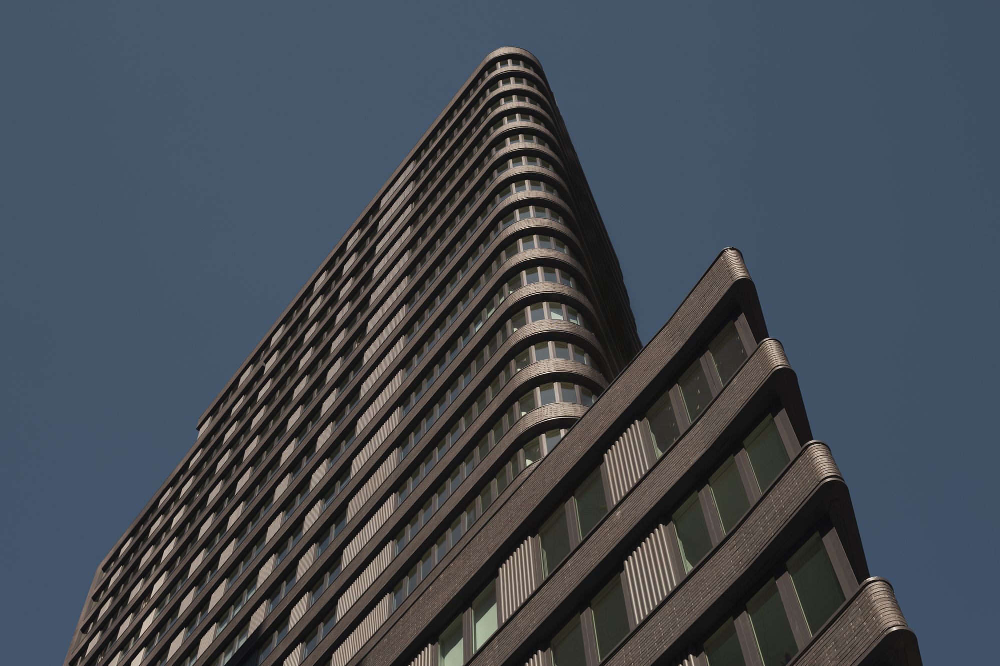
Anagram Columbus Circle, New York. Photography by Ivane Katamashvili.
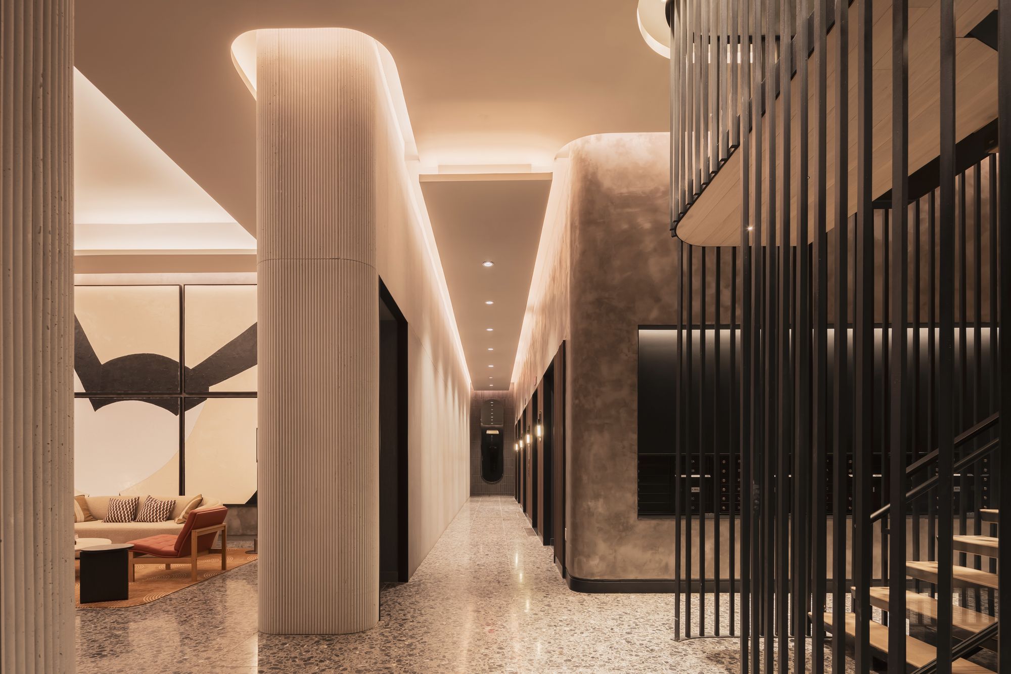
Interior view of Anagram Columbus Circle, New York. Photography by Ivane Katamashvili.
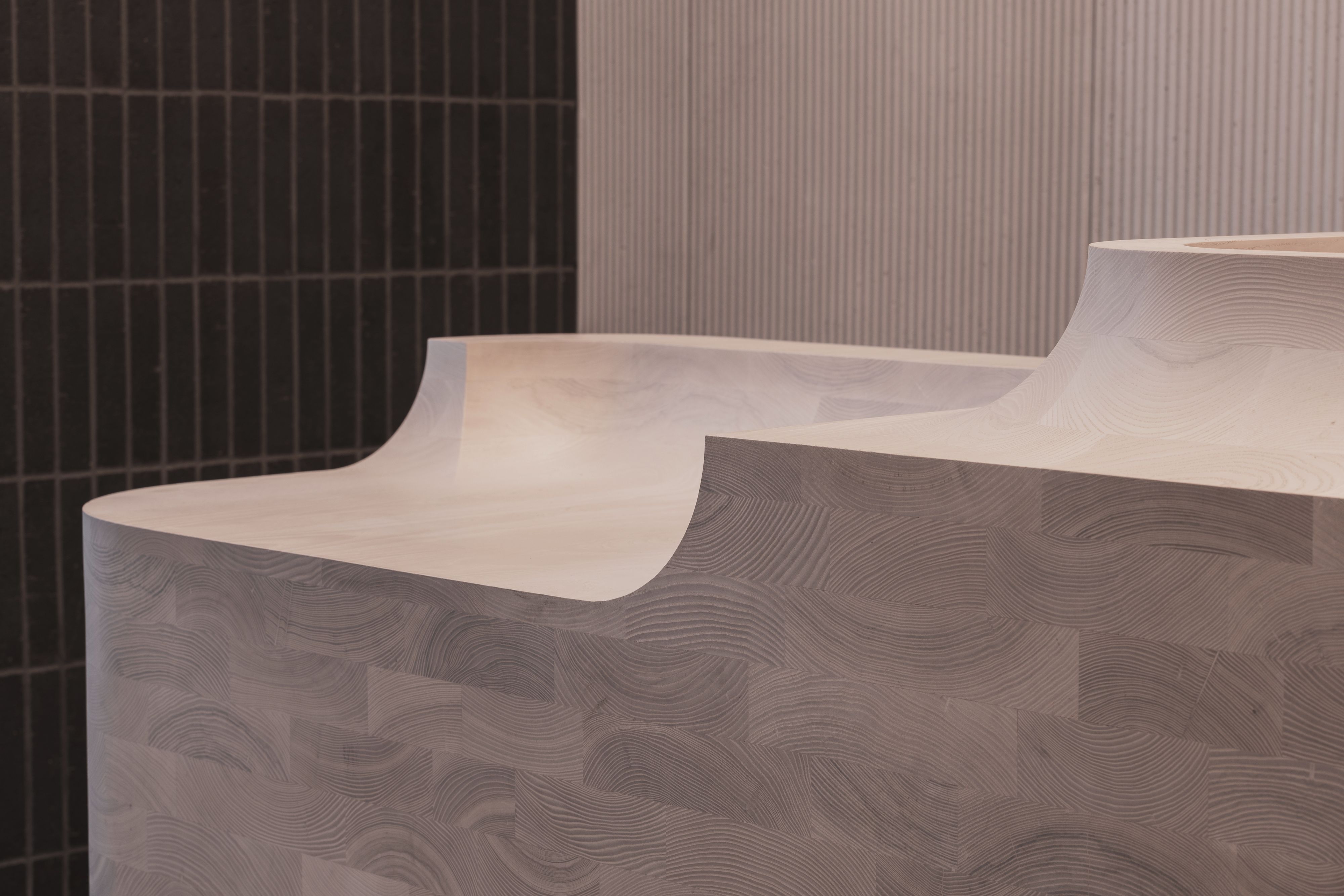
Detail within the Anagram Columbus Circle, New York. Photography by Ivane Katamashvili.
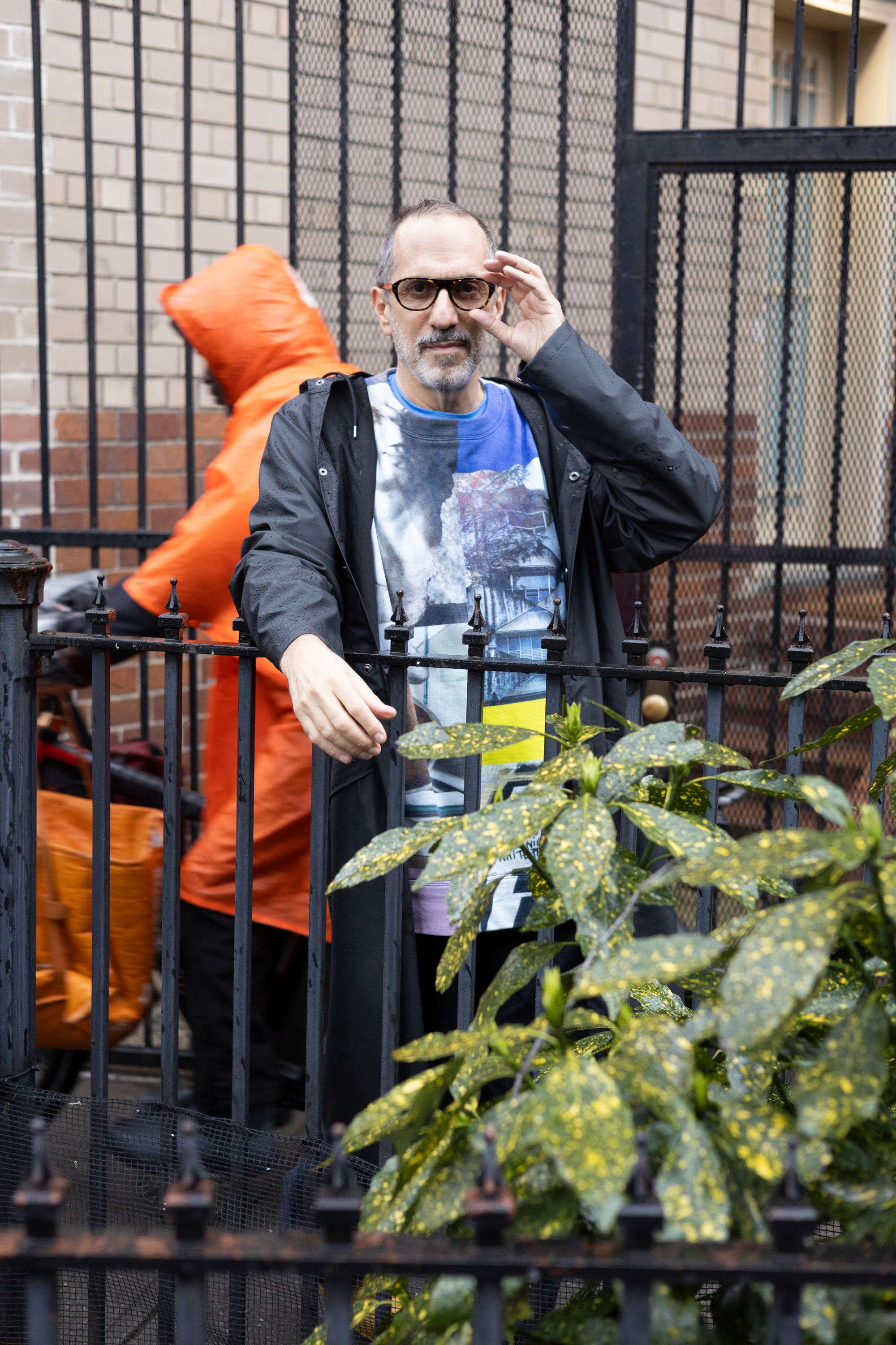
Adam Rolston photographed by Thomas Polcaster for PIN–UP.
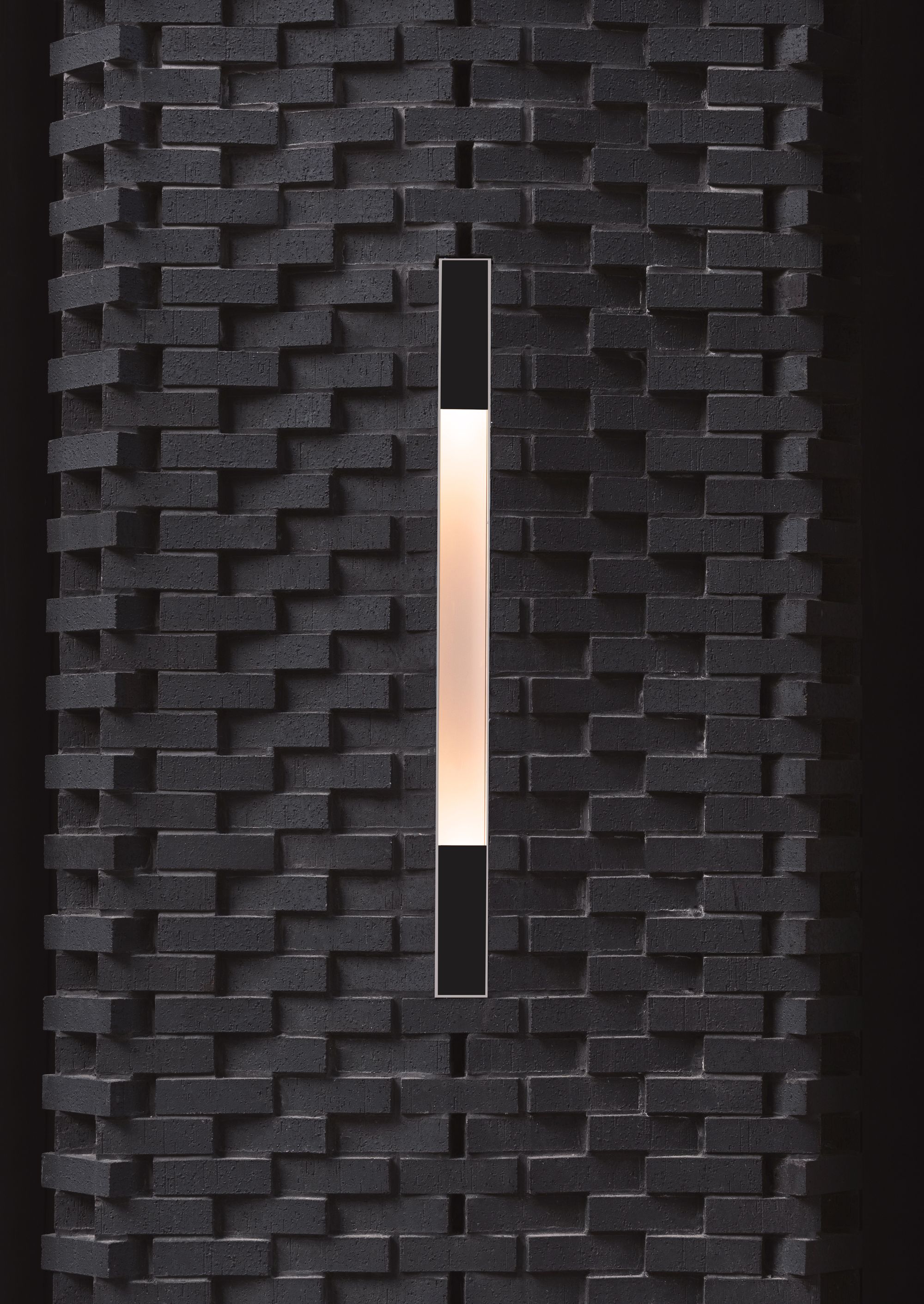
Detail within the Anagram Columbus Circle, New York. Photography by Ivane Katamashvili.
Which is a joining together of the material and the ineffable. You were able to convince a relatively conservative client to give you the keys to such a high-stakes project [like the rink level of Rockefeller Center] — do you think there was a fear that you wanted it to be ‘joyful,’ which is hard to measure?
There’s so much history to Rockefeller Center. They have incredible archives. So we dug deep, looking at details down to HVAC registers and doorknobs all the way up to the verticality of the façades, we noticed the more temporary interiors were almost uniformly incredibly curvaceous and not as rigorous as the exterior. Deconstructing it down to its component parts, then building up worlds within the framework of what was needed for the project — when that balance of the deeply practical and the ephemeral is presented in a way that connects to place, it’s pretty sexy. It sells itself.
How do you know when nostalgia is performing what your clients ask you to deliver?
I think there’s no such thing as a wrong symbol. It just might be for the wrong audience. The Rockefeller Center audience is complicated: there’s the often very affluent office worker; the local New Yorker, which spreads across all social classes, who visits the tree, the ice-skating rink, and the restaurants; and then there’s the global tourist. That’s an incredibly broad audience. But it’s actually kind of easy to fit them together: they’re coming to experience a piece of historic New York. So we try to understand that history, not to copy it or recreate it, but to use it as a palette for creating a space that’s meaningfully connected to what the audience needs. Here, then, symbol and joy become function.
But how might that work in residential buildings?
We’ve done one on Columbus Circle. The client had some initial zoning studies done, and that study could have easily been converted into Junkspace in the sense that you could take that zoning envelope and put it in a pretty skin. We said we were a little bit horrified. What they were putting on the table for us was an incredibly important site. Its main façade is on Broadway, and that part had to be kept as retail. But it’s primarily a residential building, with its entrance on 60th Street. The big idea was to kind of bend Broadway into the 60s. In conversations with the client we established it was going to be luxury rental, with a population to some extent transient. There have been a lot of discussions about the blurring between hospitality and residential, for good reasons, but we also needed a sense of place related to the physical building and services associated with that. INC is steeped in the history of this city from every angle, formally and culturally. I’ve lived here for thirty years. So we looked at New York City for the brickwork on the lower register, which plays with some of the stuff that was happening around the turn of the century. That became a genesis. But tensions are occurring elsewhere. We all know about the crisis of the office market, and I think there are a lot of very powerful people out there panic-stricken about their empty, scary lobbies. The intimidation lobby was the definition of corporate America, creating a symbol of thresholds. I think they’re very afraid that that does not play anymore. That is over.

Adam Rolston photographed by Thomas Polcaster for PIN–UP.

Adam Rolston photographed by Thomas Polcaster for PIN–UP.
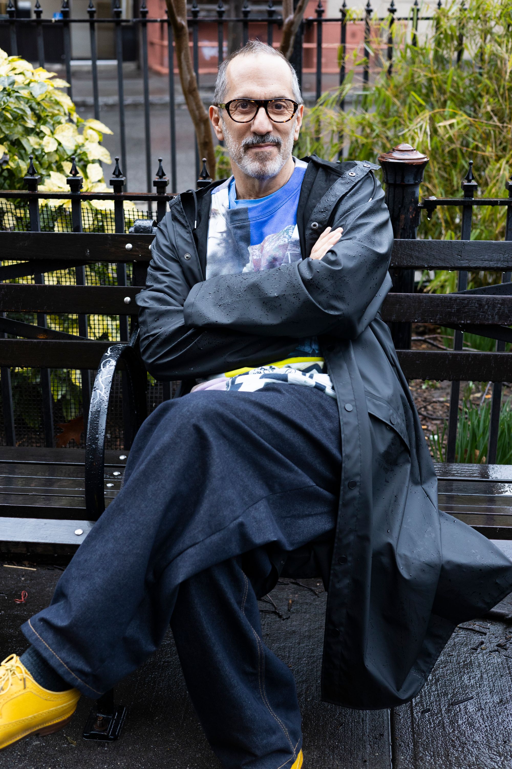
Adam Rolston photographed by Thomas Polcaster for PIN–UP.
What’s taking its place?
One of the most beautiful things that’s happened to New York City is the screen of the streets. That’s the Joyspace. It’s the Parks Department infecting the unfriendly urban environment with humanity. Once you close the street and give someone a place to sit and some beautiful greenery to gather within, it’s hard to take that away. Beauty is the program for us. Design is our tool in the battle for art against Junkspace. It’s like Joyspace is the thing that destroys Junkspace and brings meaning to a place that is meaningless — and that meaning is cultural and super specific. It’s infectious. We can make spaces for everybody. In the architecture world, our goal is to be polymaths who embrace great pleasure, to draw great pleasure from speaking to and collaborating with a spectrum of audiences. That’s the world I want to live in. I was not born into it. But it’s close.