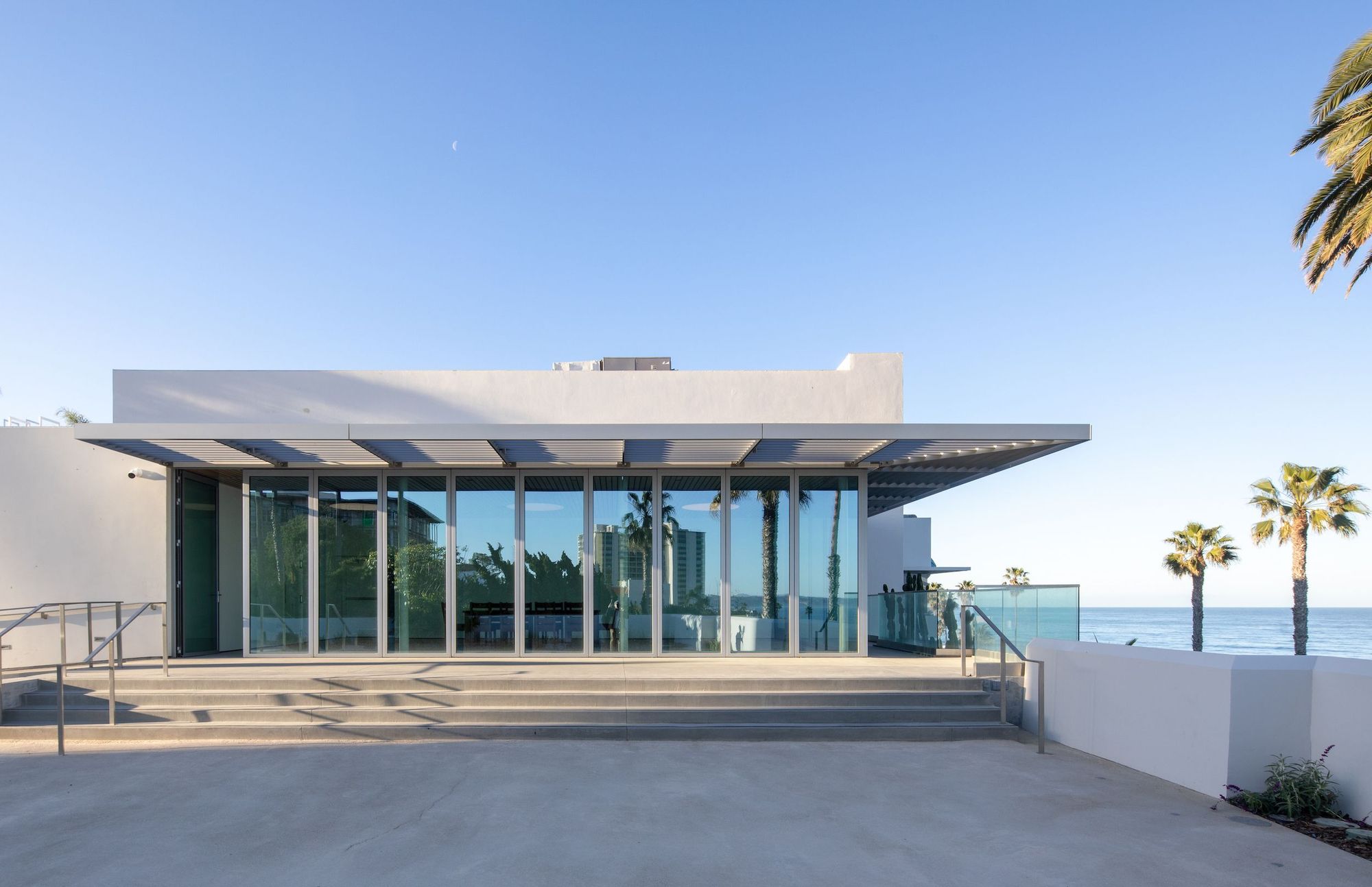
View of the MCASD’s Sahm Seaview Room from the Bartell Terrace. Photography Nicholas Venezia. Courtesy Selldorf Architects.
“The incredible light of Southern California and incredible views of the Pacific Ocean are something that you may take for granted,” Annabelle Selldorf gently teased her audience while giving a tour of the newly completed Museum of Contemporary Art San Diego (MCASD), an ambitious renovation and expansion project her team had been working on since 2014. Selldorf judiciously paused before adding, “We are from New York.”
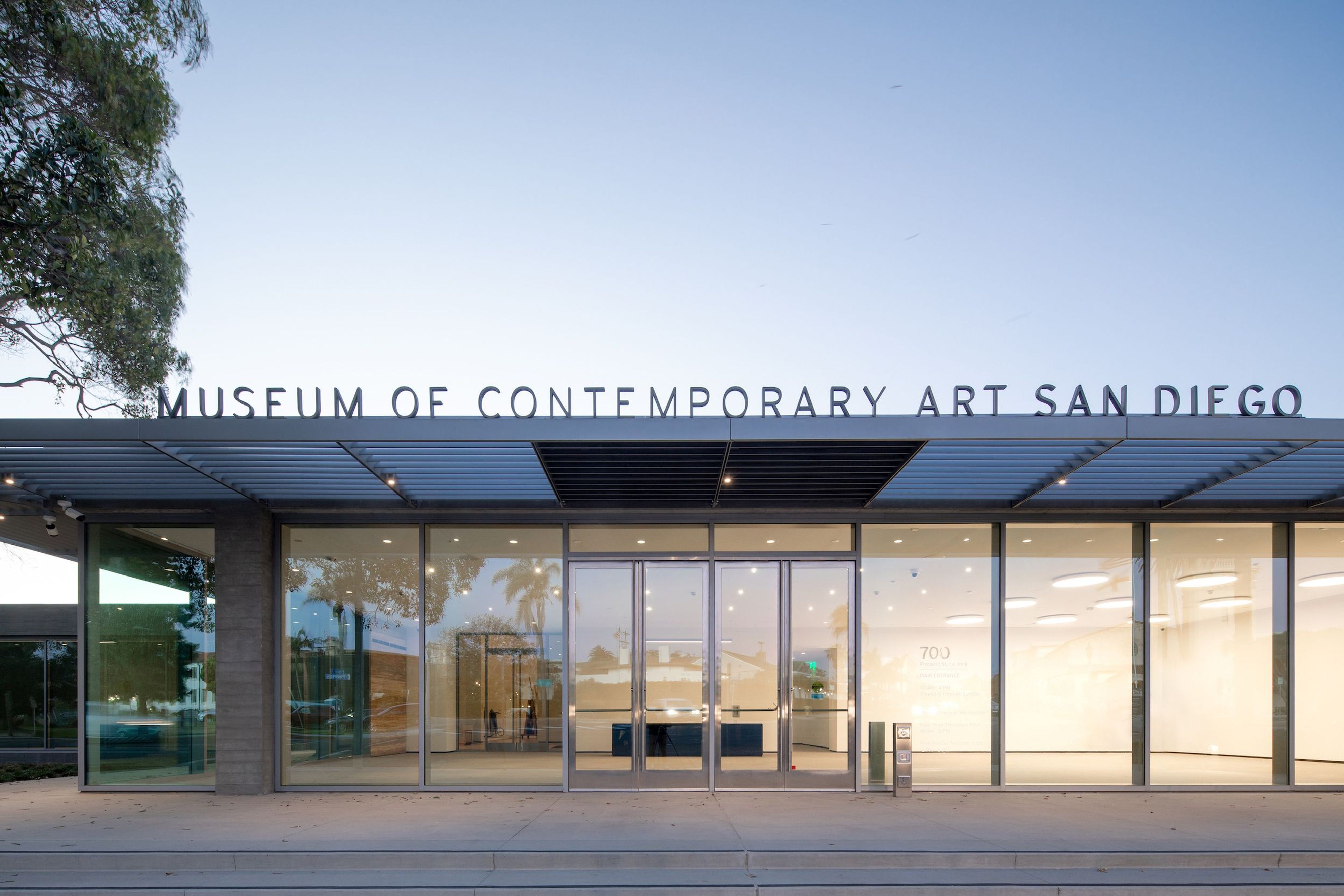
Selldorf Architects designed the new entrance at MCASD’s La Jolla location to be more inclusive and inviting. Photography Nicholas Venezia. Courtesy Selldorf Architects.
Moving through the re-organized space, which has doubled its square-footage while quadrupling its gallery capacity, you can feel just how much the museum’s breathtaking coastal La Jolla location has guided Selldorf Architects’s design. For example, an old parking lot and dumpster have been replaced by a new public art park overlooking the ocean, and along the museum’s backside once monopolized by a loading dock, there’s now a glass-flanked event space displaying “this incredible view one never gets tired of,” to use Selldorf’s words. While the design is understated in its quiet elegance, embodying the German-born architect’s signature restraint, there are plenty of thoughtful details, such as the way this spacious multidisciplinary room’s wall of windows turns the corner (if you’re facing the ocean, the back windows continue with a panel of glass beginning on the adjacent wall to your left) a subtle gesture impactful in how it emulates the dynamic of La Jolla’s curving coastline. Throughout, the surrounding natural environment’s rocky cliffs and sandy beaches are echoed in Selldorf’s material choices: glass, travertine, concrete, aluminum, and cork.
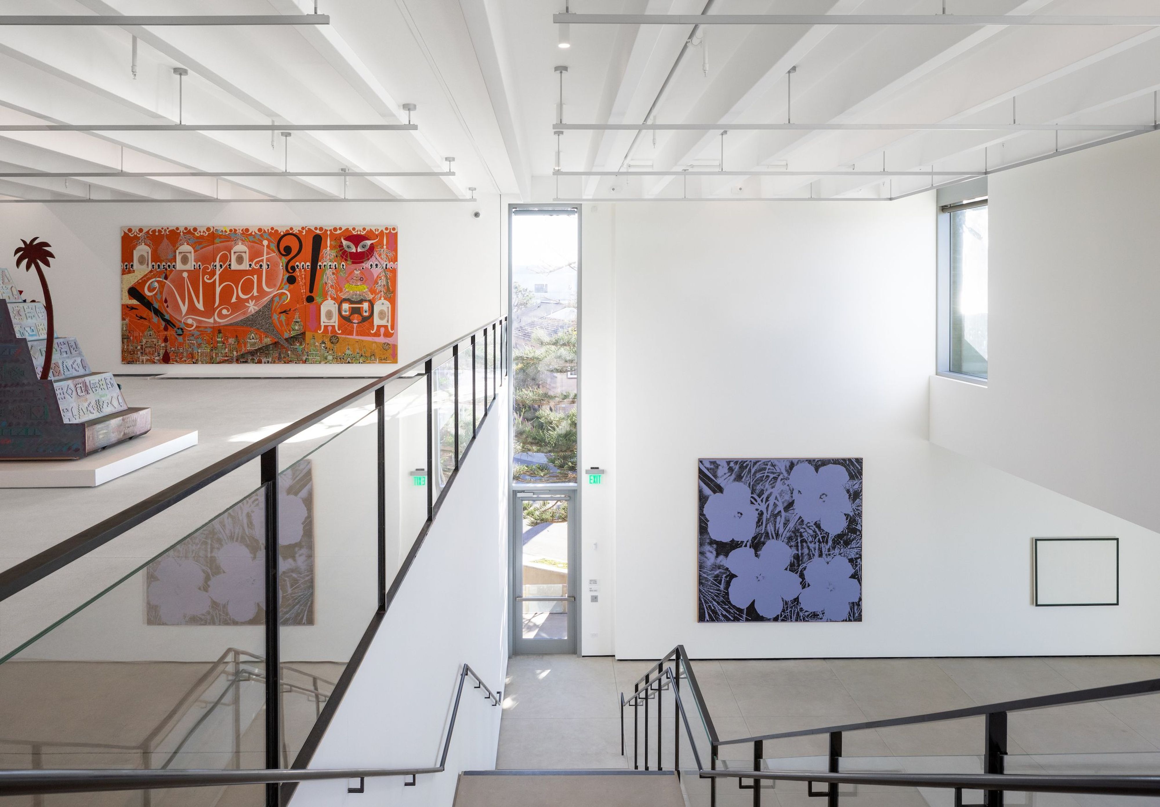
Installation view of the Marshall Gallery and Cohn Gallery featuring Lari Pittman, How Sweet the Day After This and That, Deep Sleep Is Truly Welcomed, 1988 (left) and Andy Warhol, Flowers, 1967 (right). Photography Nicholas Venezia. Courtesy Selldorf Architects.
The expansion was motivated by a desire to simultaneously accommodate changing exhibitions as well as showcase the MCASD’s permanent collection, a strength of which is an abundance of works by California Light and Space artists that Selldorf credits to inspiring much of her team’s design. Works by Helen Pashgian, Craig Kauffman, and De Wain Valentine have found a permanent home in a new gallery, which Selldorf points out is distinguished by diagonal and axial views to adjacent new galleries. This provokes the museumgoer to “make connections,” a recurring theme in how Selldorf envisioned the way her expansion’s gallery spaces and circulation plan would be activated. One gem of MCASD’s collection is Robert Irwin’s site-specific installation from 1997 titled 1º2º3º4º which consists of three rectangular apertures cut into windows overlooking the Pacific Ocean — while obviously impossible to relocate, the artwork’s spirit of attentive responsive minimalism is generously infused in the Selldorf-led expansion.
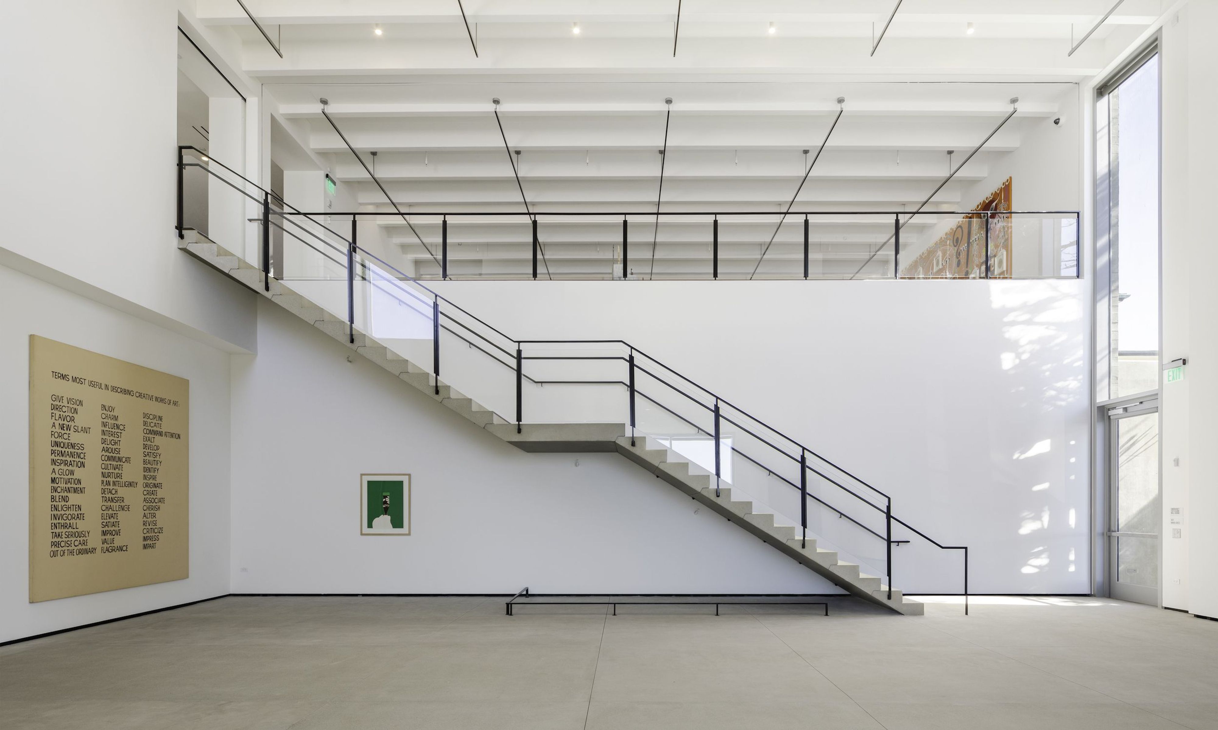
One of the MCASD’s new galleries designed by Selldorf Architects featuring a precast concrete cantilever staircase as well as artworks by John Baldessari and Marisol. Photography Nicholas Venezia. Courtesy Selldorf Architects.
While its completion has been favorably received, the project initially stirred controversy because the renovation meant demolishing parts of a 1996 addition by Venturi Scott Brown. Critic, curator, and PIN–UP contributor Mimi Zeiger editorialized in favor of saving the PoMo case study for the sake of architectural history while theorist Aaron Betsky, on the other hand, opined that the names attached to the Venturi Scott Brown addition are not reason enough to preserve “a mess of boxes” if they hinder the operations of the institution. In the end, none of the debate swayed the museum board from changing course, and consequently, gone are the front courtyard’s cartoonish columns which defined the museum’s façade for over two decades. However, Selldorf Architects did preserve (as always was the plan) the Venturi Scott Brown-designed former lobby, distinguished by a star-shaped cupola adorned with decorative neon light-trimmed fins. It is now being used as gallery space while also doubling as a juncture connecting the museum’s northern and southern wings.

View of the MCASD’s Sahm Seaview Room from the Bartell Terrace. Photography Nicholas Venezia. Courtesy Selldorf Architects.
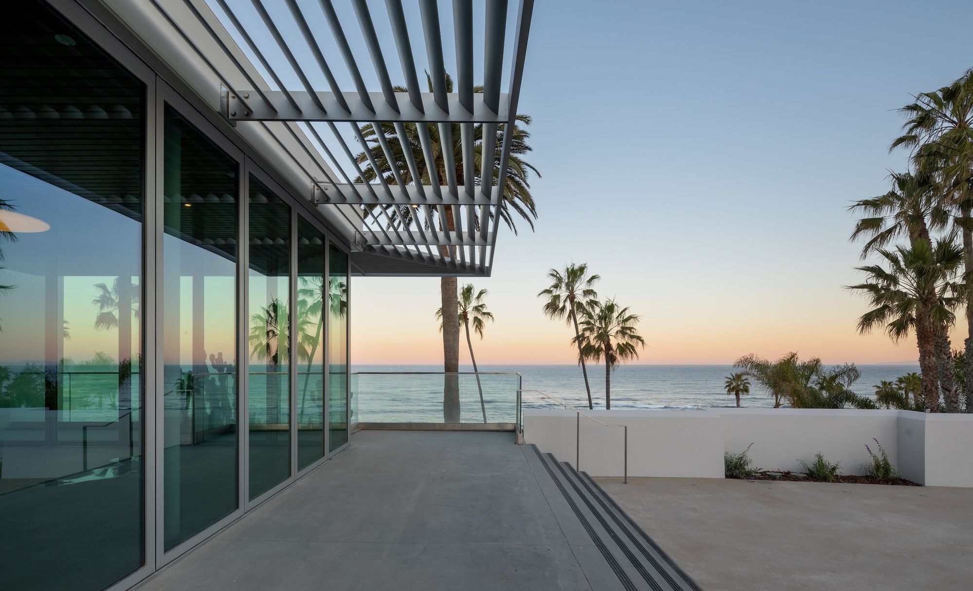
Sunset views of the Pacific Ocean from the MCASD’s Bartell Terrace. Photography Nicholas Venezia. Courtesy Selldorf Architects.
Selldorf is the latest entry in the storied architectural pedigree of a building which began its life as a home that Modernist Irving Gill designed for newspaper tycoon and philanthropist Ellen Browning Scripps. After she passed, in the early 1940s, the building was converted into an art center and later gallery spaces and an auditorium were added in expansions by the San Diego-based firm Mosher Drew in 1950 and 1960. Then the Venturi Scott Brown addition came in 1996. With the Selldorf expansion, the former auditorium has been transformed into a 7,000 square foot double-height gallery with 20 foot-tall ceilings (explaining a large part of how a building that only doubled its square footage could quadruple its gallery space). While there are differing opinions on how seamlessly the new expansion knits together the complex’s hodge-podge of different additions from different eras, I for one felt too hypnotized by the ocean to feel too critical towards any of it, and I think that’s to Selldorf’s credit.
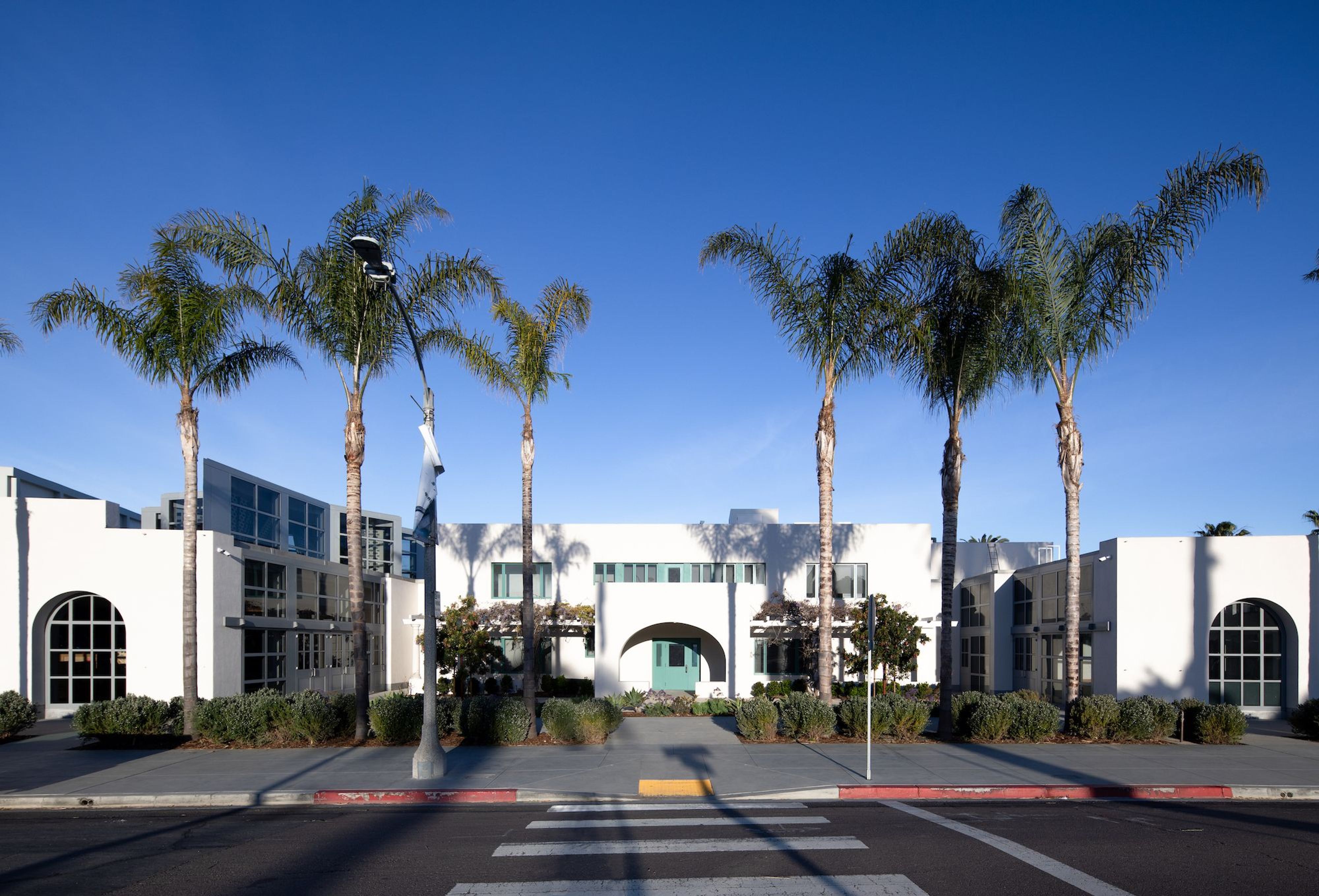
The original Irving Gill façade at MCASD’s recently expanded La Jolla flagship. Photography Nicholas Venezia. Courtesy Selldorf Architects.
The museum raised 105 million dollars to fund this renovation — though during the tour, MCASD’s director and CEO Kathryn Kanjo is quick to qualify that not all of that was spent by the builders; 20 million went to endowment. Still it was an expensive expansion in part because of the unique topography of the site which slopes down toward the coast, and consequently complicated excavation and shoring were involved. As we tour through the galleries, we’re told some of these spaces were previously all soil, unearthed to make room for the contemporary art on the walls. Other site-specific challenges included preserving two mature trees, one of which was relocated 30 feet and replanted on the three-acre property. The expansion opened to the public April 9, showcasing highlights of the museum’s permanent collection, mostly organized by period, in the new galleries. On view until July 17 in the special exhibition galleries (as well as in the theater-turned-gallery) is Niki de Saint Phalle in the 1960s, co-organized with the Menil Collection, Houston, the first survey of the French-American artist to focus on this decade of her early career before she settled in San Diego in the 90s.
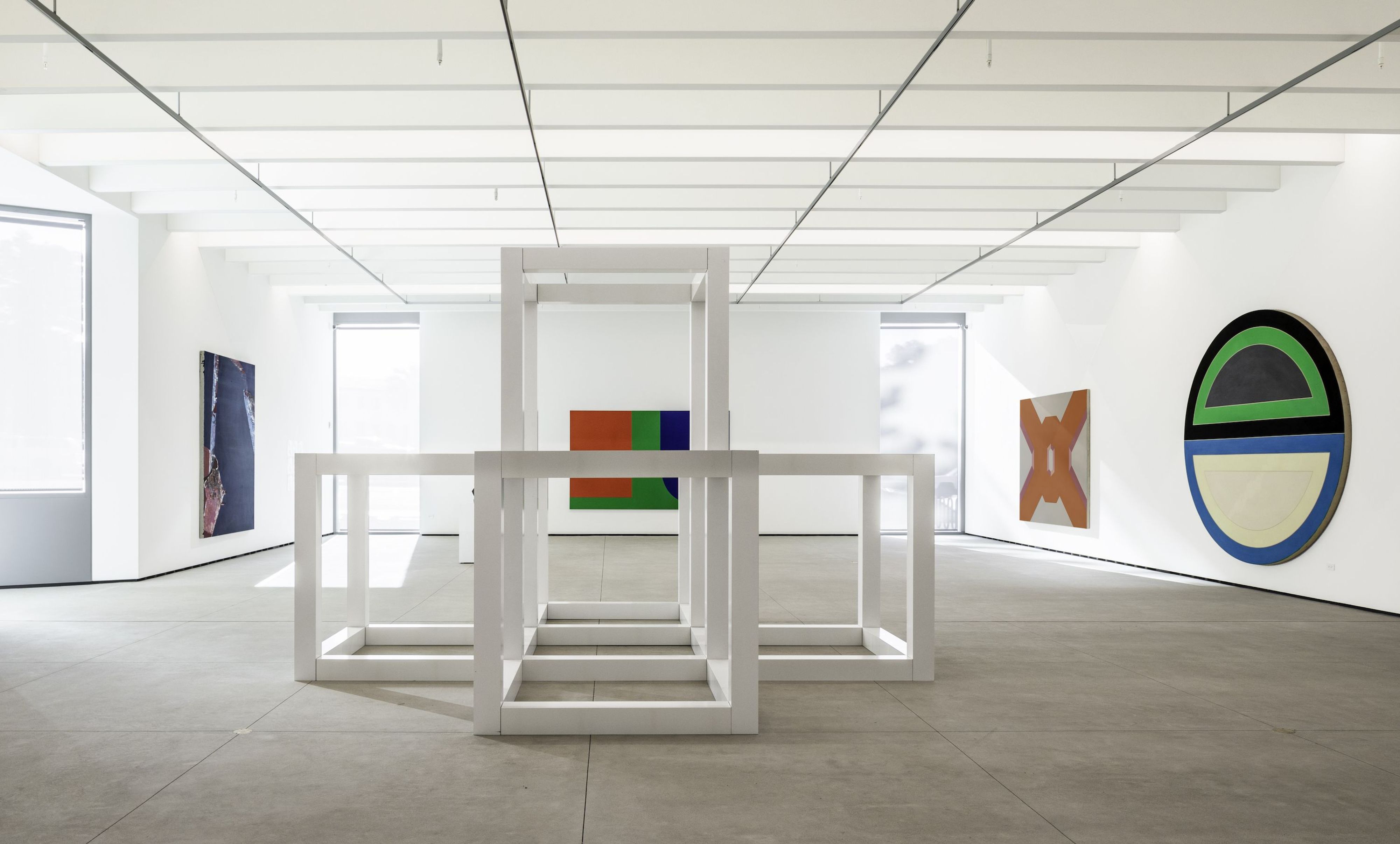
Installation view of the Foster Family Gallery at the newly expanded MCASD with artworks (left to right) by Dorothy Hood, Sol LeWitt, Ellsworth Kelly, Miriam Schapiro, and Frank Stella. Photography Nicholas Venezia. Courtesy Selldorf Architects.
Back in 2014 when the MCASD selected Selldorf Architects for their expansion, it was the New York-based firm’s first large new construction museum project. They’ve since established themselves as luminaries of a kind of low-key refinement that complements artworks with architecture in a supporting role, never stealing the show, through projects like the Frick Collection expansion, Swiss Institute’s new headquarters, and ground-up galleries for David Zwirner and Hauser & Wirth in Los Angeles and New York. And now they’ve been selected to revamp London’s National Gallery (which, talk about déjà vu, also features a Venturi Scott Brown addition from the 90s).
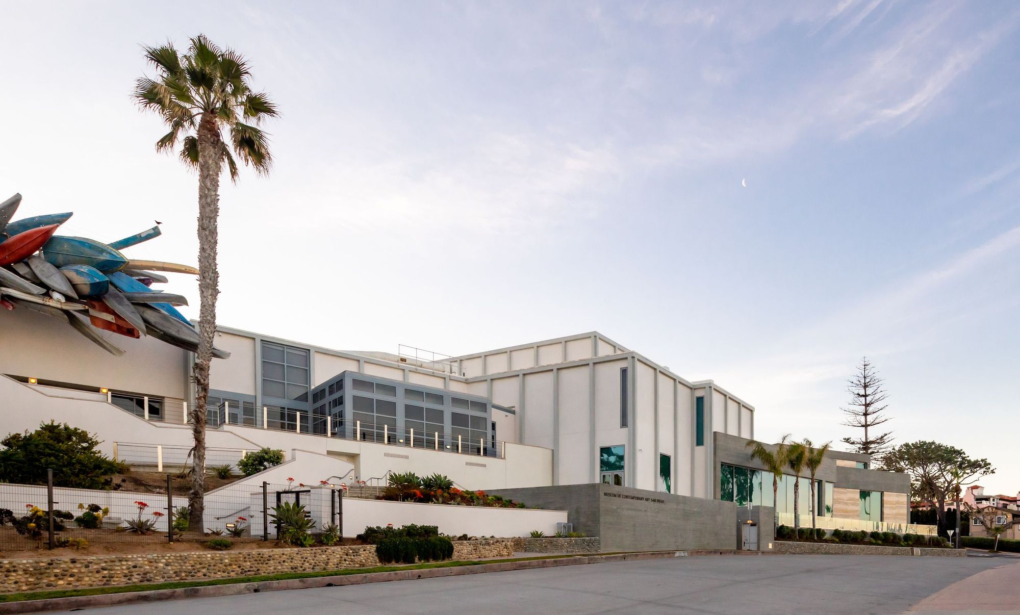
The exterior of MCASD from Coast Boulevard South featuring Nancy Rubins’s nautical sculpture Pleasure Point (2006). Photography Nicholas Venezia. Courtesy Selldorf Architects.
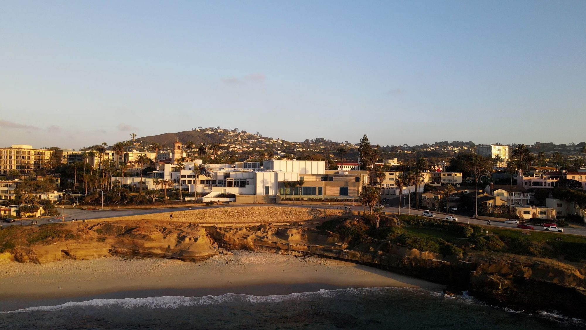
The MCASD’s La Jolla flagship was recently redesigned by Selldorf Architects to better take advantage of its oceanside location. Photography Breadtruck Films. Courtesy the Museum of Contemporary Art San Diego.
“Working on art spaces and museums has always been an integral part of the work we do,” explains Selldorf, who founded Selldorf Architects in New York City in 1988. “I believe art can be transformational; it has the ability to reach out and bring people from diverse backgrounds together and allows them to see themselves and the world around them a little differently.”