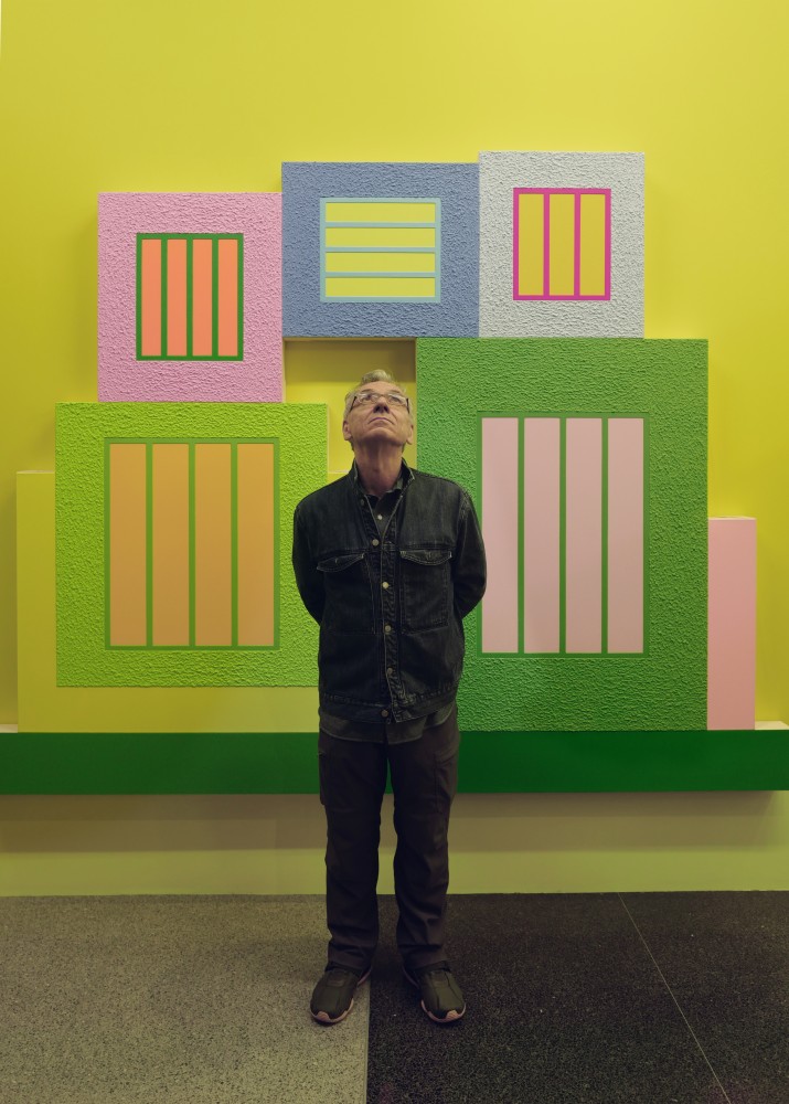
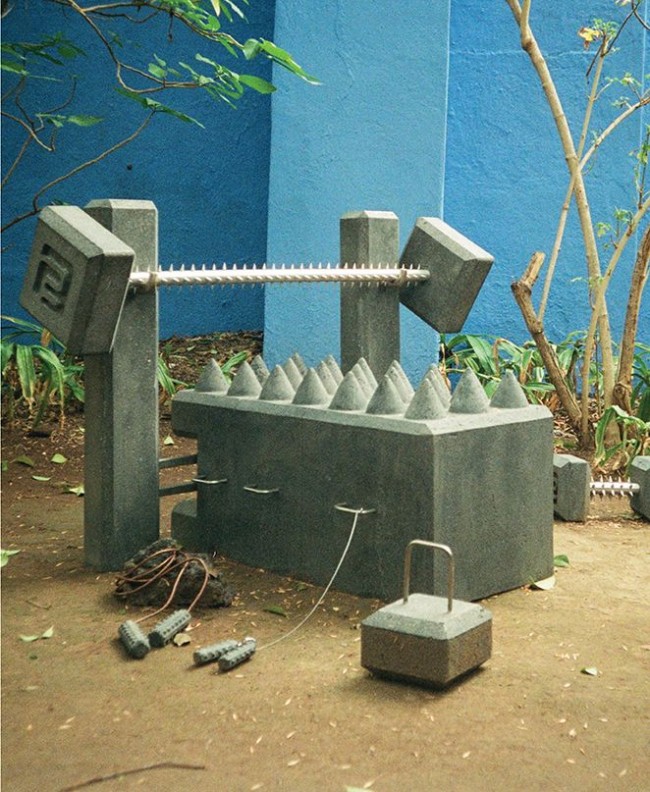
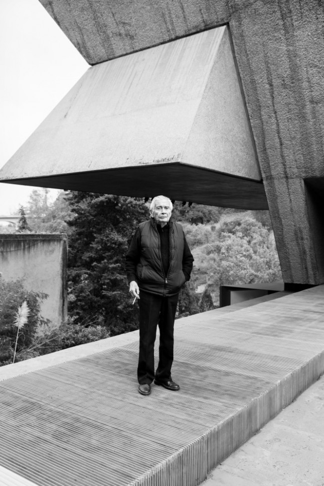
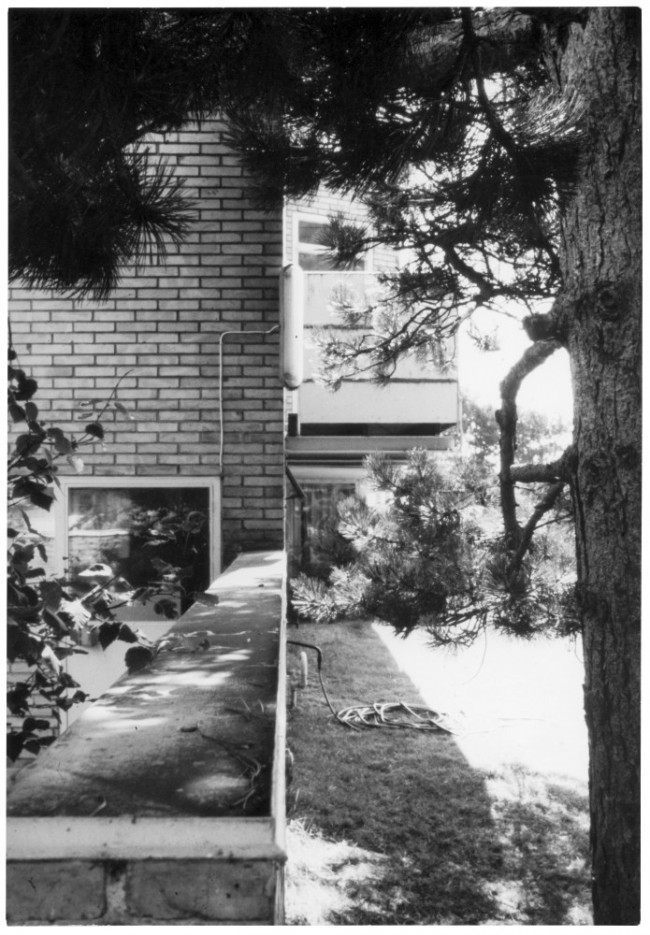
Peter Halley and installation view of New York, New York, Lever House (2018). Photography by Rafik Greiss for PIN–UP.

index magazine feature on Gaetano Pesce. © index magazine.
Peter Halley, installation view of New York, New York, Lever House (2018). Photography by Rafik Greiss for PIN–UP.
index magazine feature on Gaetano Pesce. © index magazine.
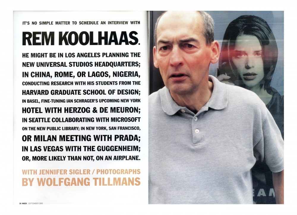
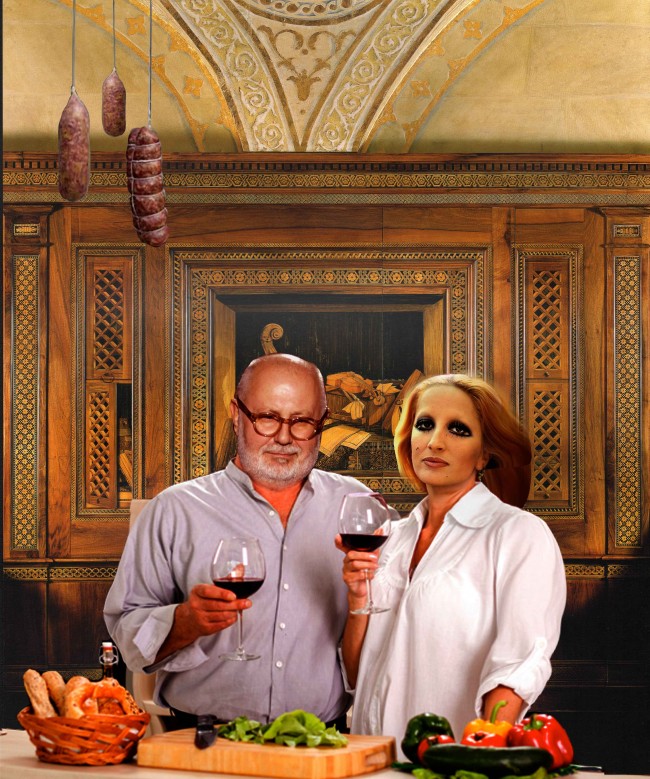
index magazine feature on Rem Koolhaas. © index magazine.

Peter Halley and installation view of New York, New York, Lever House (2018). Photography by Rafik Greiss for PIN–UP.
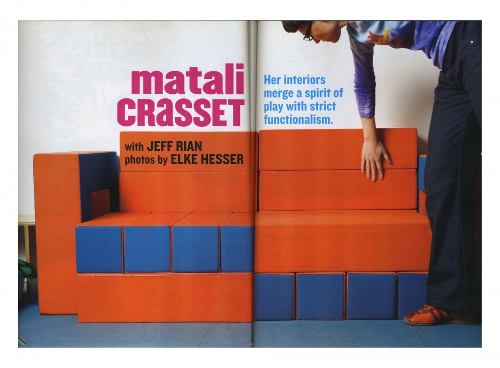
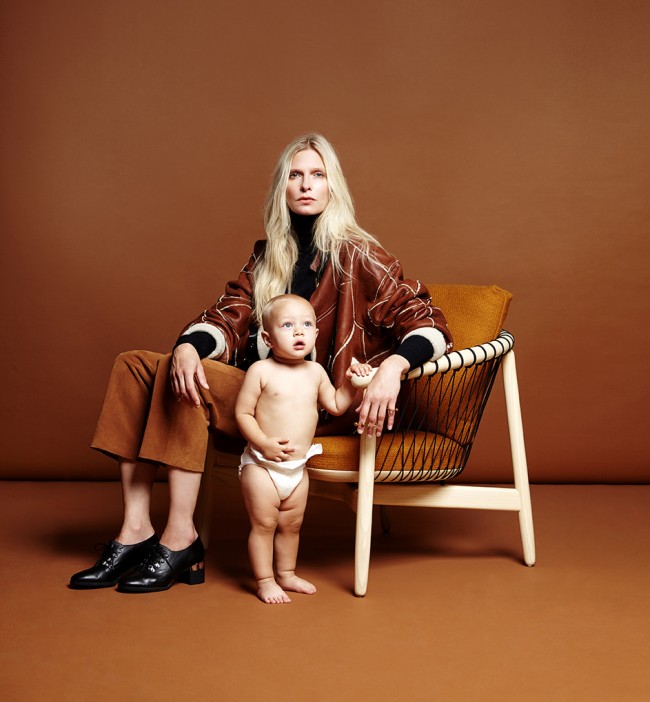
index magazine feature on Matali Crasset. © index magazine.
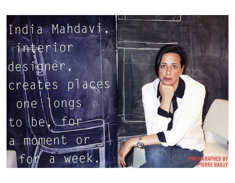
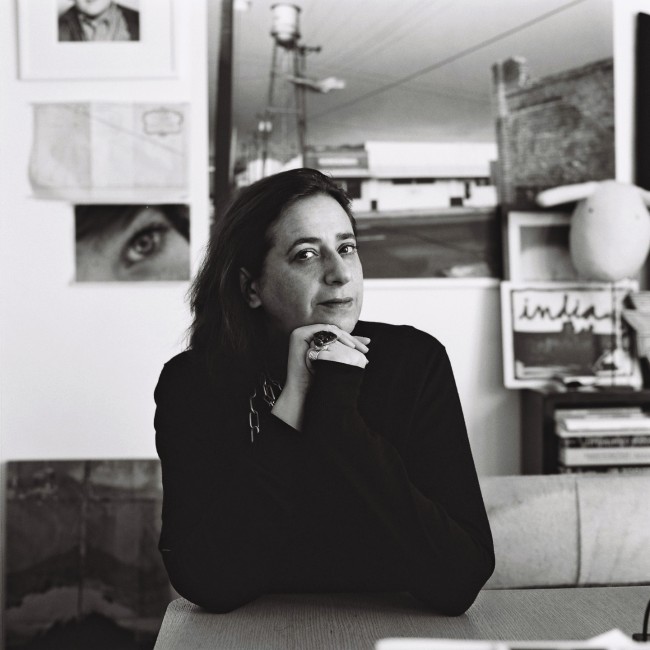
index magazine feature on India Mahdavi. © index magazine.
Peter Halley, installation view of New York, New York, Lever House (2018). Photography by Rafik Greiss for PIN–UP.
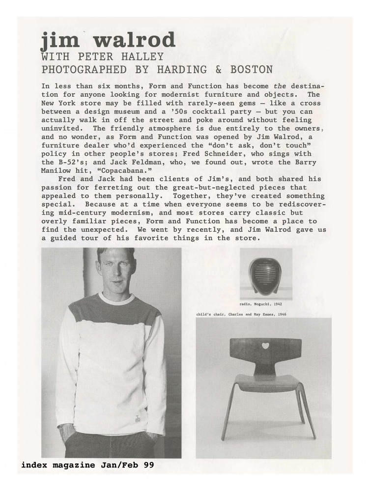
index magazine feature on Jim Walrod. © index magazine.

Peter Halley and installation view of New York, New York, Lever House (2018). Photography by Rafik Greiss for PIN–UP.
Peter Halley, installation view of New York, New York, Lever House (2018). Photography by Rafik Greiss for PIN–UP.
Peter Halley and installation view of New York, New York, Lever House (2018). Photography by Rafik Greiss for PIN–UP.

Peter Halley, installation view of New York, New York, Lever House (2018). Photography by Rafik Greiss for PIN–UP.
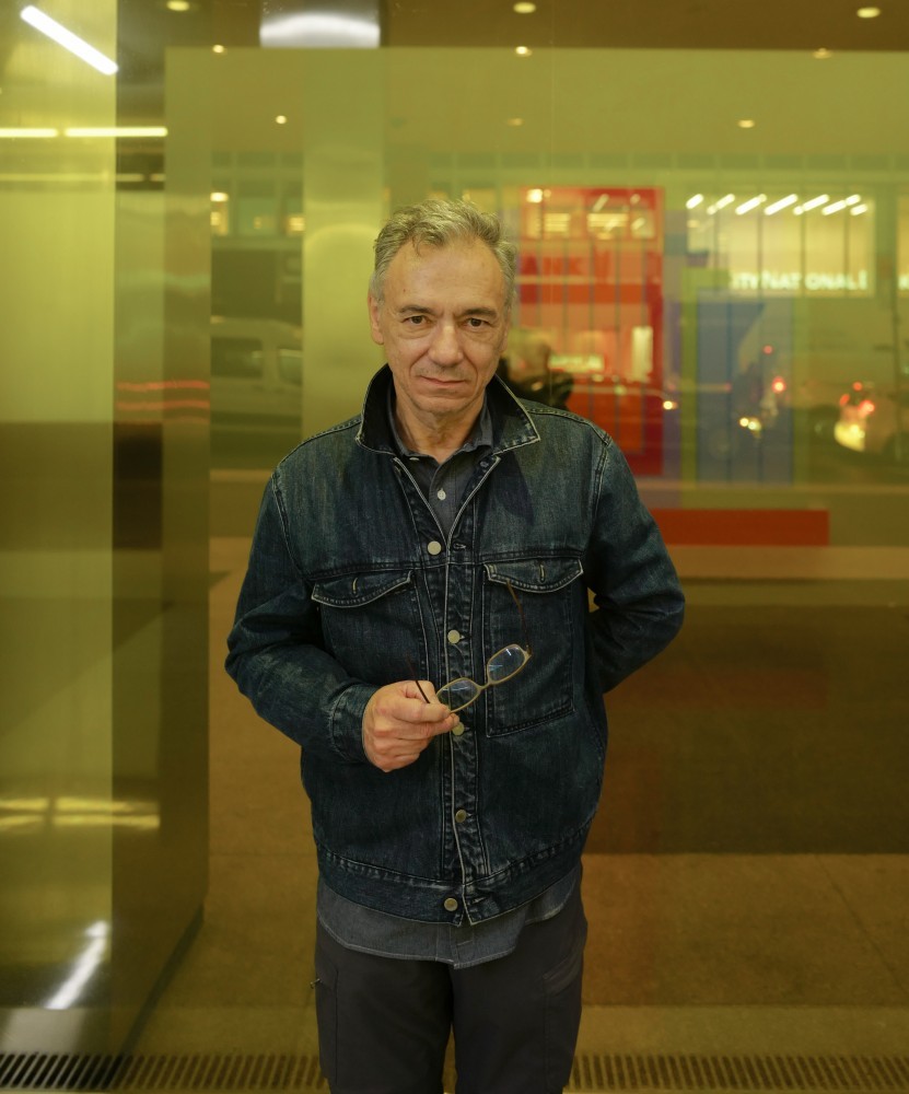
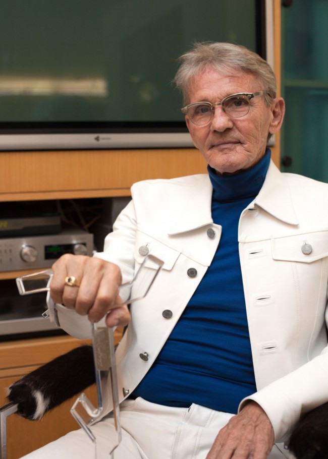
INTERVIEW: Dayglo Legend Peter Halley On Architectural Installations And Index Magazine
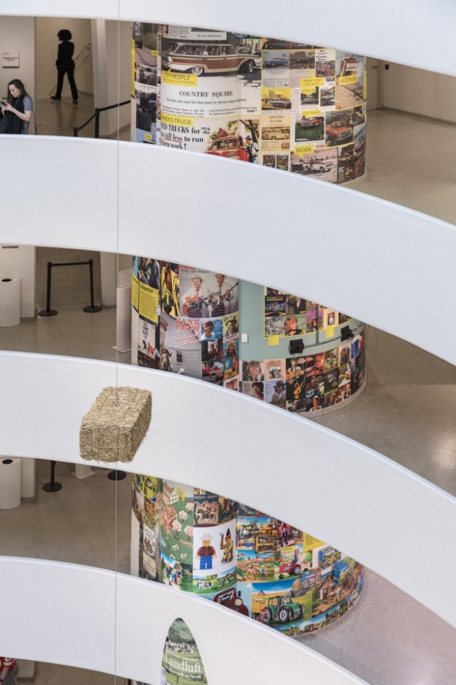
The past year has been non-stop for artist Peter Halley, starting with last fall’s comprehensive love letter to his hometown, New York, New York at Lever House. The site-specific installation transformed the Modernist landmark — the exterior into a city-block sized light box and its interior into a discotheque version of an Egyptian tomb. In April at the Venice Biennial he opened Heterotopia I, named for a Foucauldian concept developed to define transgressive spaces designated for highly-specific, super-charged experiences. Somewhere between a church and a carnival ride, the immersive installation presented by the Academy of Fine Arts Venice and Flash Art magazine expanded on Halley’s exploration of interior architecture as a tool for enlightenment. Then last June, JRP|Ringier published Peter Halley: Paintings of the 1980s: The Catalogue Raisonné, the first monograph to track a decade-long evolution of Halley’s vocabulary, which he developed to question accepted truths of Modernism with regards to abstract painting. He’ll conclude the year back in New York City with Heterotopia II, an exhibition at Greene Naftali gallery which opens November 9.
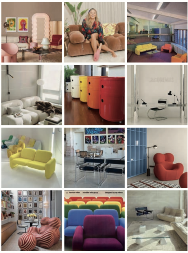
While Halley is publicly known and celebrated for his Day-Glo contributions to abstract painting, I know him privately as one of my first bosses in New York. In 2001 I was hired at the influential vérité-style culture magazine, index, which Halley co-founded in 1996. There I witnessed first-hand one of his lesser-known contributions. Because of his admiration and connoisseurship of design and architecture, Halley’s magazine, for the first time, consistently brought the leaders of that world into a pop-culture context. Along with the artists, fashion designers, actors, musicians, and directors that filled all culture magazines of the day, index interviewed Gateno Pesce, India Mahdavi, Rem Koolhaas, Ettore Sottsass, Jim Walrod, and Greg Lynn, pioneering a new accessible and entertaining approach to presenting architects and designers — the DNA of this approach is embedded in PIN–UP today.
Peter Halley and installation view of New York, New York, Lever House (2018). Photography by Rafik Greiss for PIN–UP.
Fourteen years after index stopped publishing, I was happy to catch up with Halley to discuss the architectural approach guiding his recent installations, how the iPhone has improved the reception of his work, and the queer strategies that have always been central to his creative process.
You came of age as an artist during the Reagan years, and Trump could be seen as Reagan on steroids. Does the iconography that you’re known for — conduits, prisons, cells, and explosions — feel different to you during different political climates?
Yes. People reminisce about the 80s like it was some kind of big party. I came to New York in 1980, and Reagan, an actor with very bellicose policies, had just been elected. The '82 recession was really bad, there was massive unemployment and a nuclear weapons standoff with Europe, followed by the AIDS crisis. It was a dark, threatening time, and even though I was using Day-Glo paint, my paintings from that era were very austere. In contrast, during the Clinton years, the paintings seemed to get a lot peppier, and I guess that extended through Obama. And then the minute Trump was elected, my work changed radically. All of a sudden I started making paintings in which the cells and prisons were no longer on the ground. They became elevated, and the gravity of the paintings moved to the center, destabilized and topsy-turvy. It's almost like I felt like my head was spinning, and for me it's a kind of untethered space. I mean, I'm certainly not an activist artist, but I think, as an artist or writer, the way you respond to political and social events isn't always directly addressing them, but how it affects your language and the emotional resonance.
Some of those “topsy-turvy” paintings were featured in your Lever House exhibition last fall. Was that show a big deal for you because you grew up around the corner?
An extremely big deal! I have a strong identification with New York City. We lived on 48th and 3rd my whole childhood. My parents moved there in 1956 when it was still a low-rise, residential neighborhood. The zoning laws were revised around 1960. All of a sudden glass office towers sprung up in every direction, and I ended up growing up in this very alienating, intense, over-scaled environment.
Had you always had a vision of what you would do with the Lever House if you got the chance?
Not at all. Whenever I do an installation, it's about studying the site. At first, it was daunting because the aesthetic of the building is quite different from my own. My work is clunky, big bold forms, and that building is the height of delicacy. It's almost Japanese in its elegance. One thing it reinforced for me is the idea that young architects’ early buildings are often extraordinary because they have nothing else to do, so they pour all their energy into their projects.

index magazine feature on Rem Koolhaas. © index magazine.
When was the Lever House built?
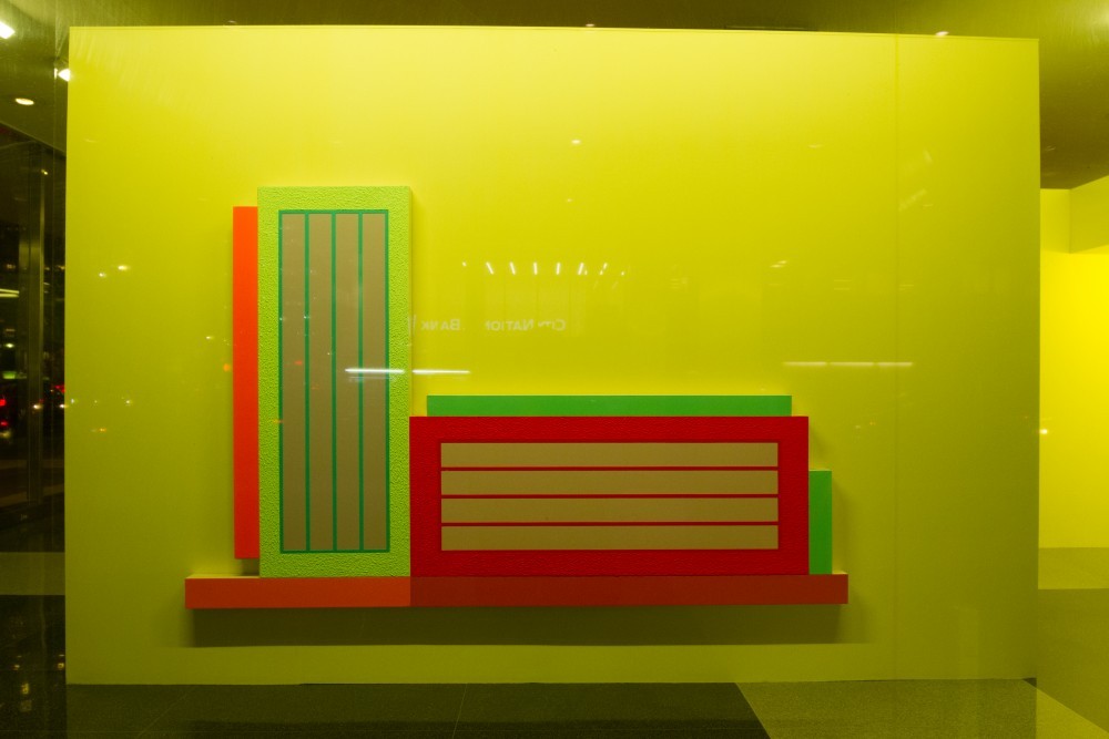
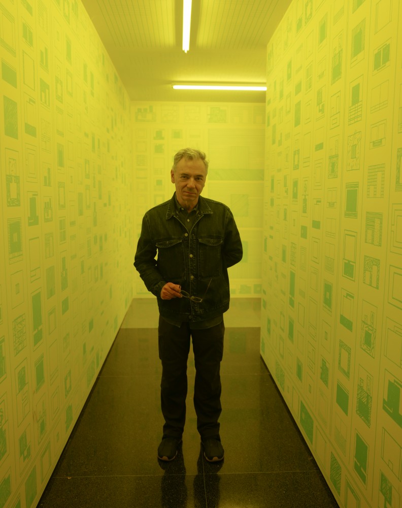
In 1952 by Gordon Bunshaft and Natalie de Blois. They also co-designed another great building, the Union Carbide building down the street. My first step was studying the site and the building and the layout of the lobby and seeing how it fit into the surrounding environment. Then I decided the project would be based on three levels of public address: urban or street level, public space, and private or hidden space. That turned out to be the motivating organizational principle. The signature of that building is the second floor slab. At the time of my show that space was empty so I decided to make an intervention in terms of the architecture of the building as a whole. I covered all the second floor windows with vinyl tinted yellow, which created a band of yellow light that could be seen up and down Park Avenue. It ran from September to December. Usually I don't like when it gets dark early, but last fall I couldn't wait for daylight savings time!
Was the show’s title New York, New York a reference to Frank Sinatra’s iconic song?
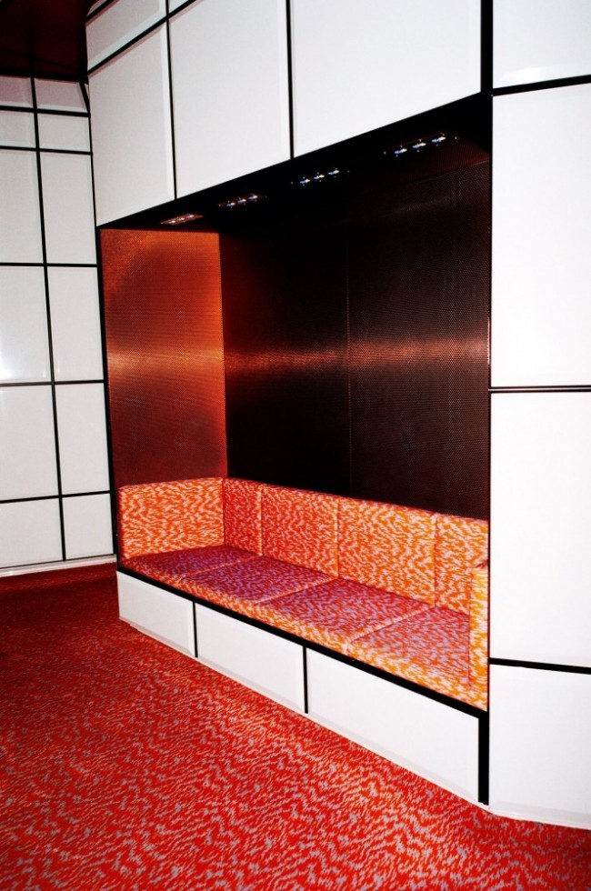
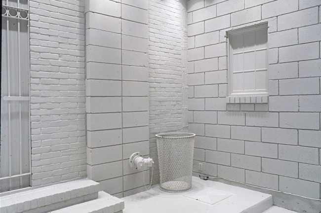
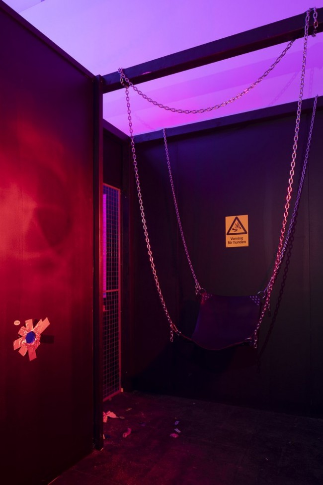
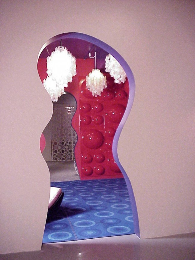
No, there are two “New York, New York”s. The one I was referring to, which was playing in the installation, is from the play On The Town, with music by Leonard Bernstein. It’s funkier and funnier, a less grandiose song. What hooked me were the beginning lines: The Bronx is up / the Battery is down / the people all ride in a hole in the ground. It's funny. Adding it was a last minute decision. You could only hear the music once you were in the final chamber of the enclosure. The idea was that you wound your way through this maze, into this tomb-like setting, and then were greeted by an upbeat New York song. The impulse came from Egyptian tombs and Greek temples. So the final room, which has a backlight, is clearly the inner sanctum. I was wrestling with the question, “What do you feel when you arrive at the most sanctified endpoint?” Not grandiose, not spiritual, the secret message is laughter. I wanted it to be upbeat. I hoped the audience would turn around and smile. Within that inner sanctum, one room has these changing colored lights and metallic wallpaper, which is pretty tacky. The black light is also not exactly the height of sophisticated taste. I relied on cheap special effects — it’s all quite carnivalesque.
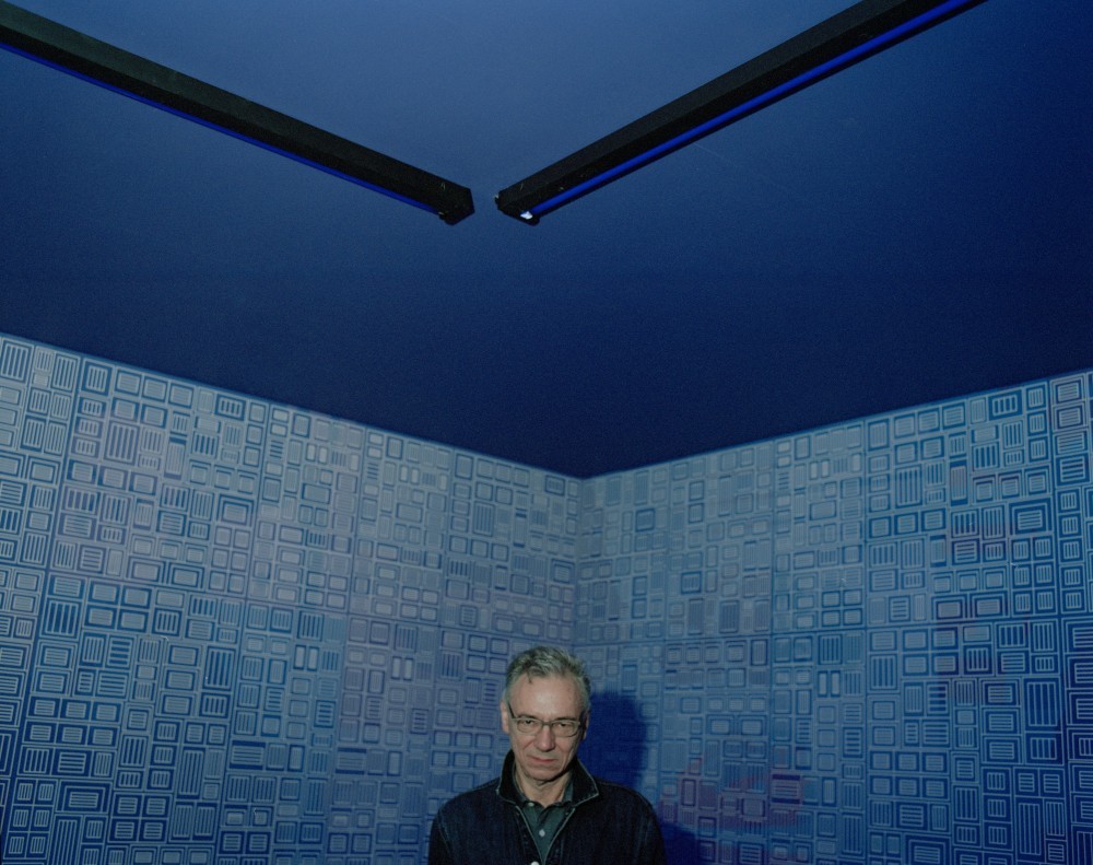
My strongest association inside that space was the feeling of a back room at a gay club.
That’s sort of what I wanted. Although, there's an autobiographical, self-indulgent twist to it. In that space I decided to include photos of my parents with Andy Warhol in the background of the wallpaper. I thought, this would be my little secret that nobody would ever see. Except it turned out when you took a photo with your iPhone, it became visible. At the opening three people noticed it. So, the problem with this sex club angle is you don't really want to do it with your mom and dad looking in from the wall.
Wow, so it's a very psychological space.
(Laughs.) Yeah, Freudian! I've always been very big on the idea of humor as a creative engine, so a lot of my ideas are sort of parodic responses. That does have something to do with Postmodernism, which is a questioning of all the Modernist truths.
-

Peter Halley, installation view of New York, New York, Lever House (2018). Photography by Rafik Greiss for PIN–UP.
-

Peter Halley, installation view of New York, New York, Lever House (2018). Photography by Rafik Greiss for PIN–UP.
-
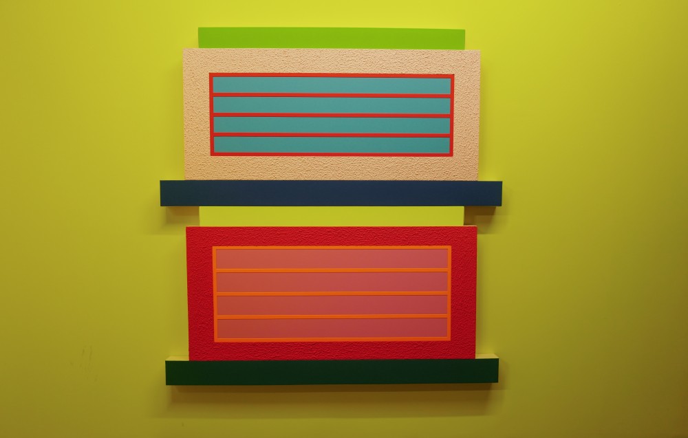
Peter Halley, installation view of New York, New York, Lever House (2018). Photography by Rafik Greiss for PIN–UP.
-

Peter Halley, installation view of New York, New York, Lever House (2018). Photography by Rafik Greiss for PIN–UP.
That’s why the interior space feels like both an Egyptian tomb and a discotheque?
I was interviewed by Tom McGlynn for The Brooklyn Rail, and he described what I created as what Michel Foucault refers to as a heterotopia. I’d read some Foucault but I didn't know what that was. Early on in his work, he came up with this idea that there are special places in traditional societies, like a men's lodge, or women's lodge, for that matter, or ships, or boarding schools, that are enclosed, delineated, non-normative spaces. These can either be very positive places where people go for pleasure and camaraderie or very negative ones, like prisons where people are trapped. All heterotopias have very strong borders. You're either you’re in it or you’re not.
That’s where the title for your show at the Academy of Fine Arts during the The Venice Biennial came from?
Exactly, Heterotopia I. For that installation I invited a few artists: Lauren Clay, Andrew Kuo, and R.M. Fischer to help articulate the different spaces.
In your recent paintings, some of the color combinations are so intense that they actually hurt my eyes if I look at them directly for too long.
People have always said my work is both seductive and assaulting. That balance between drawing you in and pushing you back has always resonated with me.
I’m curious, do you have a favorite color?
It's weird, I don't know why, but the color that's most meaningful to me is yellow. I use a lot of Day-Glo yellow, but it all began with Day-Glo red for me — it creates a sort of anti-natural luminescence, glowing, nuclear. The idea of that intensity and heat definitely resonates with me. Within my own generation, so many artists were conservative in their use of color. Nobody was experimenting or pushing the envelope. Then about 15 years ago, I began to notice that artists were using color more freely and older people seemed more responsive to it, and I swear to God that it’s because of the iPhone. We've become so used to interacting with this colorful iPhone world.
Peter Halley and installation view of New York, New York, Lever House (2018). Photography by Rafik Greiss for PIN–UP.
My fiancé just read Ten Arguments For Deleting Your Social Media Accounts Right Now, and it explains that the iPhone and apps are based on slot machines — colors of slot machines are designed to keep you playing as long as possible. I was told to switch my phone screen to black and white if I wanted to use it less.
I'm of the opinion that Instagram has been great for the art world because it's been very democratizing. I know artists whose work has gotten around because someone saw it on Instagram. Another example is the art fairs. You never used to know what was going on at Miami Basel unless you got a plane ticket and an expensive hotel room, and now you can just scroll through the whole thing. It’s made a big difference.
In 2017 I saw a billboard on top of a building on Ninth Avenue of four interracial men making out. It had no text. I posted it on Instagram stories and asked, who made this? Within like, an hour, the artist Camilo Godoy DMed me and offered to send his book that accompanied the billboard. Two days later we met up and saw exhibitions together, now we are friends.
Wow, that's what I call social media. I just found the architect I'm going to work with on Instagram. I mean all social media isn't equal. Facebook is as bad as it can get, and God knows what they'll do with Instagram, but sometimes things are great for a moment, at least for us visual people. What I follow most compulsively on Instagram is actually architecture.
What architecture Instagram do you recommend?
@SocialistModernism has all these amazing Brutalist buildings from Romania and the former Yugoslavia that's been very educational. Since you addressed the issue of color in my work — my work looks mediocre in print but looks really good on a phone or computer. LED screens have really helped improve the reception of my work.
Because they capture the glow a printed reproduction can't?
Yes, and the other really gratifying experience I've had in the last few years is that digital natives (people 30 to 40) seem really comfortable with my work, because both in color and imagery, it seems to speak to how they assume the world is, in terms of circuitry, diagrammatic images, and highly keyed color. I didn't have that experience until recent years.
Many of your paintings of prisons use optimistic color palettes. They make me think about how people create their own, how we strive for contentment or balance within a prison system we've designed for ourselves.
That's definitely a sub-theme. Although, the prison came about because I wanted an enclosed space for the window. In my paintings I have two different spaces. he cell, which has no window; it's covered with stucco, completely hermetic. And the prison, a space that's also isolated but you can see out of it. My use of the prison started as a joke on geometric Modernism, because for artists like Malevich or Albers, the square was something ideal, timeless, and universal — almost a spiritual icon. So I said to myself that geometry isn't all that great. Geometry is often about restriction and isolation. So it seemed funny to me to take a square and put three bars on it, call it a prison and say, Hey! This isn't the ideal geometry of Mies van der Rohe, this is the threatening geometry of Foucault. Playing around with that has been a constant for me.
Your starting point, the parodic critique of Modernist truth, isn't necessarily obvious, it’s evolved and grown into its own world.
You know, in the 90s I first learned about queer studies and how the word “queer” was used as a verb — “queering.” And, you know, when I talk about putting bars on a square — I think these are pretty close to the idea of queering, which is taking something and sort of re-contextualizing it, often with a light-hearted touch. I'm also interested in the parallels between queering and the basic premises of Postmodernism. So if we think of Postmodern architecture and design, such as Memphis, that's pretty parallel to the idea of queering, culturally. In other words, this strategy that I use — this slightly offbeat, humorous transformation — other artists use it as well.
You make me remember that queer strategies are not strictly linked to sexual orientation. Before this period of unprecedented acceptance, gay people grew up watching society as complete outsiders, which led to creating unique solutions in many areas of life and art. But I never thought that the outsider status needed to develop a queer sensibility was exclusive to gay people.
I've always assumed the same. I'm a straight person but I identify with queer strategies. And, if I may say so, I think index was on the leading edge of queer culture. When it launched in the mid 90s, every once in a while someone would ask, is this a gay or straight magazine? They were puzzled because it was queer. But, the real queer icon is Andy Warhol. The Whitney show last winter included all of his TV commercials, which were so brilliant and such a queering of the brands.

index magazine feature on Matali Crasset. © index magazine.
At the beginning of index, you were responding to Andy Warhol's Interview Magazine. There's a very direct parallel: both are pop culture publications, owned by artists, and run out of studios.
Yeah, I thought that Interview had lost its original spirit. And the idea was to create something closer to its roots.
Interview needed to be queered at that point. (Laughs.)
Exactly. index gave creative people voices. I've always believed in interviews rather than articles. Wolfgang Tillmans also comes into this — this idea of showing things as they are rather than dressing them up. (Tillmans shot the first cover of index and was a regular contributor throughout its run.)
Designer Jonathan Olivares credits index as the reason he became a designer. That’s the best example of one of the most important things that independent media can do: offer young people a map of the different routes that are possible outside of mainstream society.
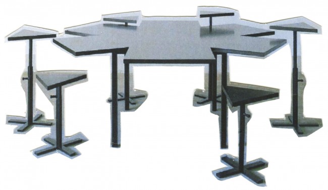
When I met Jonathan he was working as a salesperson at Louis of Boston, this fashionable department store that sold index. He began to read our interviews with architects and designers, which included Gateno Pesce, India Mahdavi, Rem Koolhaas, Ettore Sottsass, Jim Walrod, etc. and that's why he decided he wanted to become a designer. He's so interesting! index also interviewed the designer Matali Crasset. I had never heard of her, but after we did this interview I went nuts over her work and subsequently sought her out. We did two projects, which were these great collaborations between opposites. I'm from the city, I'm American, and I'm involved in the mainstream art world, and she is French, grew up on a farm with this Green Party idealism and yet, over the years, we've not only worked together but have become good friends.
Even with extremely different backgrounds you have very similar aesthetic instincts.
You know, when you share a formal language with somebody, it's this bizarre bond. Everything she does looks brilliant to me. It's what I would want to do if I could think in three dimensions. The other story is Wayne Koestenbaum. I interviewed him for index, and we became friends. When I became director of the painting program at Yale, I invited him to critique the graduate students for nine years. He became a painter because of that.
Amazing! I’m not 100 percent sure, but I think you may be able to credit index with being the first pop culture magazine that brought design and architecture into the conversation with film, art, music, and fashion.
You're probably right. That was my thing. index was a collage of voices: rather than just covering music, or art, one person would want to do a fashion piece, Bob Nickas wanted to cover a psychedelic rock band, and I wanted to interview Rem Koolhaas. So each issue was a collage of different people's interests. I like when people are innovative in a field, and I don't care what the field is. But as a business model it was hard to navigate, because it wasn't a fashion magazine, or a film magazine, or a music magazine. So it didn't have the natural urgency to advertise. But what was most appealing to me was this broad spectrum of ideas about different types of making.
That's one of the main reasons I felt so lucky to start my career with you at index. I consider it the grandfather of the contemporary independent magazine. You can see its DNA today in many independent magazines: Apartamento, Fantastic Man, The Gentlewoman, and PIN–UP. What you say about business is true and it forced the sensibility to fracture into the more thematic magazines I work on today.
Well, you know, Michael, I always tell people this, so you might as well hear it. index was sort of hobbling before you came along. We didn't have any advertising, and besides the income, we didn't have a strong profile. And then you joined the team — and you were 24 years old — and completely transformed the situation and were instrumental in bringing the magazine to the next level.
I wasn’t expecting that. That means a lot to me. Thank you Peter.
You're welcome.
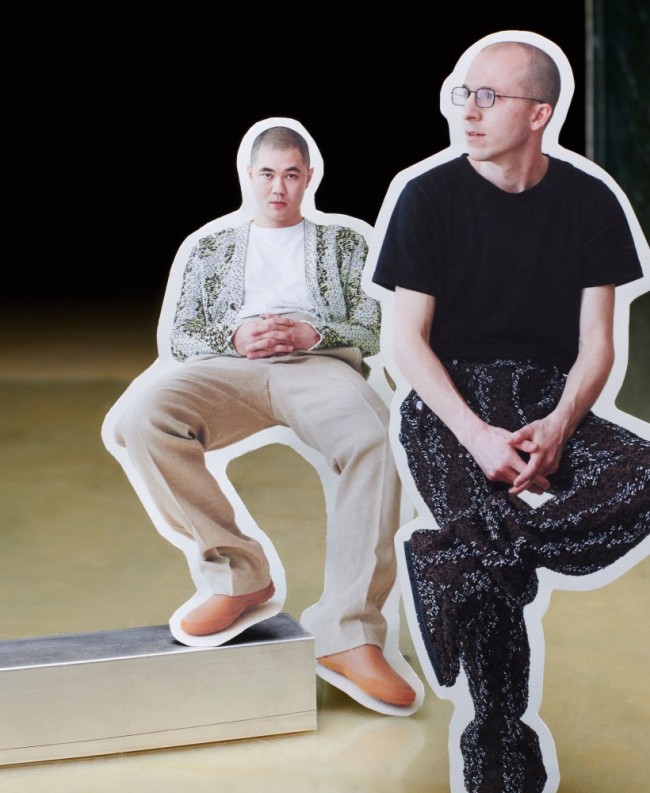
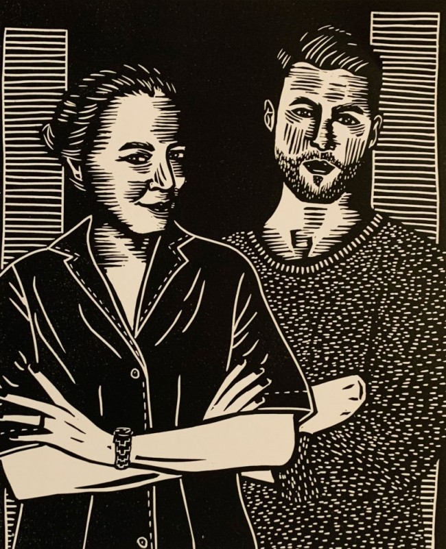
Text by Michael Bullock.
Portraits by Rafik Greiss.


