How SITE and The Late Fashion Designer Willi Smith Brought The Street Into The Showroom

SITE's designs for WilliWear’s showrooms were inspired by the streets of the West Village and the Lower Manhattan Piers. Photography © SITE
Broken windows, concrete sidewalks, crumbling brick walls, chain-link fence, rusty industrial piping, abandoned tools, and layers of eroding façades are probably not what comes to mind when imagining the showroom of a successful New York City clothing brand. Yet WilliWear, founded in 1976 by designer Willi Smith (1948–87) and his business partner Laurie Mallet, was different from other brands of the era as well as from most companies today. Not only was it the first multimillion-dollar fashion company helmed by an African-American designer, it was also the first to deliberately shun high fashion and instead seek inspiration in the street for women’s, men’s, and children’s clothing. No wonder, then, that when envisioning WilliWear’s first showroom in the early 1980s, Smith and Mallet saw it as another opportunity to upend industry convention.
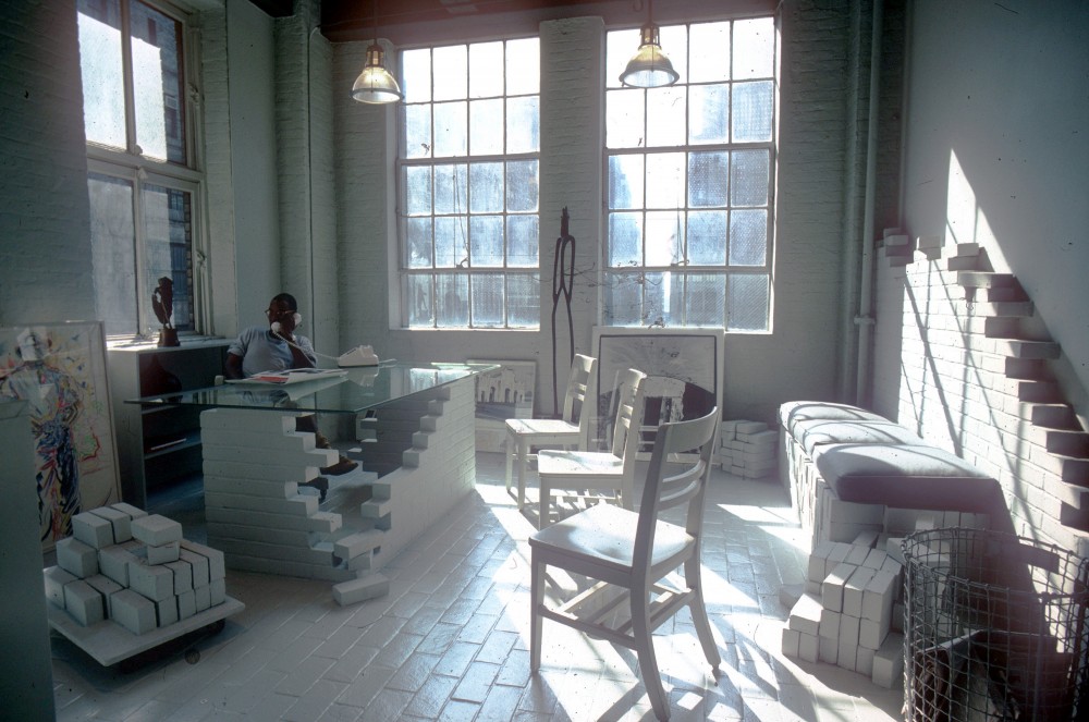
Willi Smith at the WilliWear executive office designed by SITE. © SITE Architecture
Finding the right architects to reimagine the traditional showroom was the result of perfect timing. As Smith and Mallet were walking down Fifth Avenue contemplating possible directions for their new home base in the Garment District, an unusual Rizzoli bookstore display in Manhattan caught their attention. The window featured a half-finished brick wall and abandoned tools. Newly released design and architecture books were scattered throughout the simulated construction site. Their covers popped against the muted, unified backdrop. A bold departure from current trends in window dressing, the deconstruction was even more unusual in the context of a prestigious uptown art bookseller whose displays typically favored elegance and refinement. This punk anti-design was the work of SITE, a collective of artists, architects, and engineers who had banded together to challenge the conventions of the built environment with a form of conceptual thinking that had incubated in the environmental-art movement of the 1970s. As Alison Sky, a founding partner, explains: “They (Rizzoli) had no budget, and I noticed a property was being built across the street. So I invited the construction workers to build a brick wall. I directed them to stop halfway and leave all their tools as if they had left for a lunch break. After arranging the books on the piles of brick, I left. When I returned the next day the installation was completely gone — cleaned out during the night by the Rizzoli in-house designer.”
-

BEST Notch Building, retail store in Miami, Florida showing the “wandering wall” in its open position, 1979. © SITE Architecture
-
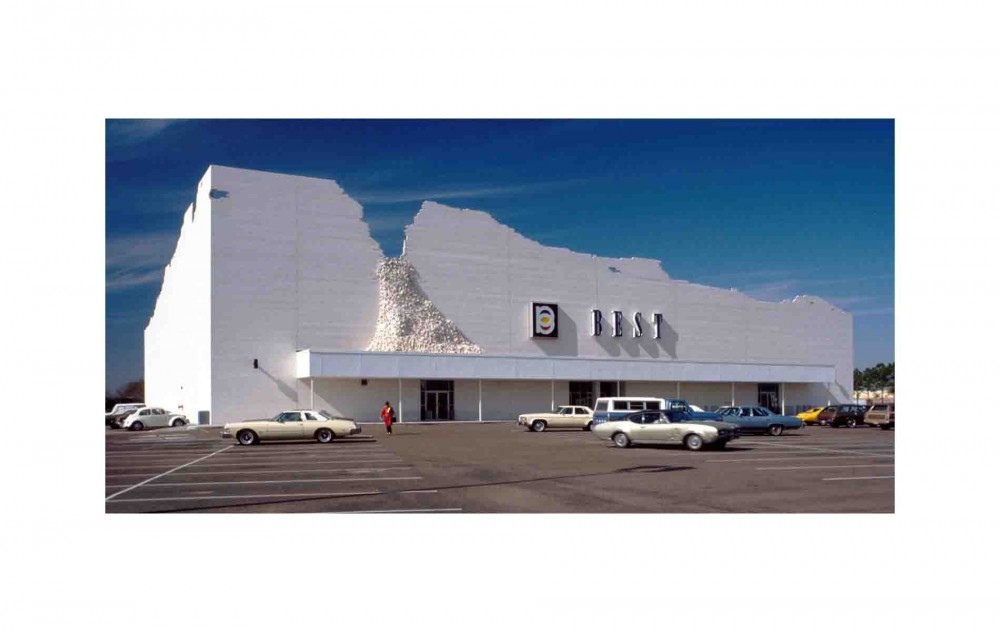
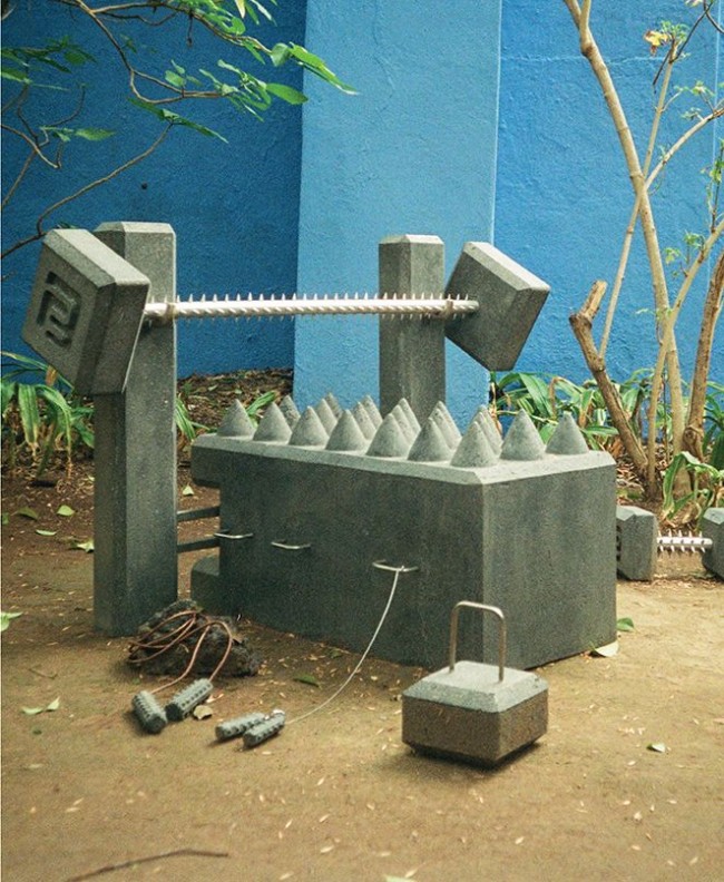
BEST Indeterminate Façade, retail store in Houston, Texas, main façade view from parking lot, 1975. © SITE Architecture
So it was in that small window of opportunity on that one day that WilliWear discovered SITE, who by the turn of the 1980s had earned themselves a high-profile international reputation as the subversive pranksters of architecture. Their radical work for BEST chain stores from 1975 to 1984 achieved something unimaginable, simultaneously functioning as big-box retail outlets and giant conceptual sculptures that critiqued the conventions of the big-box genre. Eleven BEST stores were built in total, each with its own subversive focal point: the 1975 Houston, Texas store, Indeterminate Façade, featured an apocalyptic roofline of crumbling brick; the 1976 Towson, Maryland store, Tilt Building, pivoted the entire façade at a 35-degree angle, forcing customers to walk under the resulting chasm and enter through a hidden glass envelope; and the 1980 Richmond, Virginia, store, Forest Building, was designed to allow nature to grow through its façade. “There was lots of controversy swirling around those stores because they used architecture to comment on itself,” explains James Wines, another SITE co-founder and today the only remaining original member.
-
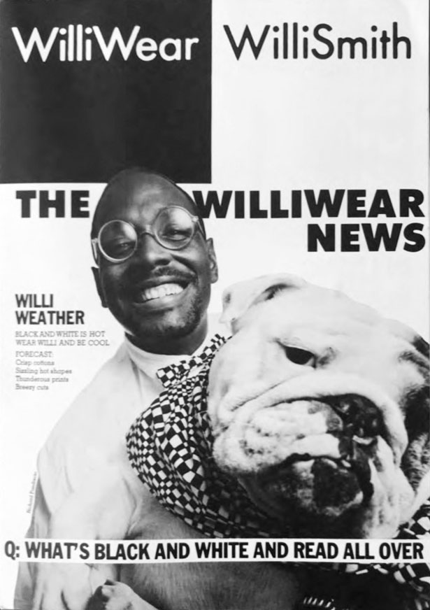
The WilliWear News, a collaboration with Paper Magazine from summer 1986, photographed and designed by Richard Pandiscio.
-
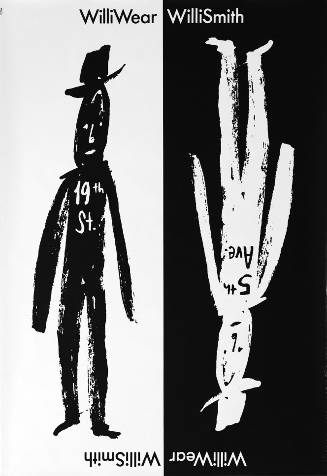
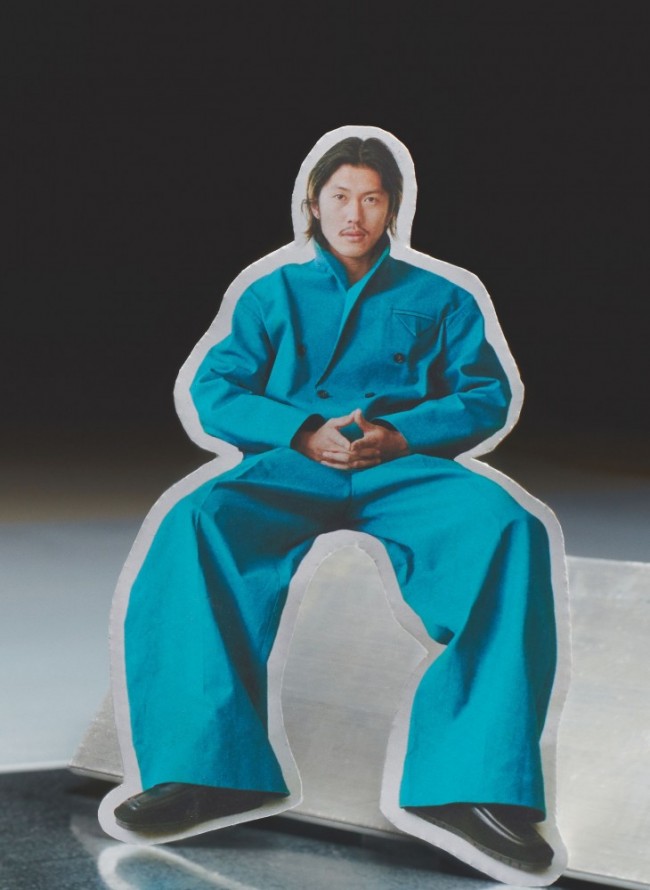
WilliWear poster c. 1987.
On paper, the charismatic Wines was the polar opposite of Smith: white, straight, and 15 years his client’s senior, where Smith was young, black, and openly gay. But behind these inverse identifying distinctions were two men with profound similarities: both functioned as artists but had chosen to work in commercial fields; both had a taste for fully immersive art, such as theater and Land Art; both were drawn to works that had a component of social critique; both had a reputation for bucking convention; and both were media darlings. These affinities sparked an immediate friendship. “Willi was like an Oscar Wilde character — good looking, charismatic, and not at all pretentious,” Wines fondly recalls. “When you read Wilde, you see that he punctures holes in everything, and Willi had a bit of that in him too. A conversation with him wasn’t like talking to Donna Karan, it was like talking with an artist. When Alison and I got to know him, it was almost like we had known each other our whole lives.”
-
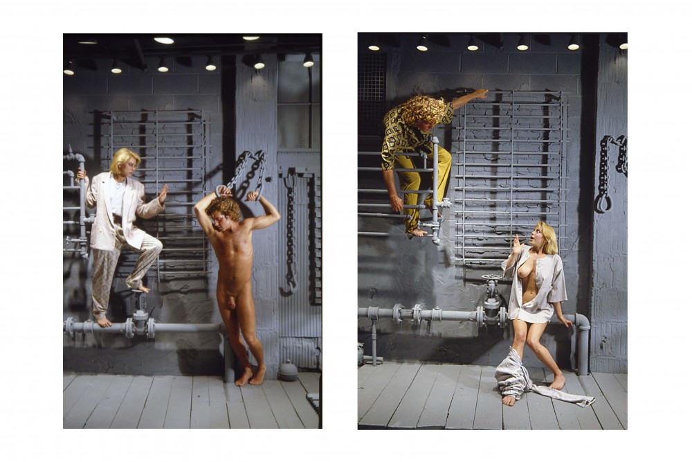
Still from a narrative photo shoot in the WilliWear men's showroom designed by SITE Archtitecture (c. 1982). © Andreas Sterzing
-

James Wines, co-founder of SITE (along with Alison Sky), poses in one of the WilliWear showrooms. © Andreas Sterzing
Sky and Wines interviewed Smith and Mallet in order to understand WilliWear’s goals and dreams. “He told us he wanted his showroom to be the exact opposite of Ralph Lauren,” Wines remembers. “He was not interested in aspirational wealth. He was interested in looking good, being cultured, and enjoying pleasure, and he wanted to share those interests with as many people as possible.” Sky adds: “It can be difficult to answer such simple questions, but when we asked where his inspiration came from, he told us it was from watching people on the street. When he said that, it was so evocative that he didn’t have to say more.” SITE’s conceptual proposal was equally simple. “We said, ‘Let’s just do the street,’” recalls Wines. “‘Let’s bring the street into the showroom.’ And he loved that idea.” For the next step in the process, SITE and Smith explored areas of the city they were mutually inspired by. During a tour of the Christopher Street Pier, then a notorious gay cruising spot, Wines remembers how Smith pointed out favorite textures, materials, and atmospheres. “He highlighted particular arrangements, specific portions of corrugated metal and pipes. He also took me to the gay bars around the waterfront. He preferred the rough spots: the Hellfire, the Anvil, places that had a very strong character,” recalls Wines. Together SITE and Smith embarked on recreating and repurposing the mood and attitude of places in the city that inspired Smith the most, and formed a team to scour the streets, sometimes after midnight, for authentic discarded materials.
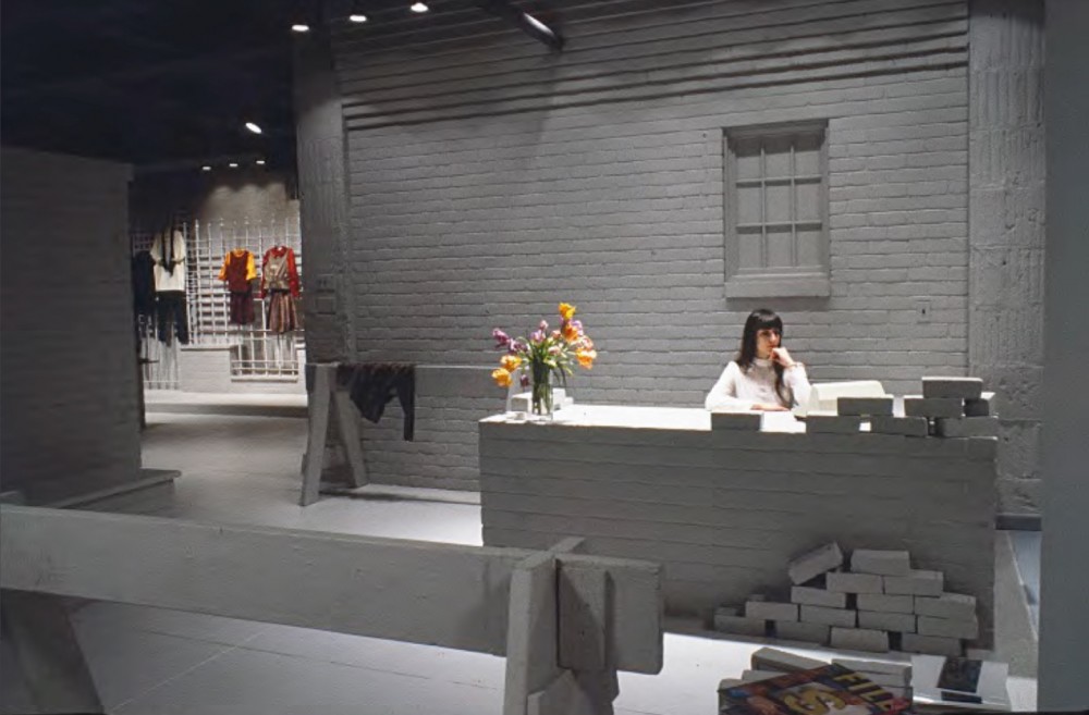
An unfinished brick wall in WilliWear's women's showroom reprised the Rizzoli window display that introduced designer Willi Smith and his business partner Laurie Mallet to the work of SITE in the first place. Photography © SITE
The WilliWear women’s showroom opened in 1982 at 209 West 38th Street in New York City’s Garment District. In many ways it took the original concept from the Rizzoli window display and expanded it into an entire world. The interior featured a detailed streetscape complete with brick and cinderblock façades, multiple doors and windows, sidewalks, window grates, and various styles of fencing. In this simulated urban landscape, elements had multiple functions — the city fences and window bars doubled as display racks, which allowed for maximum flexibility for hangers, and the sidewalk could be used as a fashion-show runway. Like in the bookstore display, the reception desk was an unfinished brick wall, and the whole interior was painted a pale gray that visually unified the complex space into one cohesive dreamscape, animating the vitality in Smith’s work and making the outfits the sole inhabitants of this surrealist ghost city. The men’s showroom, which opened later that year, utilized the same strategies, but visually took its cues directly from the abandoned warehouses on the piers, incorporating as many real materials as possible. “Their interiors had architectural plans, but their creation was very much about being in the location with the collected materials and collaging the pieces together,” says Wines. “The way we work is equally art and design, and art requires you being there and experiencing what works in the moment and making adjustments.” Both stores were extremely successful, as Sky recalls: “They were places people wanted to stay in. They worked wonderfully for buyers, fashion shows, and celebrations. They were completed by the vibrant clothing and people who entered.”
Architectural critic Aaron Betsky’s 1997 book Queer Space: Architecture and Same-Sex Desire sought to define places like the Christopher Street Pier in the 80s, describing them as a misuse or deformation of a place, an appropriation of the buildings and codes of the city for perverse purposes. Betsky found such spaces liberating and believed they were vital in helping residents alleviate some of the imprisoning characteristics of the modern city. But long before the idea of “queer space” had been validated by academia, Smith had harnessed its energy, parading his industry’s crème de la crème — fashion editors, models, celebrities — through interiors styled after a location notorious for anonymous, public, gay sex. While in retrospect this seems the ultimate subversive political act for a daring out fashion designer, it was not necessarily perceived that way at the time, and might not have reflected Smith’s own lifestyle. “He may or may not have used the piers for pleasure,” explains Wines. “That was his private life and it was private. It never seemed to me like Willi had an agenda. I think he was inspired by the piers because they were seductive and real.” Even designer Andre Walker, who worked in the men’s showroom from 1988 to 1989, was not aware of its origins. “The fact that it was a reference to the piers went over my head. I just thought it was a cool street-urban vibe. It’s also quite telling that they didn’t change the showroom decor for over seven years.”
SITE used industrial ruins for WilliWear showroom designs. © SITE
After the New York showrooms, SITE embarked on another round of projects for WilliWear. There was Smith’s personal office, which was designed by Sky as an extension of the street theme in the men’s showroom. In London they turned a corner of the venerable department store Harrod’s into a permanent construction site, the Los Angeles showroom was a ghost beach, and the flagship store on Manhattan’s Fifth Avenue featured an elaborate urban park in which monochrome light-gray ivy had overtaken the entire retail environment. The final project in 1985 was Mallet’s private residence, a Greenwich Village townhouse called House of Memories, again extending SITE’s strategies.
SITE and Smith collaborated successfully because at the core of their practices was the concept of starting with common references. “In order to make a strong statement that can affect the most diverse audience, you have to begin with what’s common,” explains Wines. “We really shared that, a conception of starting with the commonplace but then making an intervention that changes the meaning. That is a powerful act. Everyone can relate to the ordinary, but then they experience something extraordinary. We all had a mission of putting art in places where you least expected to find it.”
Text by Michael Bullock.
Images courtesy SITE and Andreas Sterzing.
A version of this essay will also feature in the book Willi Smith: Street Couture (Rizzoli, 2020), published on the occasion of the exhibition of the same name, on view at the Cooper Hewitt, Smithsonian Design Museum from March 13 through October 25, 2020.
Taken from PIN–UP 27, Fall Winter 2019/20.